
An early prototype exploring a new vision for Booking.com's global payment system.

In 2018, Booking.com made just over USD $14 billion in revenue, making it the world’s biggest accommodation booking site, and world’s 3rd biggest eCommerce site.
At Booking, I lead the initial effort to redesign the payment system that processes tens of millions of euros worth of transactions per day, across 140 countries from around the world.
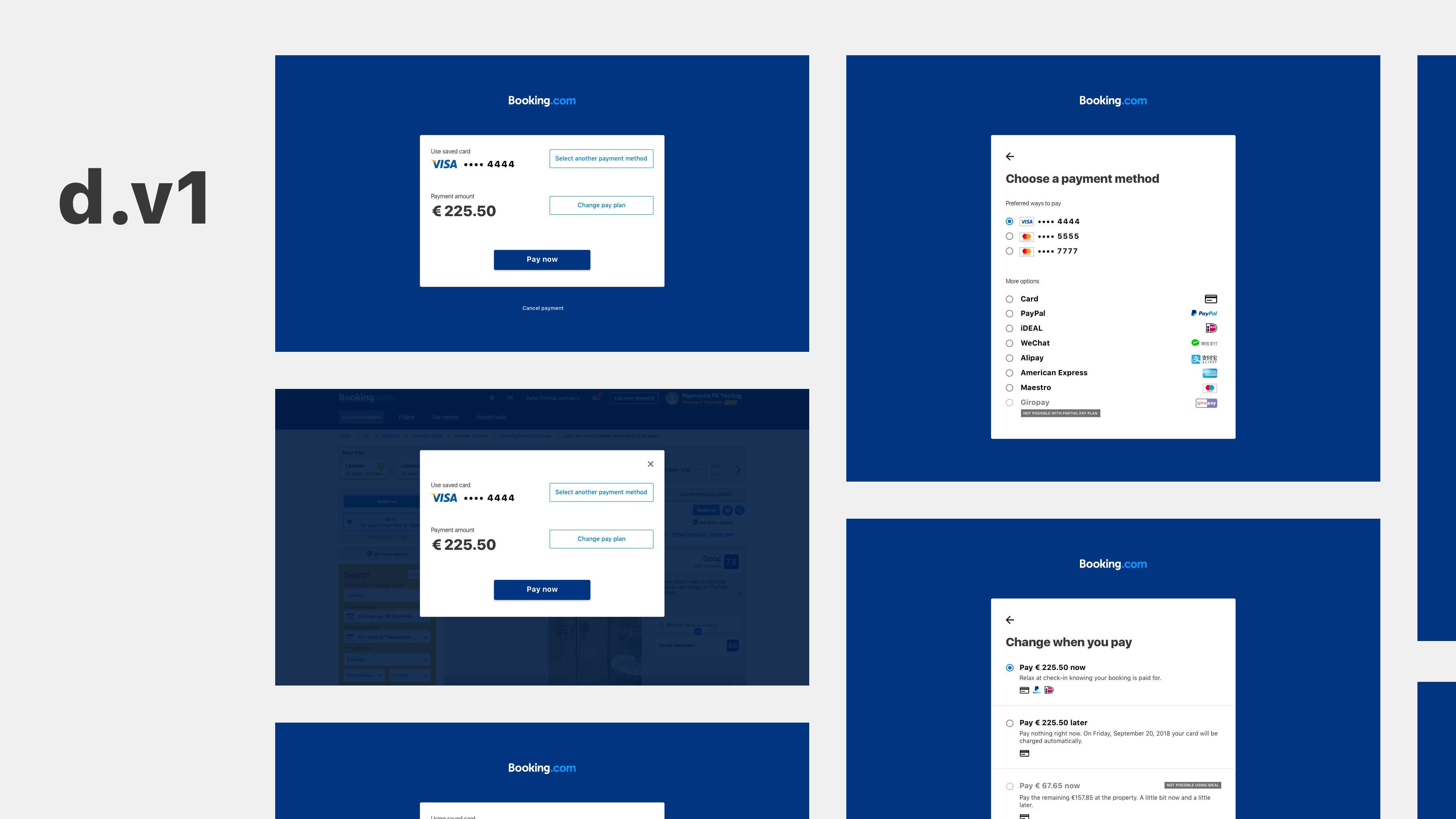
Exploring a new payment experience for the desktop web.
Impact made.
Due to the confidential nature of this work, I cannot disclose the exact monetary impact, but let’s say it was “very significant” — in the tens of millions of euros per year.
A versus B
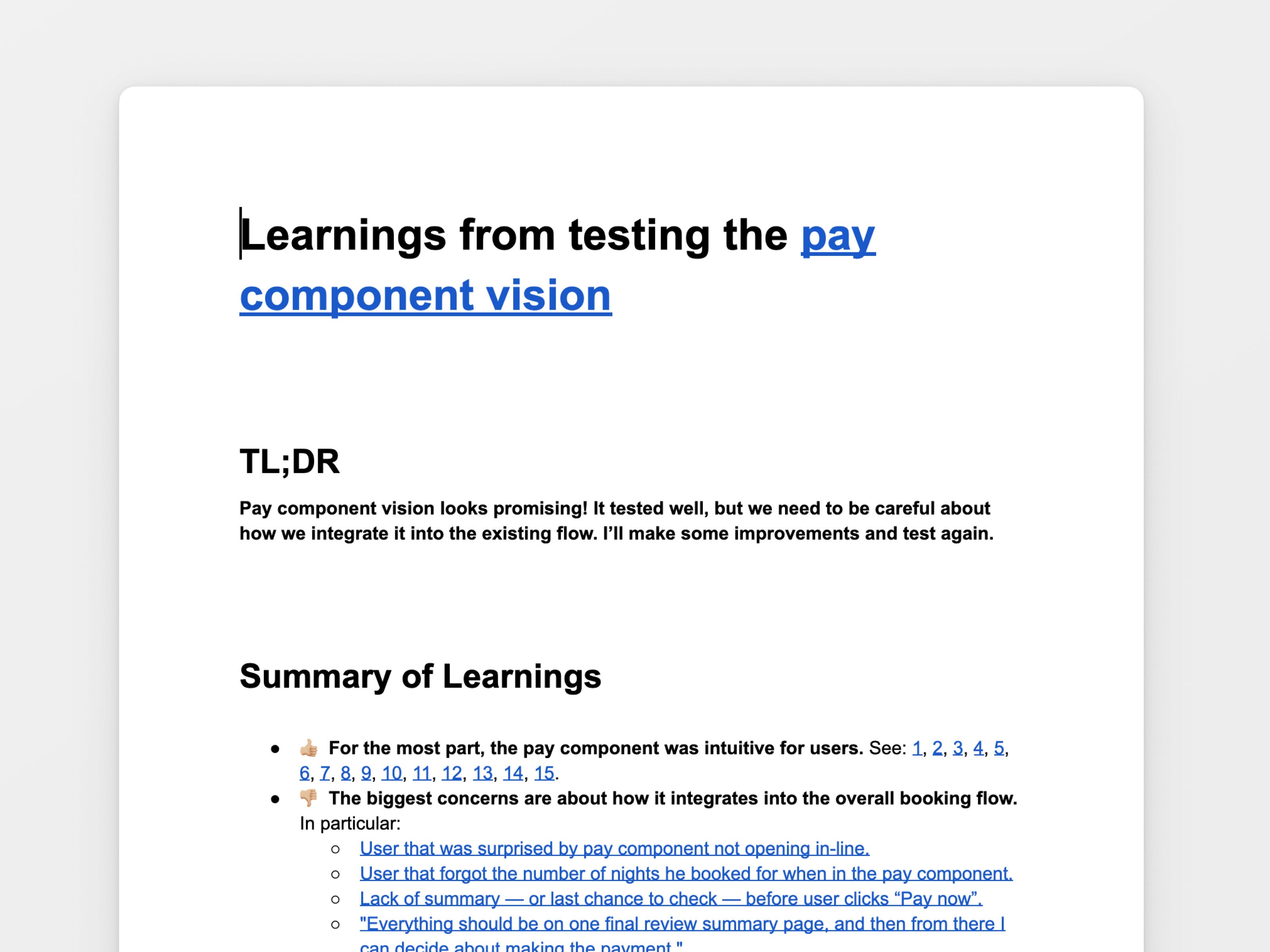
All iterations to the Booking.com website are A/B tested before they go live. Booking’s systems for data-informed decision making made my jaw drop. The extent of data available is just astounding.
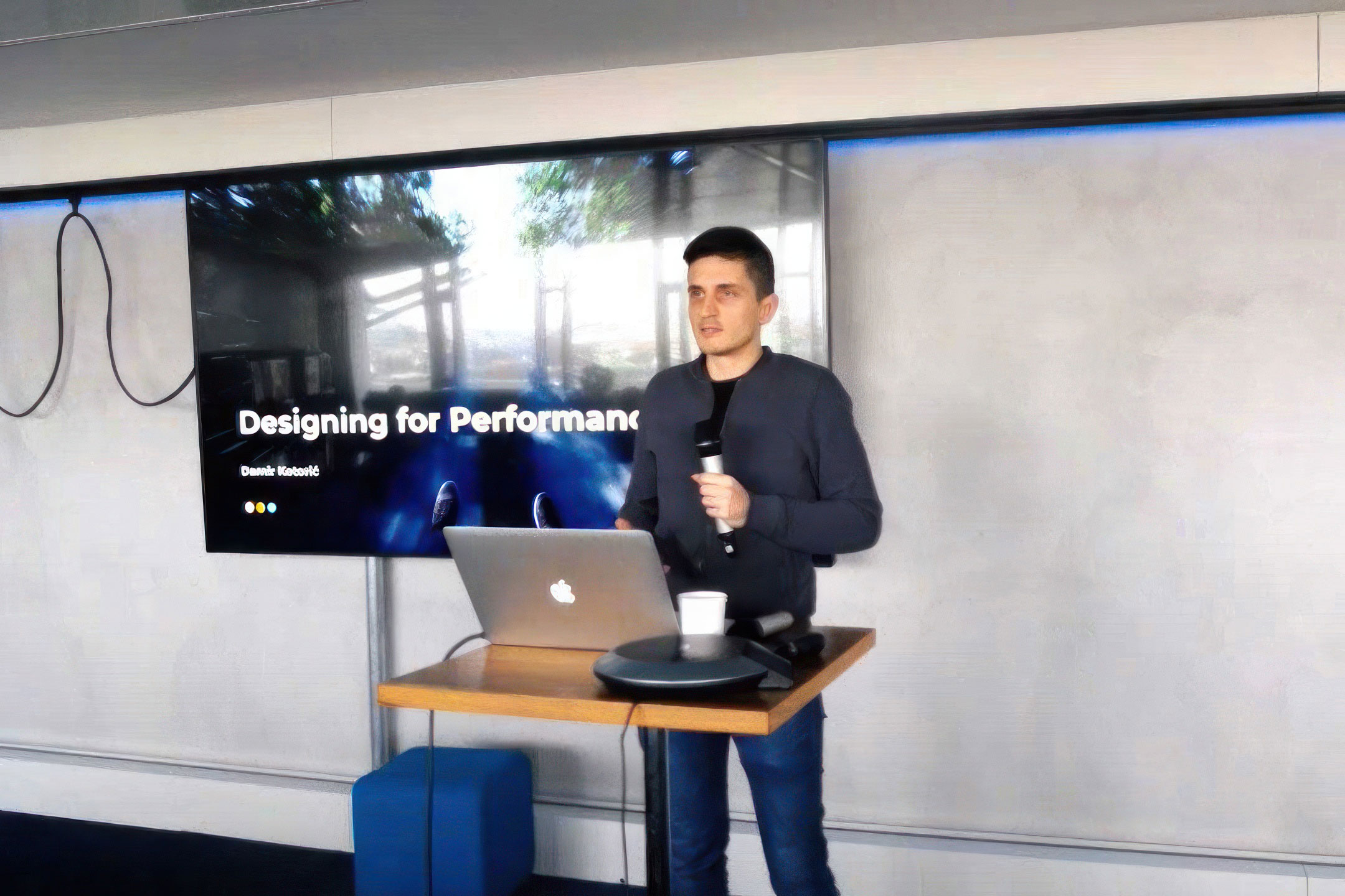
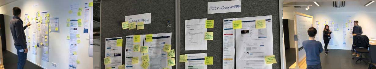
Facilitating design workshops.
First on the agenda was performing research to identify the current payment experience, keeping on the lookout for problem areas and opportunities for improving the user experience.
The complexities of design for a global payment system.
Companies like Booking can approach the payment experience in one of two ways:
The Amazon / Apple model of accepting only debit/credit card payment and one system of payment where you pay for everything at once. Nice and simple, but limited in flexibility for the customer. No card, no party.
The Booking model of accepting over a dozen different payment methods and half a dozen ways of structuring payments. You may choose to pay for everything with a card. But, you may also choose to pay in instalments using Paypal. Or, you may choose to pay some of your booking up front using a debit card and the rest at the hotel using cash.
Booking’s approach is more inclusive, covers a wider percentage of global customers, and is more empathic to the user. WeChat Pay and Alipay, for example, are the most popular payment methods in China. Booking caters to these customers allowing them to use their favourite payment method. That’s good customer service and good business. Win-win.
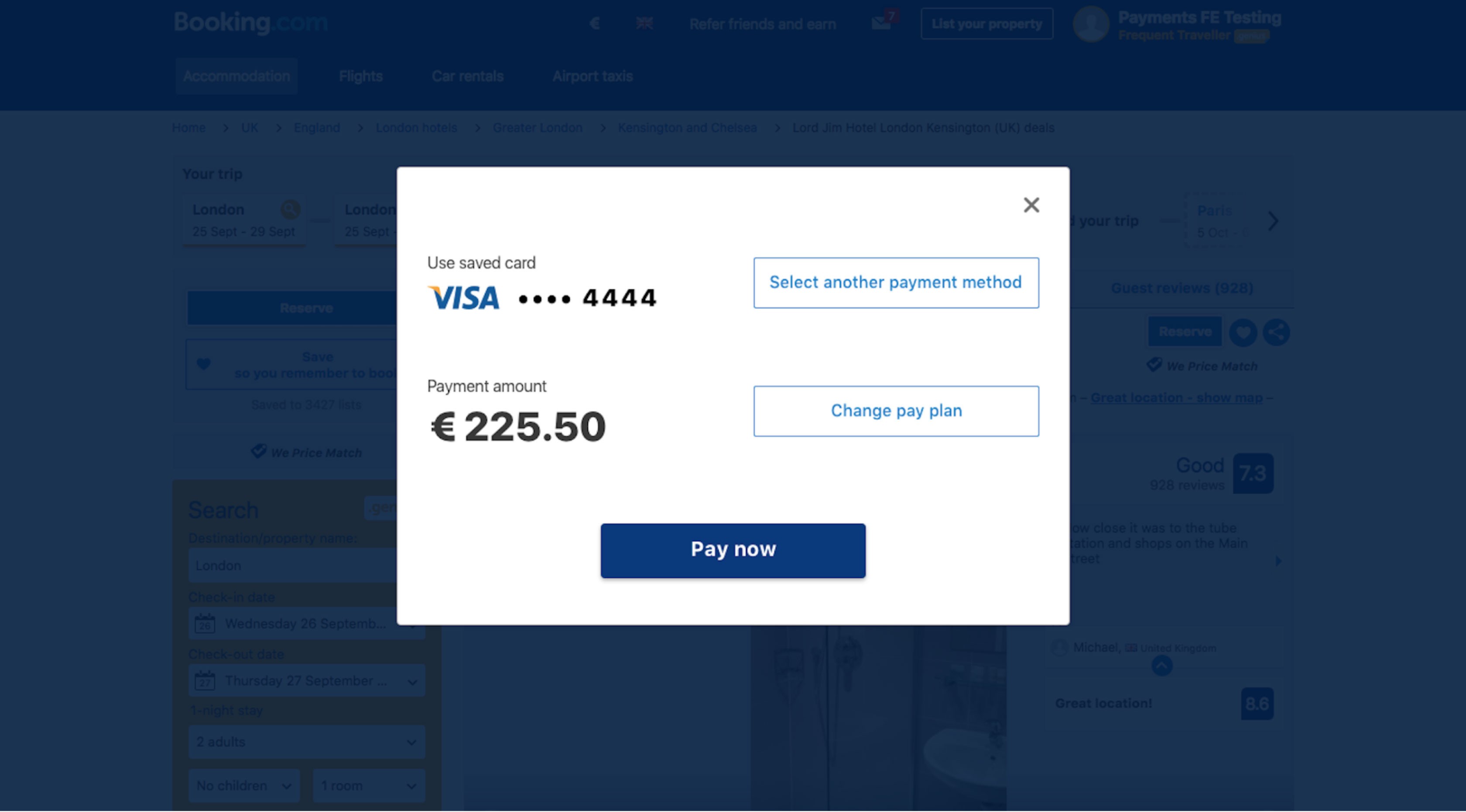
A payment modal — an early prototype experiment.
But this model creates complexity. Lots of complexity. Booking supports over 50 different currencies, is available in over 140 different countries, and is localised to over 40 languages.
Let’s not forget, we need to cater to mobile web, desktop web, iOS and Android platforms, too. The goal is to create a future-proof system — as much as that's possible in an ever-changing industry.
Prototype early.
Good research is imperative. But I don’t like to spend weeks and months researching. Instead, I create a prototype early, using it as a tool for further research.

User testing insights.
Using this prototype, I performed some remote user testing with usertesting.com, then watched the videos of participants completing the test tasks, and compiled all learnings into an easy-to-digest report.
I prepared a summary report featuring links to key moments in the user testing videos. For management this meant an easy executive summary for an easy skim-through, along with the source data if they wish to dive deep.
We had a lot of our assumptions confirmed — users are okay with going to a separate payment mode before returning to the main site (similar to the Apple Pay experience). Some assumptions were busted — when users click Pay they're not yet ready to pay, even if there's a summary of their booking on the page. They expect another final step, and one last button click before the payment is initiated.
Stakeholders.
With a company of over 10K employees and some 300 designers alone, you can expect some red tape around the process of redesigning the heart of the main booking flow. Our work here was a starting point. A way for people to rally around the idea of a new payment system.

EUR € 35 million per year
I was the lead designer on two teams:
Accessibility
Mobile Payments
The combined impact of my A/B tested conversion rate optimisation work at Booking.com was calculated to be worth a whopping € 35 million per year for the company. I worked on two product teams of 6-8 people made up from a variety of disciplines like software development, analytics, UX writing, research and management.
Each A/B test collected data for about a month, and then we reviewed the usage metrics and made the decision whether to go live with each change after seeing exactly by how much we'd improve conversion, or how we had impacted other key metrics like the number customer support tickets issued, or abandonment rates.
In terms of direct conversion optimisation this is by far my most successful impact that I've made in my career.