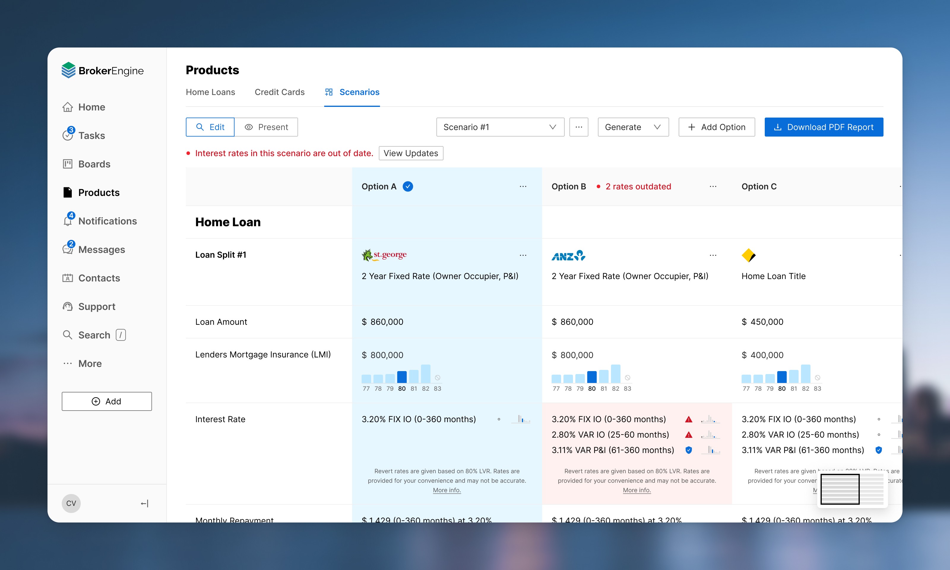
BrokerEngine is like a JIRA / Intercom for real estate mortgage brokers. I revamped this complex product, and plotted a new design direction. BrokerEngine ended up securing a 70% acquisition by Australian Finance Group during my 3-year tenure as lead designer.
Holistic And Systematic Design Overhaul
The new, simplified UI now uses colour more purposefully, and whitespace more generously. It looks less "boxy" because it relies more on typography, colour and spacing for visual hierarchy.
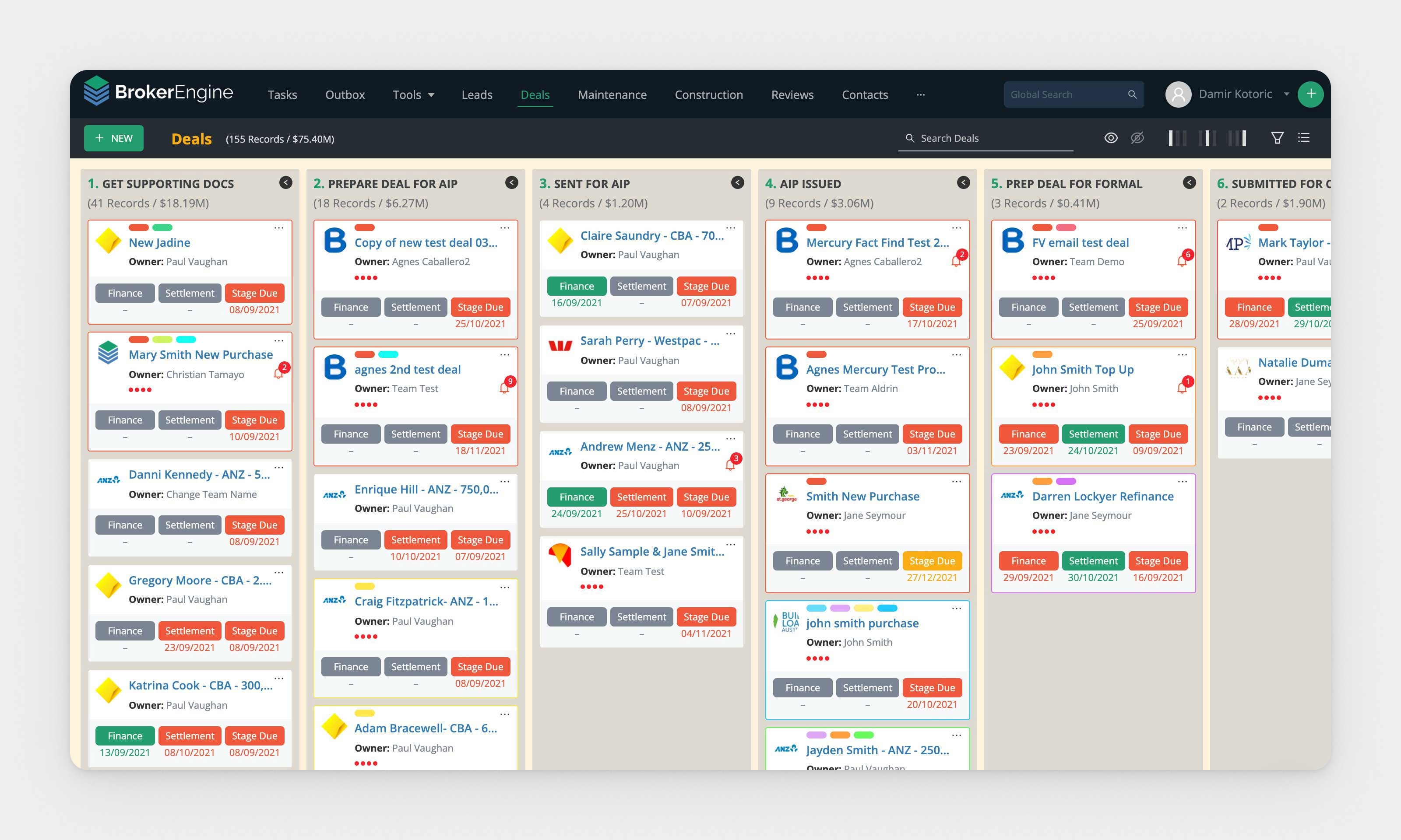
Old: Overview of all mortgage deals that the brokering team is overseeing.
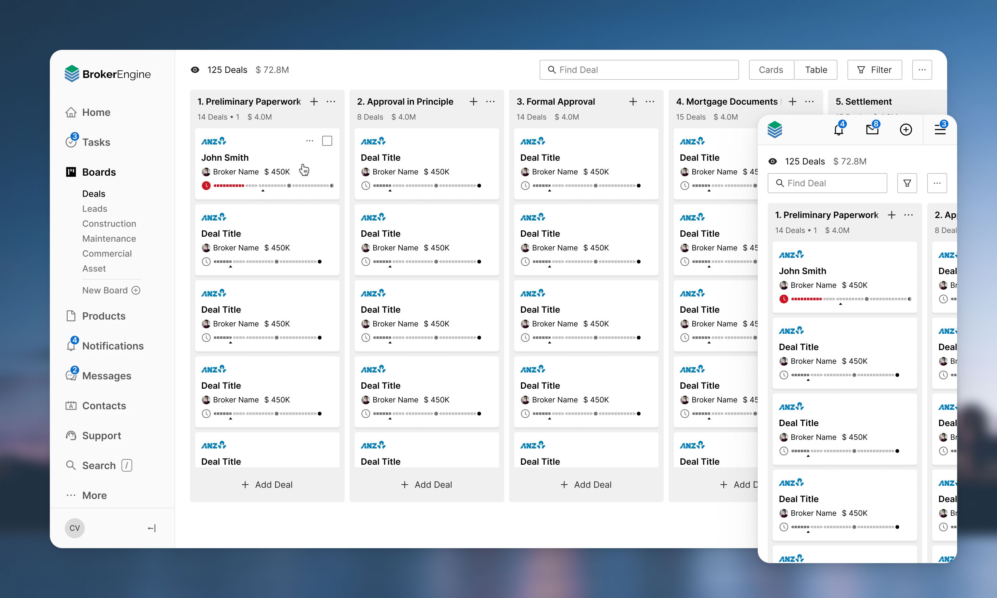
New: Redesigned overview of all mortgage deals that the brokering team is overseeing.
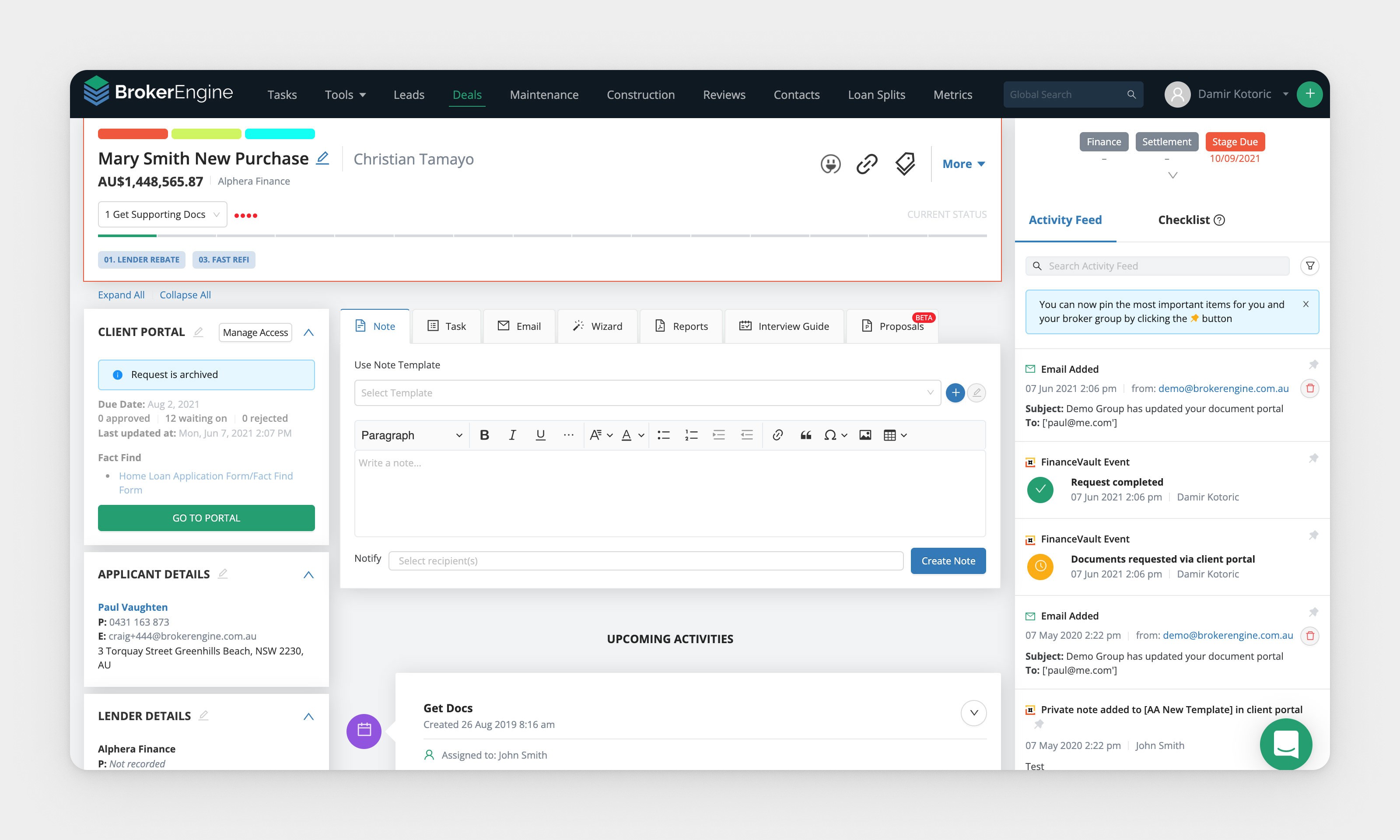
Old: Deal page, showing one particular mortgage application.
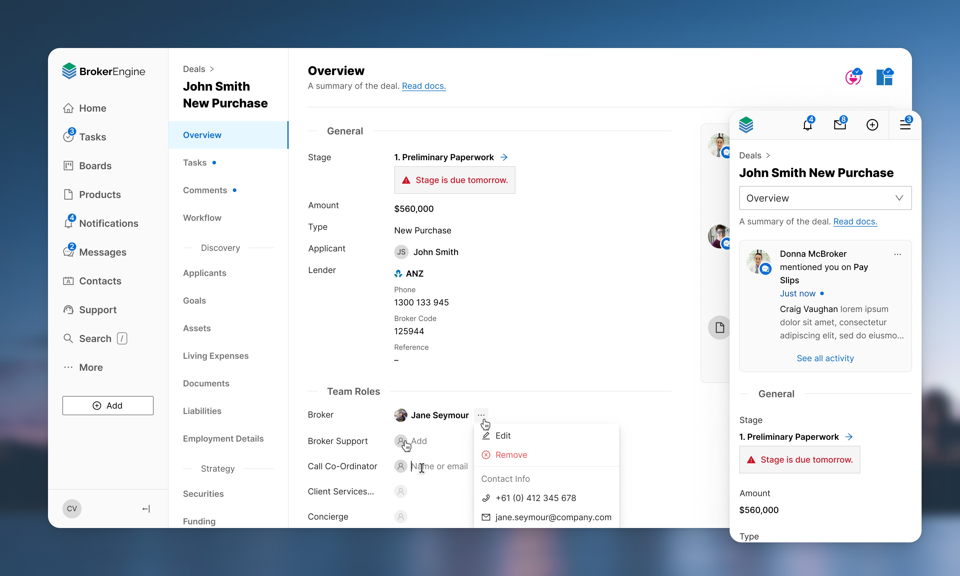
New: Redesigned deal page, showing one particular mortgage application.
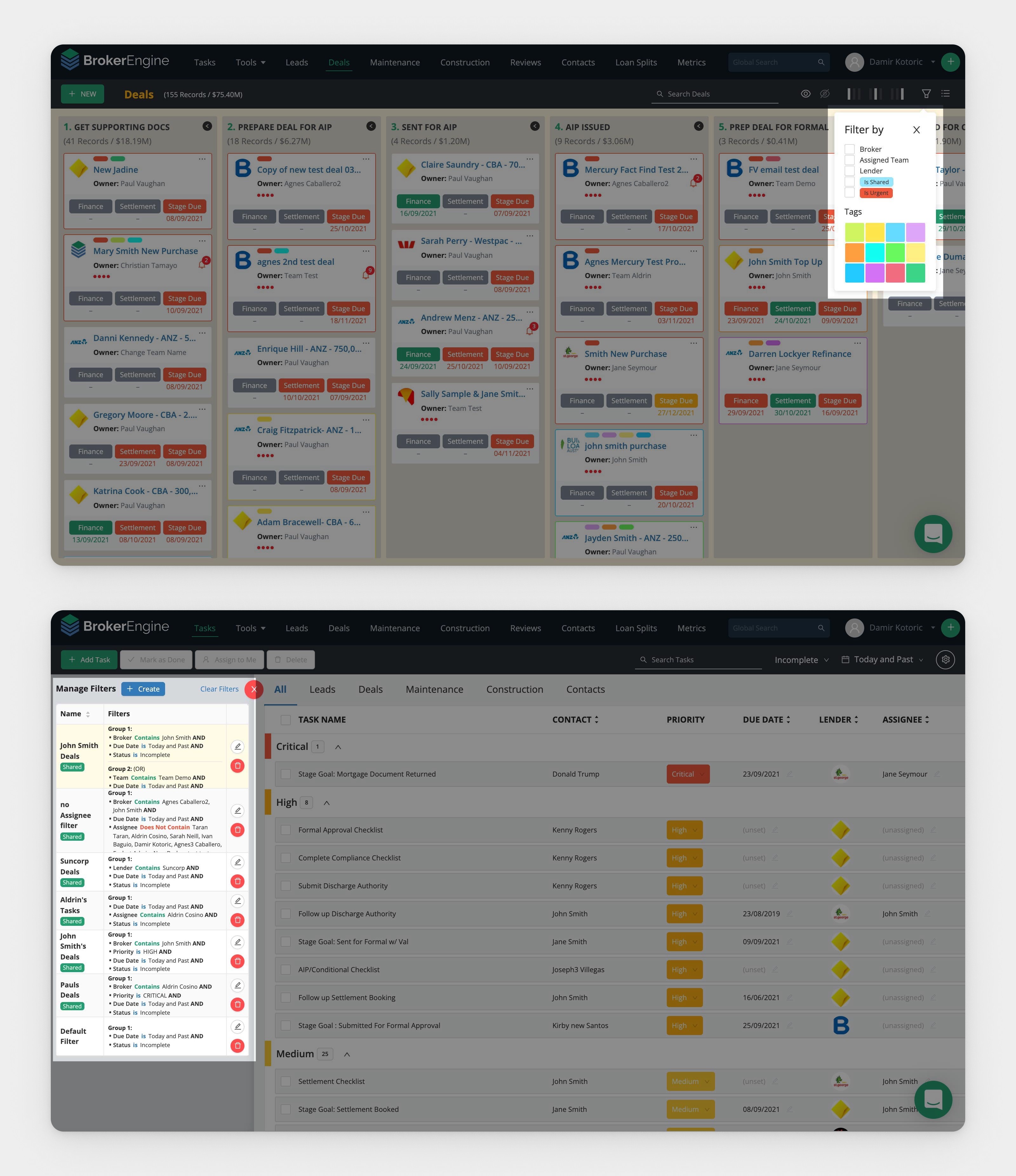
Old: Multiple fragmented filtering systems scattered throughout the app.
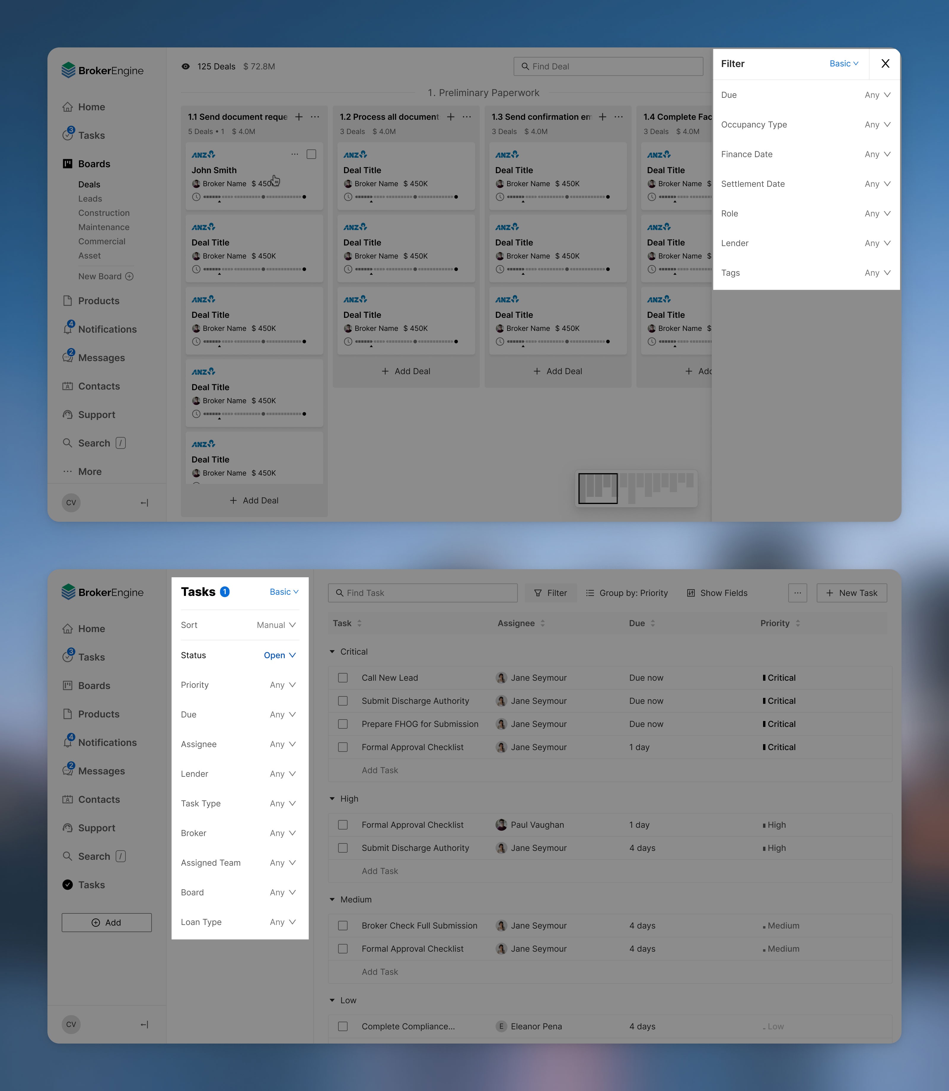
New: One single consistent Filter component that is used consistently throughout the app.
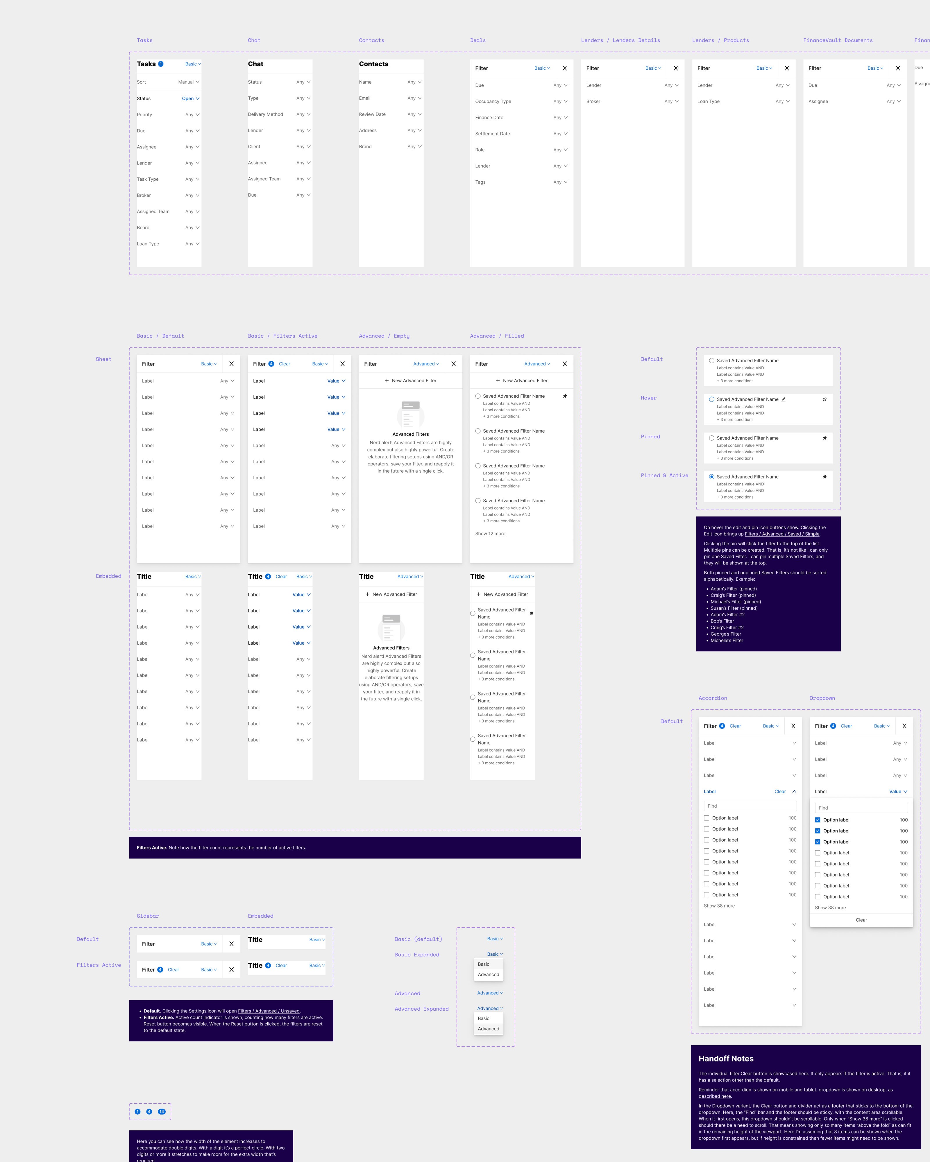
A closer look at the Filter component.

Positive feedback from a happy product manager.
Making the complex simple.
Mortgage brokers are inundated by numbers and calculations. In order to process a single client, a "deal" needs to go through 15-stages before the house keys are handed over to the customer applying for the mortgage. Mortgage brokering can feel like a turbulent bureaucratic roller coaster.
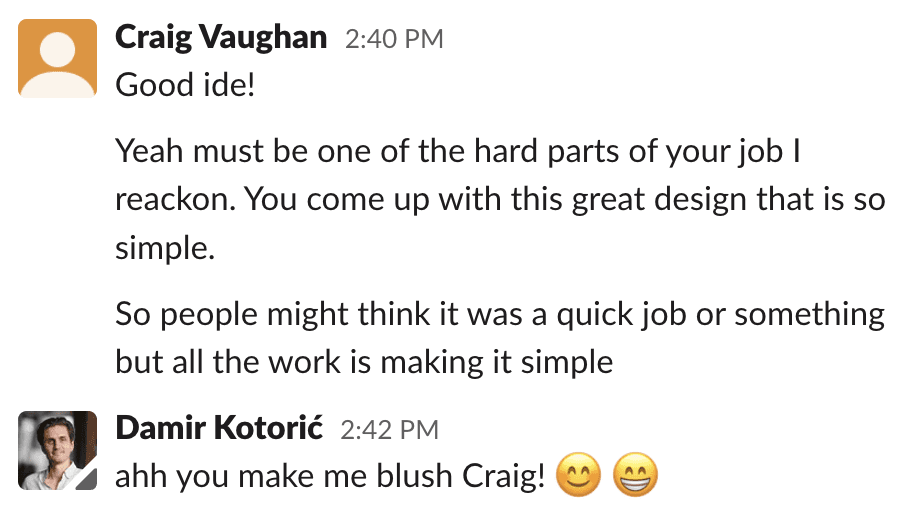
My goal for BrokerEngine was to simplify, simplify, simplify. Not to dumb down, but to elegantly simplify. BrokerEngine should alleviate stress and empower mortgage brokers to navigate this Matrix-like Data Ocean with elegance and ease.
Ant Design
Ant Design was already the design system of choice when I joined the project. I was keen to try out this new design system, made by Alibaba Group. I used Ant for Figma to hit the ground running. I found Ant Design to be a mixed bag.
✅ A comprehensive set of components
✅ Left-to-right and right-to-left variations of components for internationalisation
✅ A comprehensive, though semi-official Figma UI Kit
❌ Mediocre icon set with poor readability of icons, especially on smaller sizes
❌ Uninspiring type system, which I tweaked.
❌ The Figma UI Kit clearly was of mediocre quality at the time when I purchased it, so I had to spend lots of time unnecessarily fixing the components.

In total there are 9 Figma files on the project, each with dozens or hundreds of mockups and components. All inherit from the Ant Design file, and a custom UI Library file.
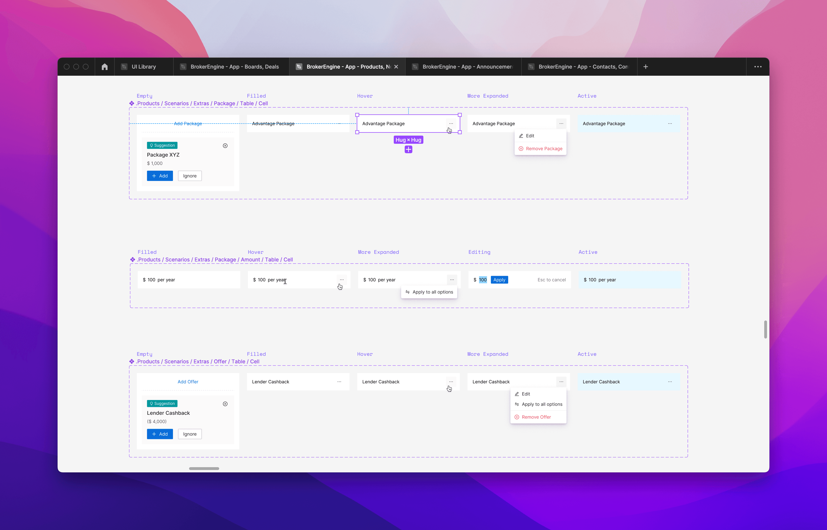
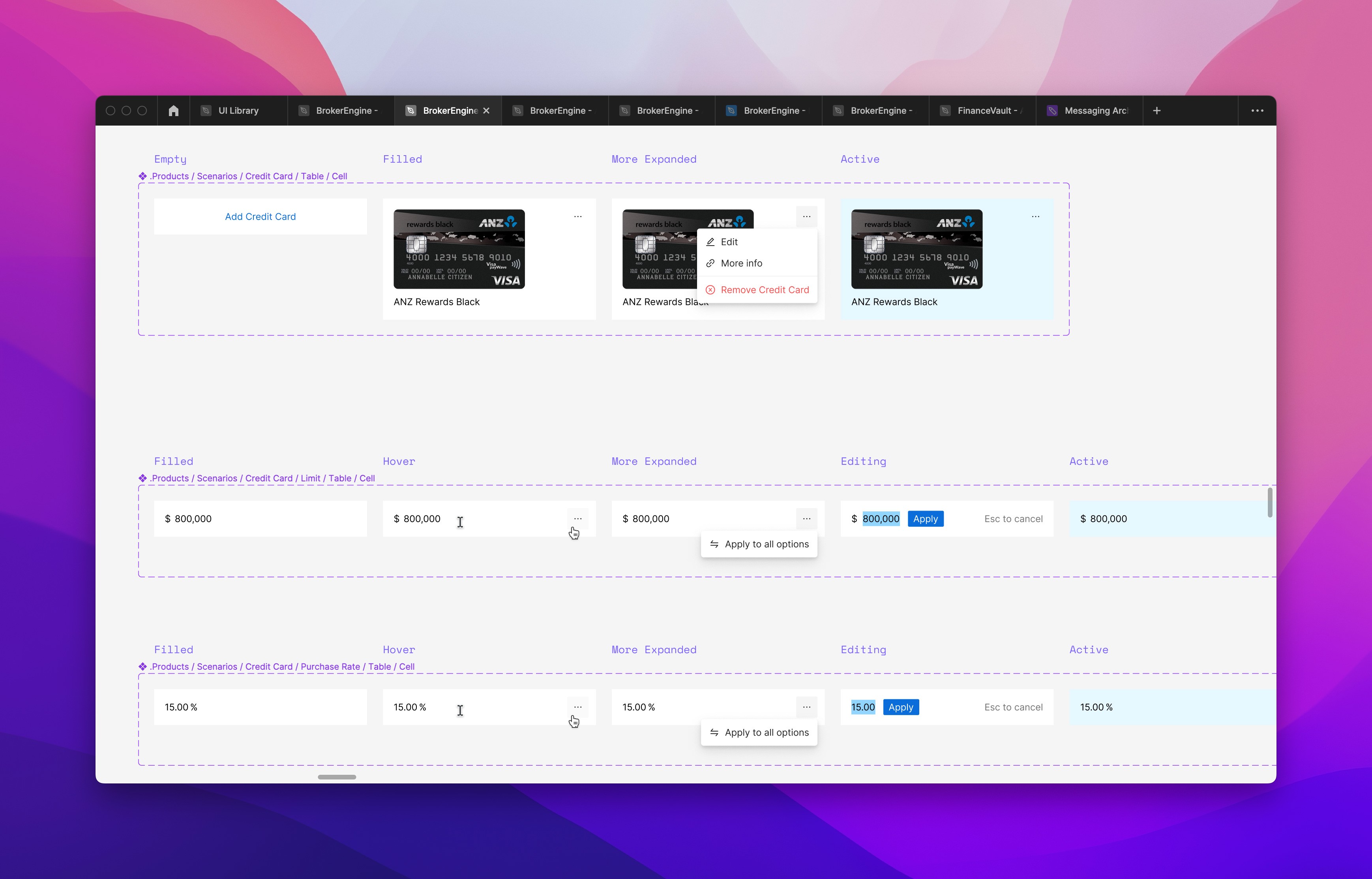
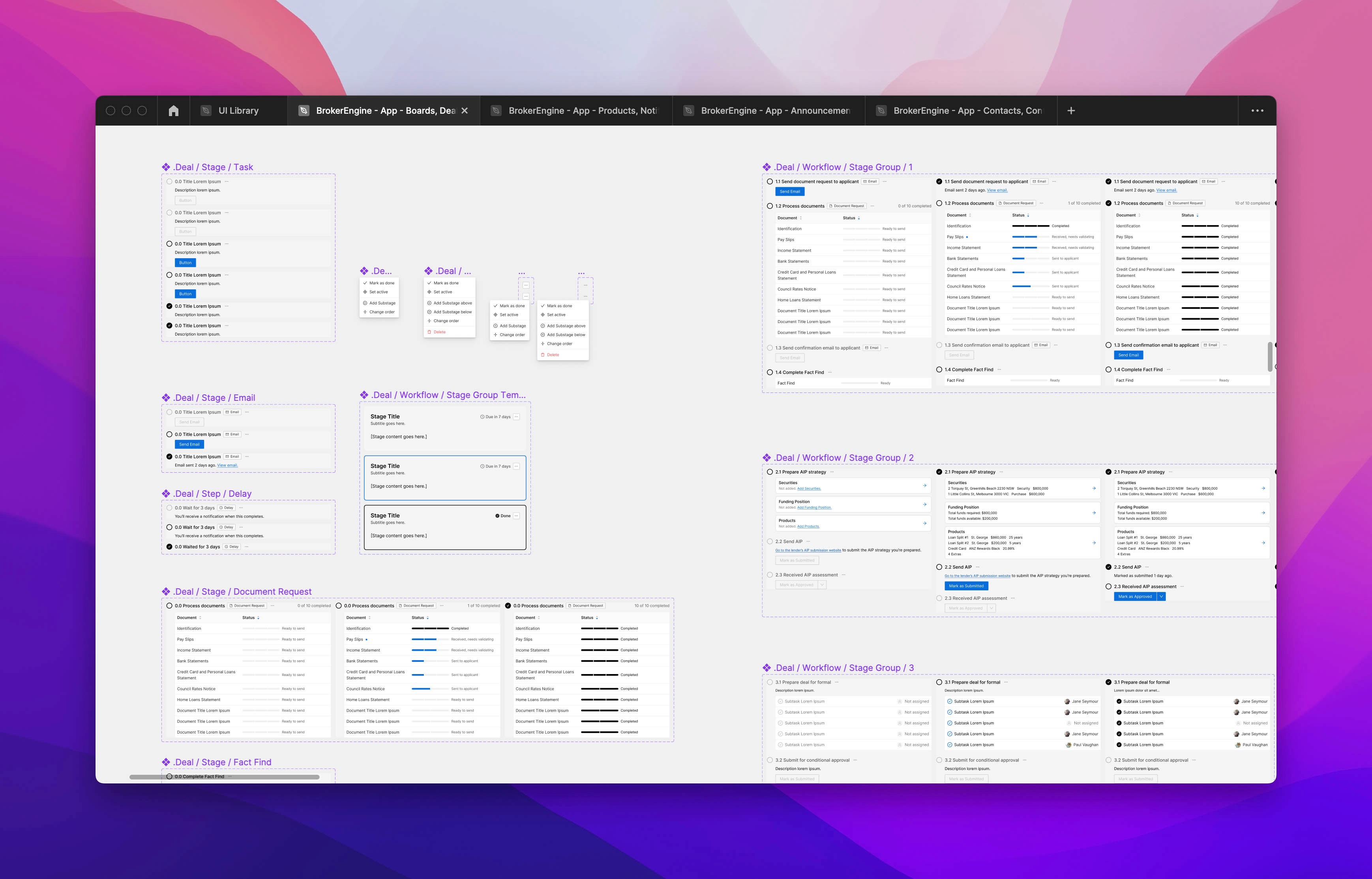
Designing component variables laying out all possible states so that there's no guesswork for developers when they start coding.
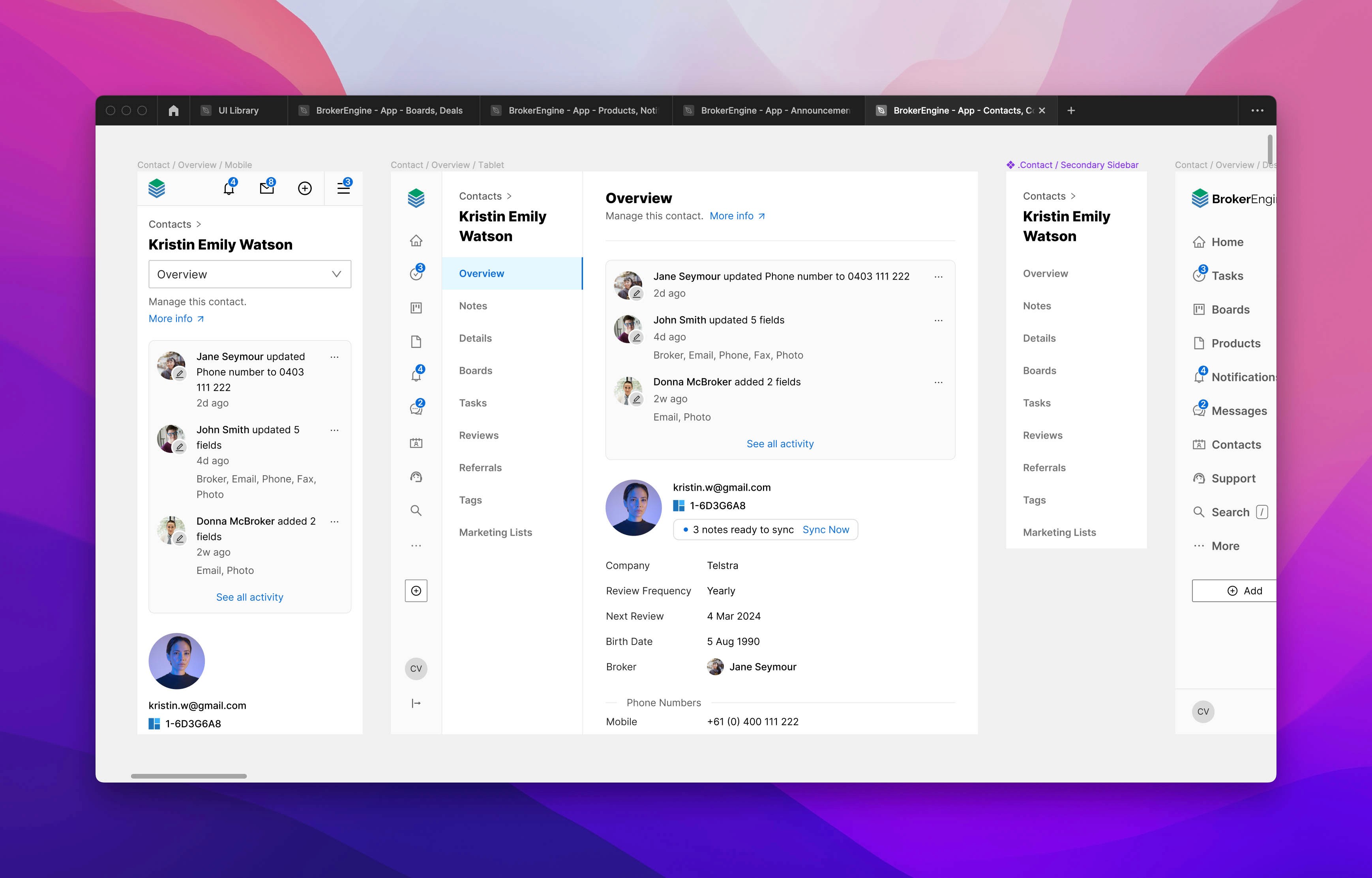
Responsive mockups for the contact page.
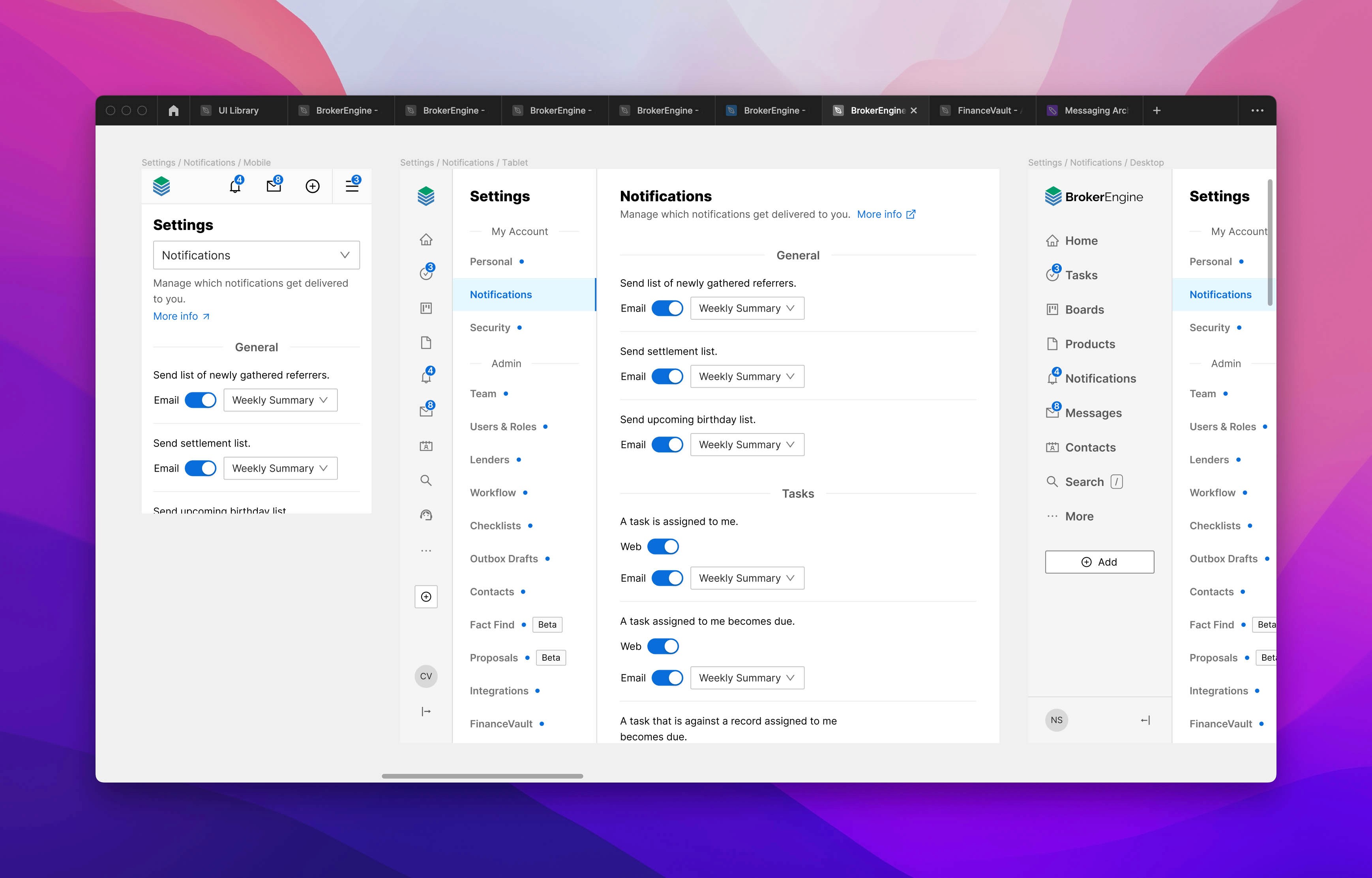
Allowing users to tweak their notification settings.
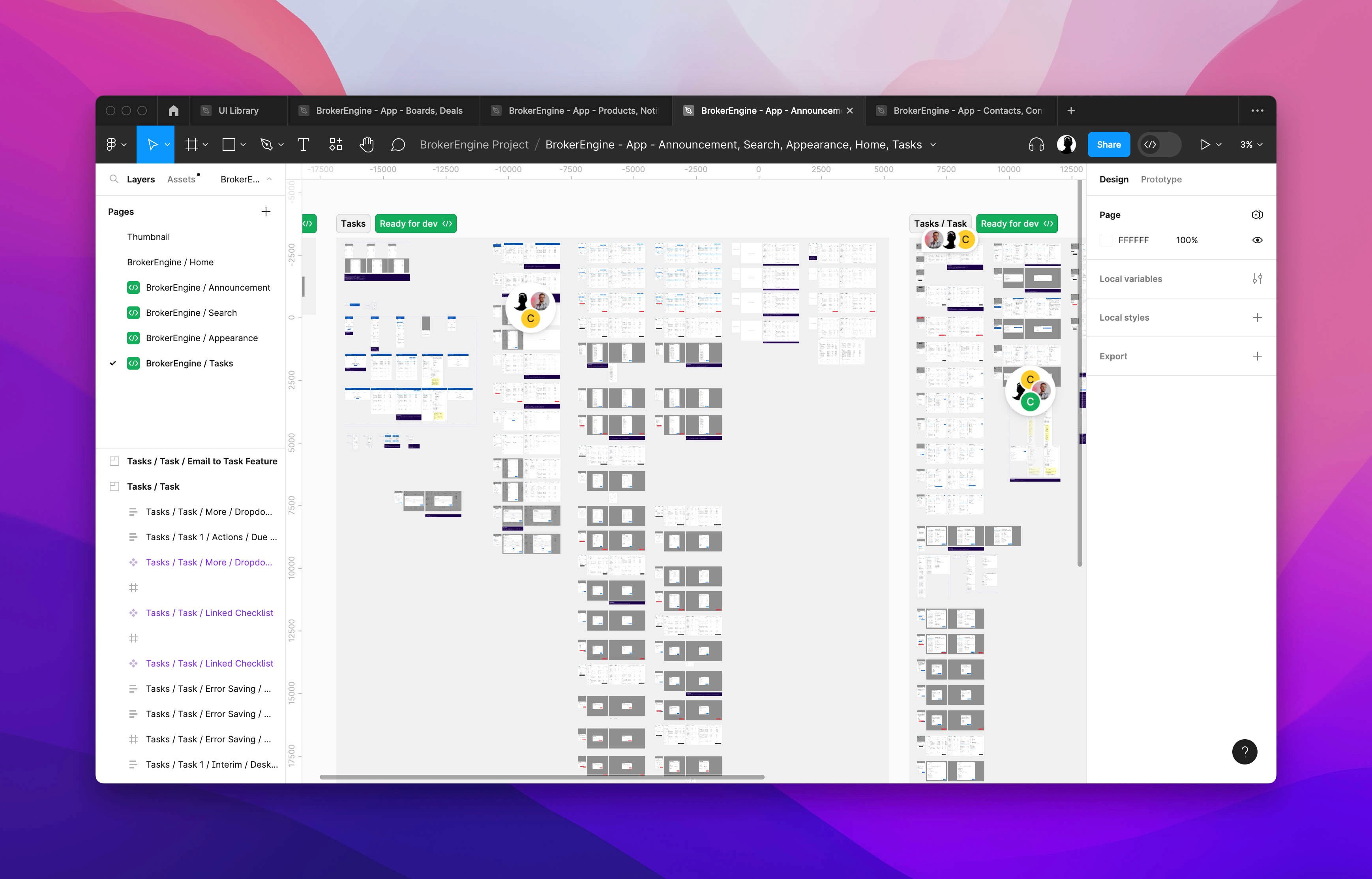
There are hundreds of mockups — so many that I had to split the one Figma file into 9 separate files. To be expected on a project lasting 3 years.
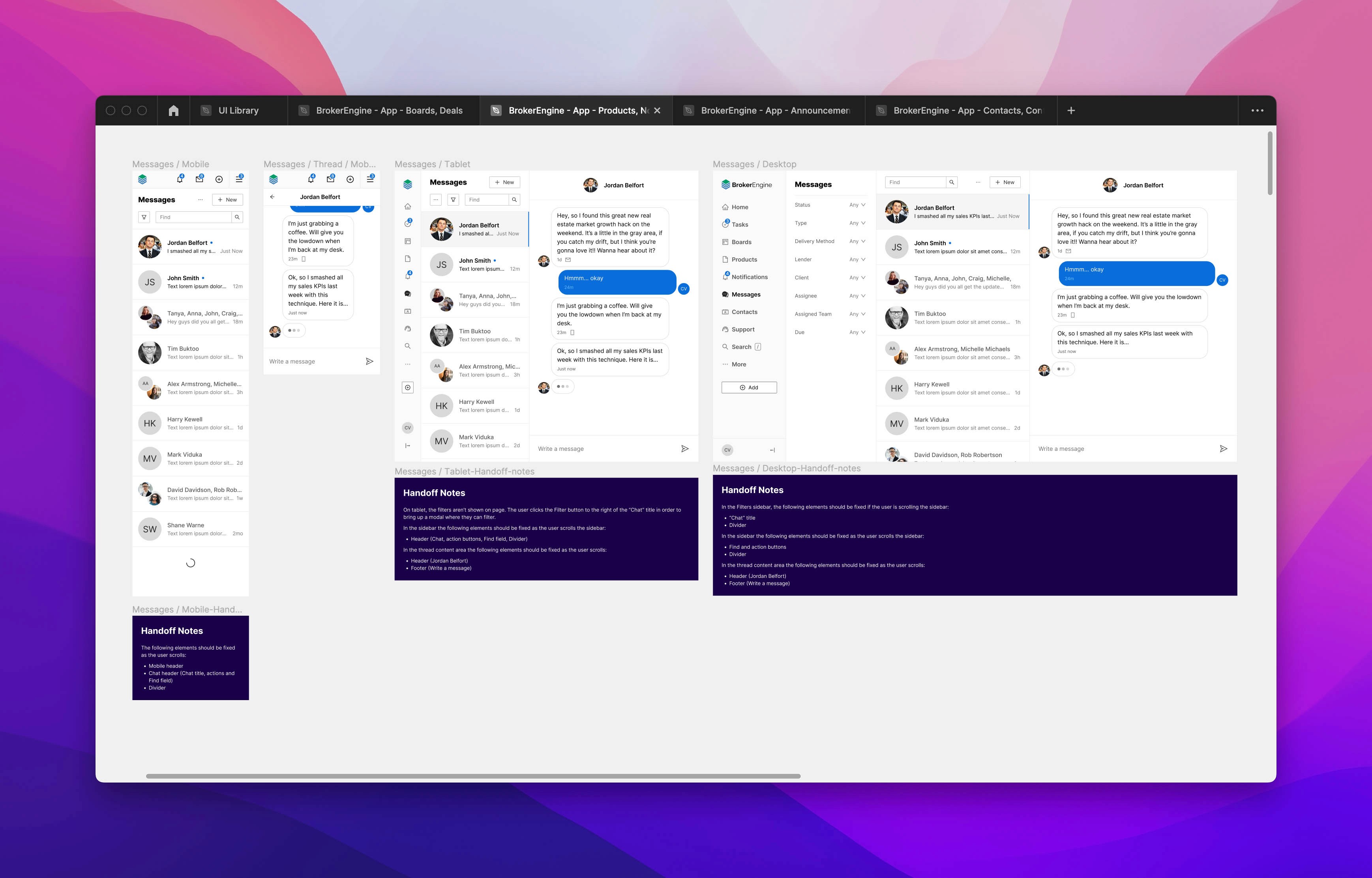
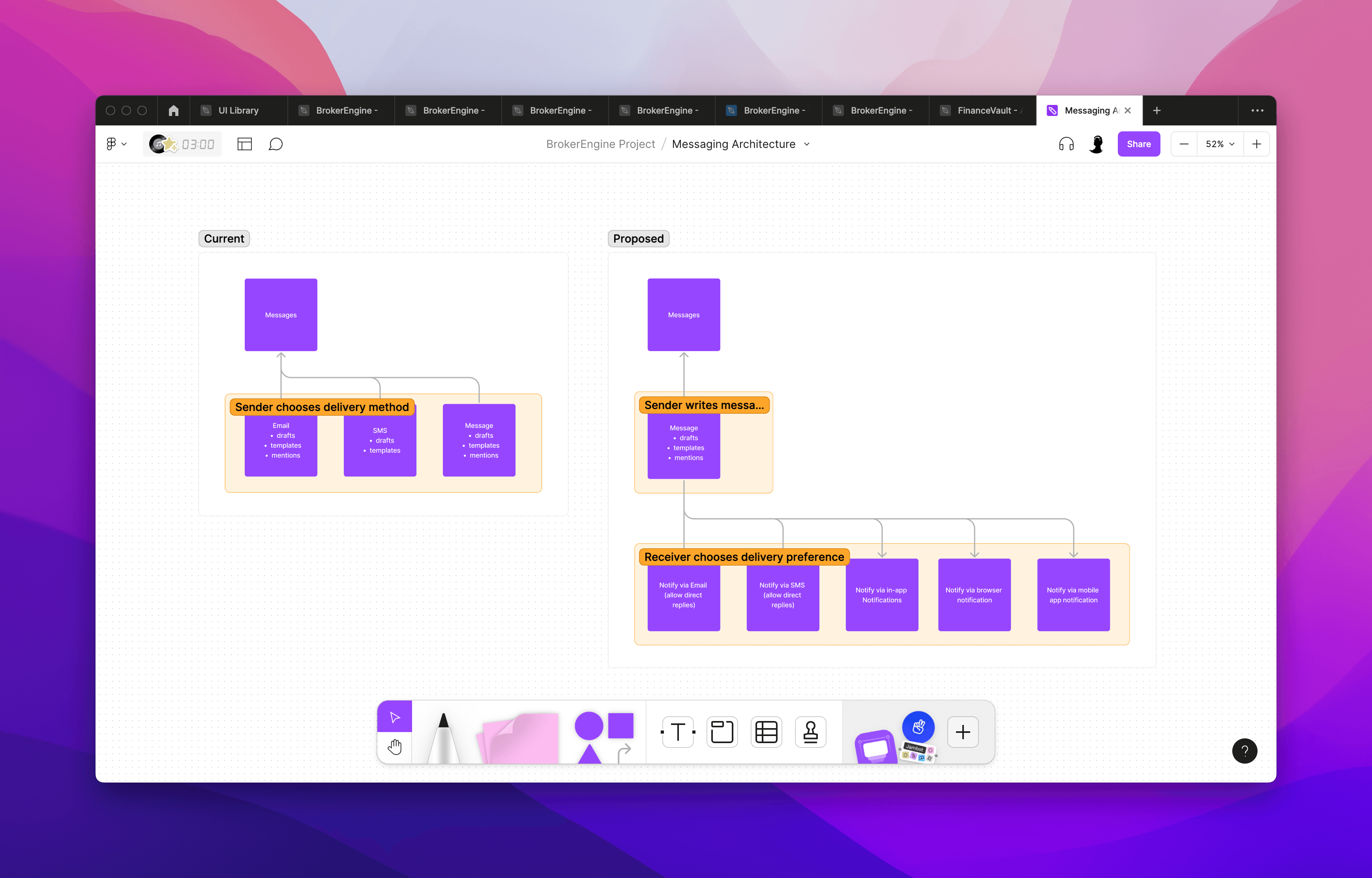
A new messaging feature that's built on a revamped messaging architecture that I suggested.
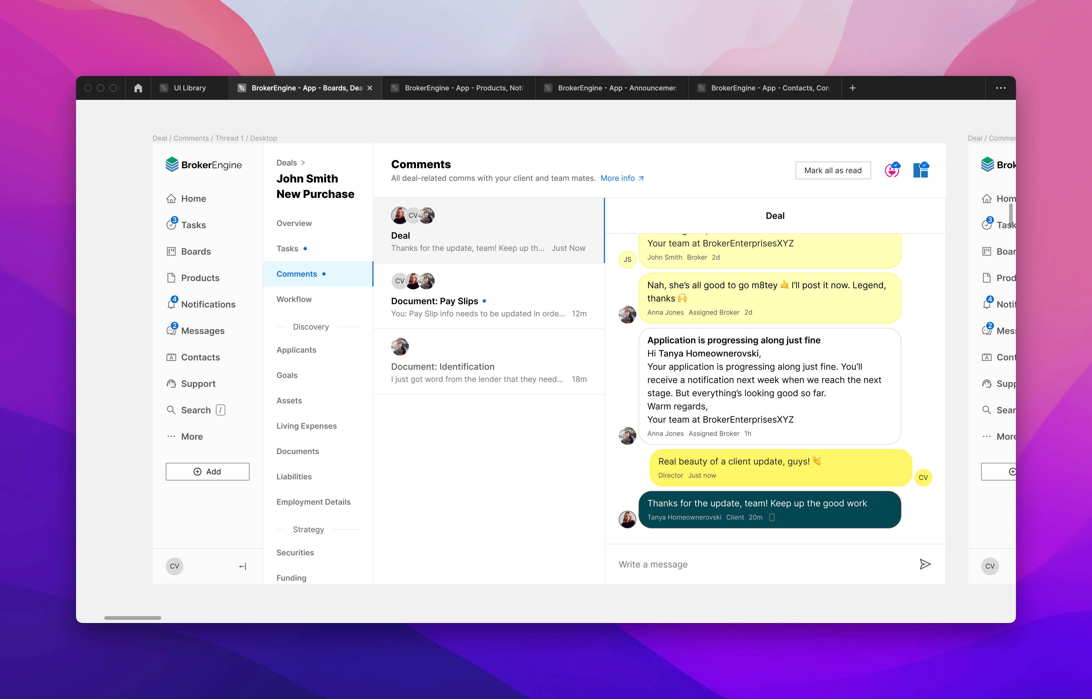
Comments power the communication between brokers and clients.
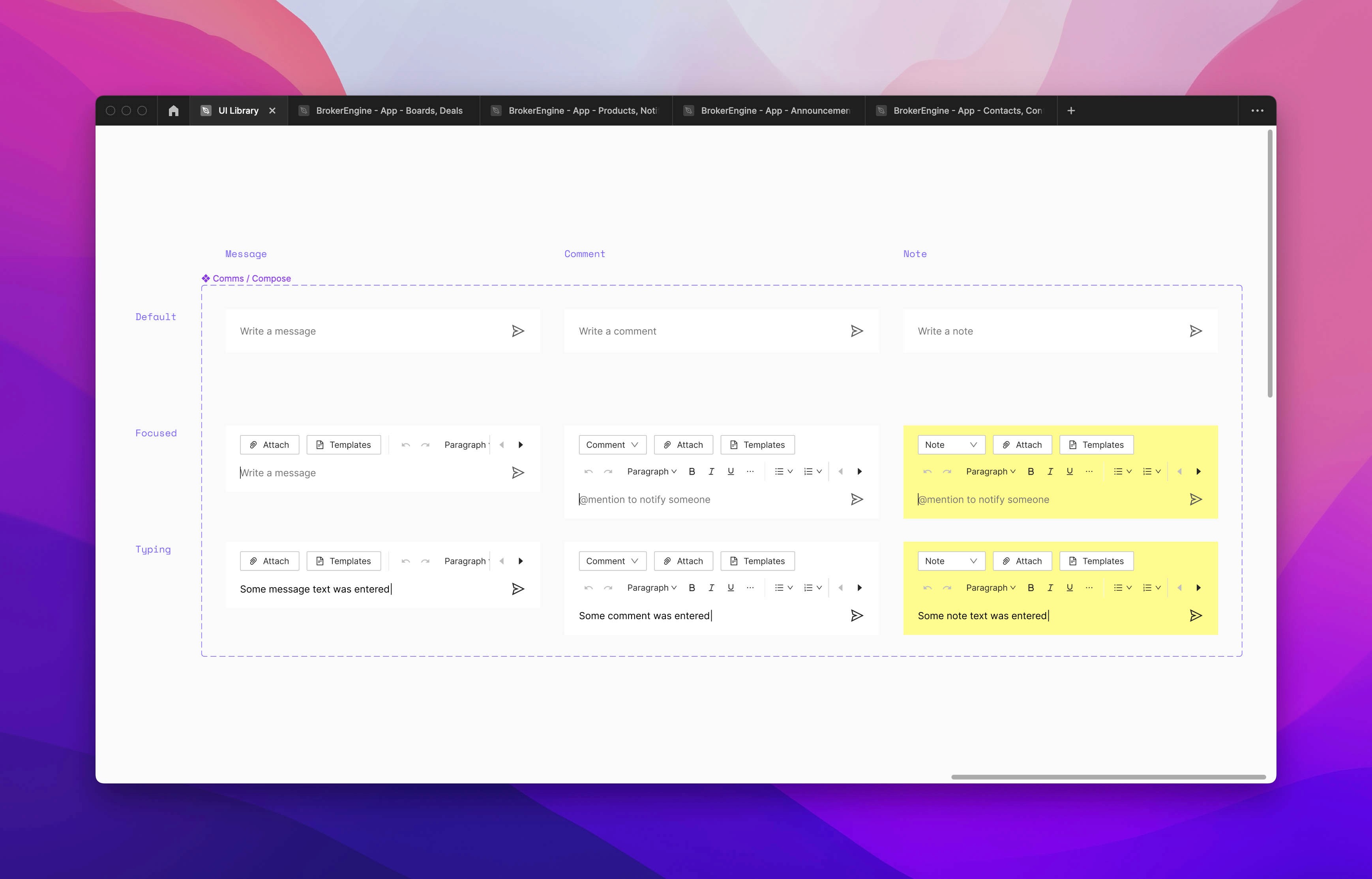
Looking into the Compose component, one of hundreds of custom components designed for BrokerEngine.
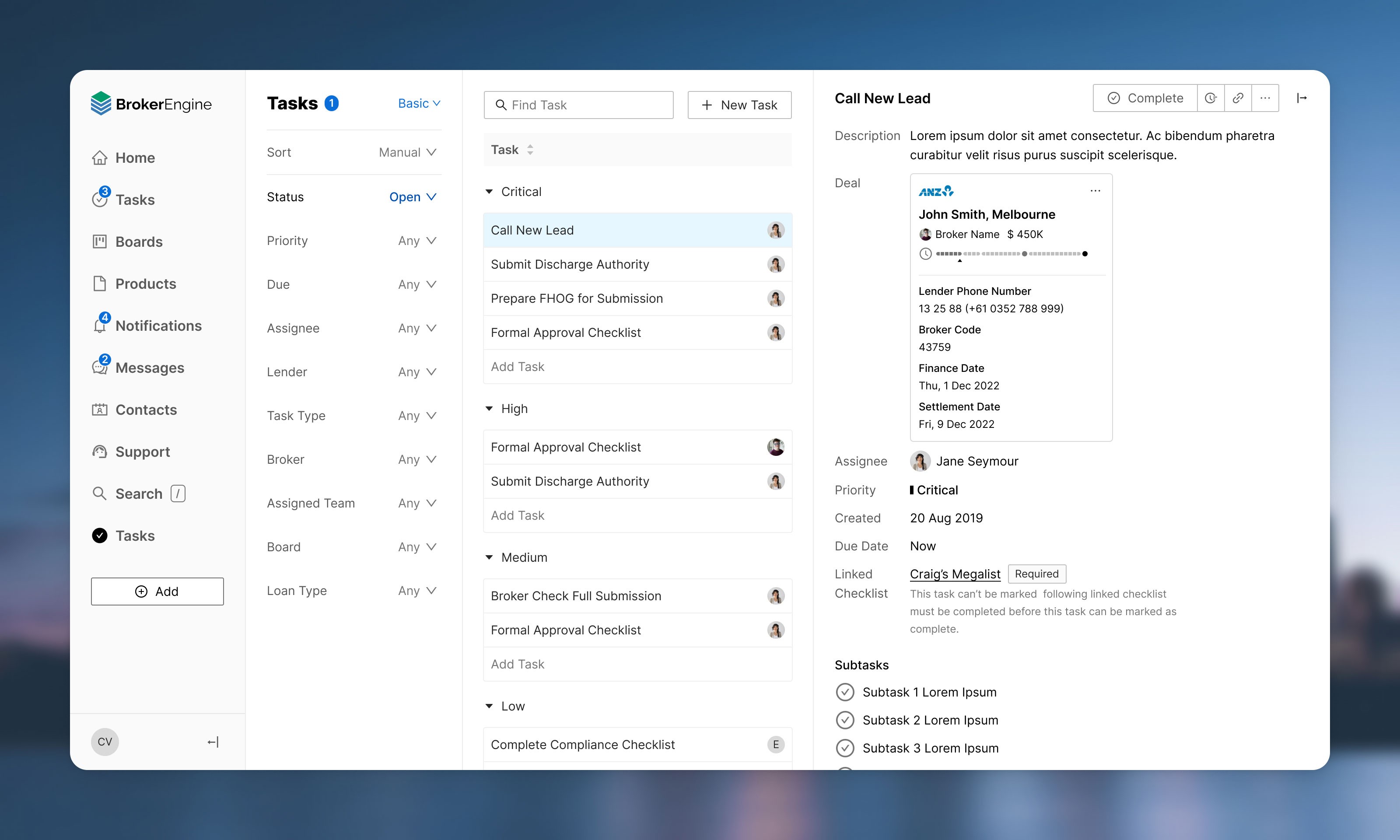
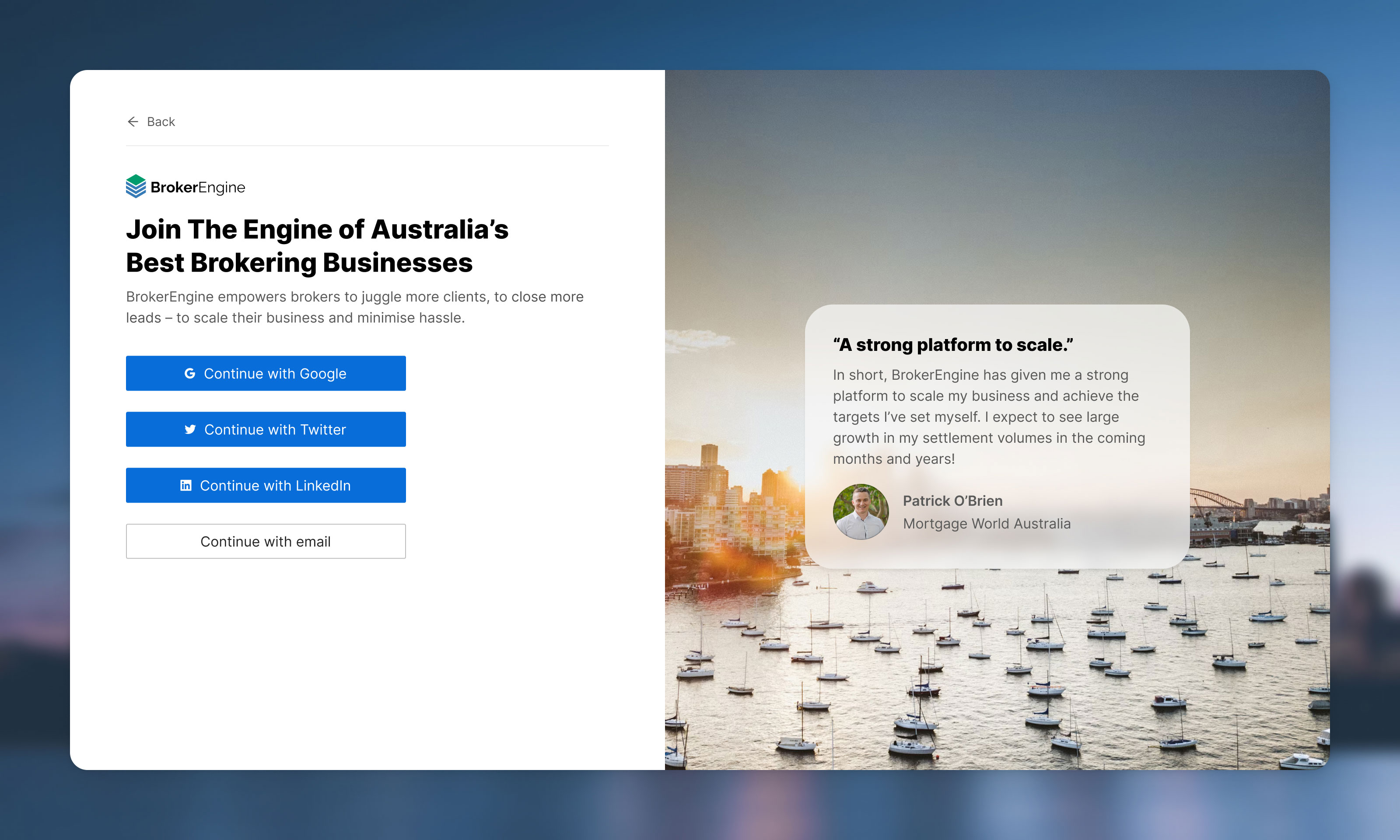
BrokerEngine was my longest freelancing engagement lasting 3 years. Thank you Craig and team! Special thanks to my mentee Edmir Fazlović for his excellent design and QA work. I'll be keenly following your progress, and wish you all lots of success in your journey ahead. And remember to err on the side of simplicity 😉
Explore all work
