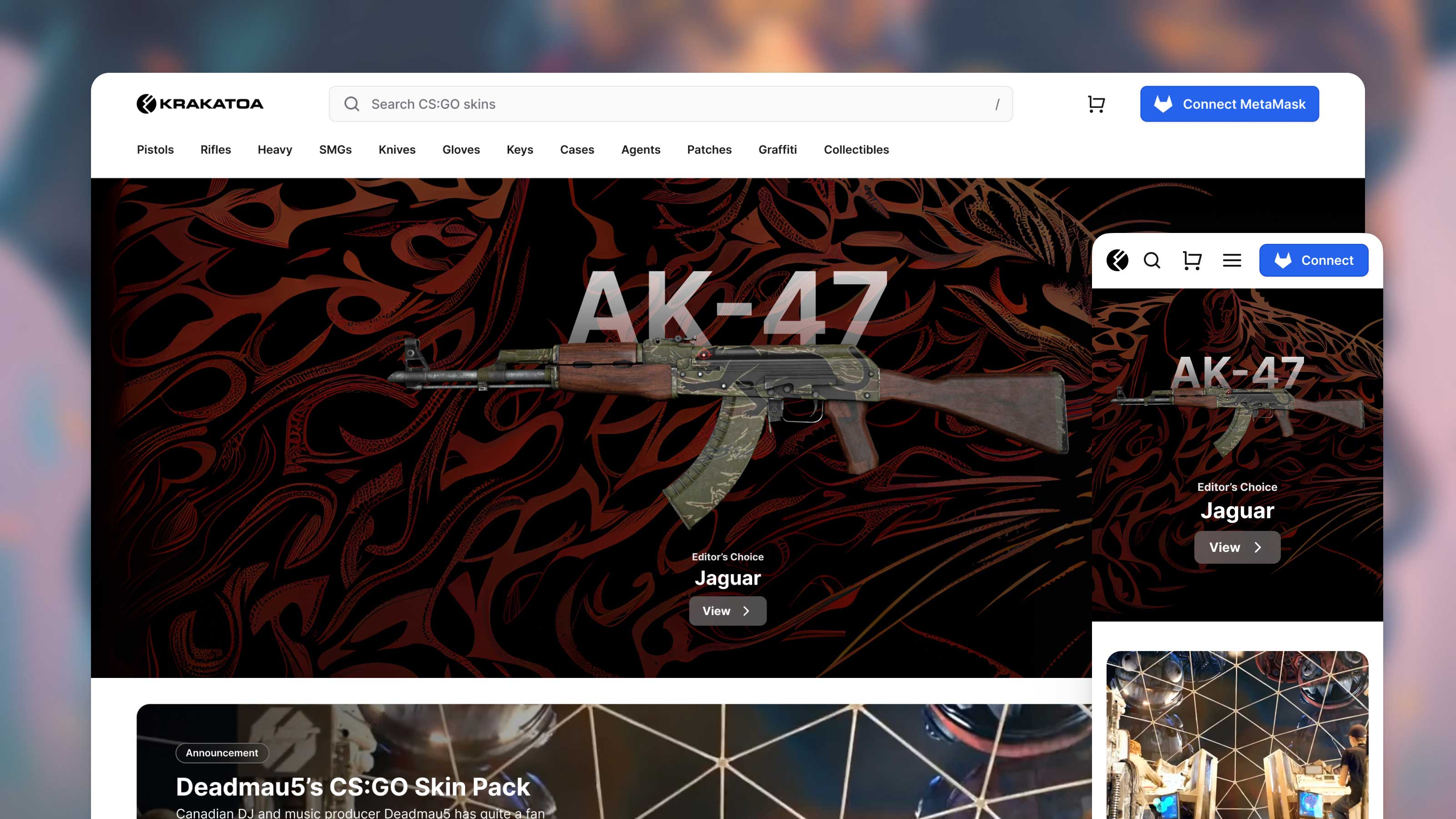
Capitalising on the CS:GO online gaming craze, Krakatoa fills a specific need in a fledgling eCommerce market, allowing players to trade weapon skins and artwork with each other directly using crypto. Featuring a 5-breakpoint responsive design, web3 payment flow via Metamask, and AI-generated artwork, this project took two months to pixel-perfect, and can now be accessed on krakatoa.gg.
Putting the mega in menus.
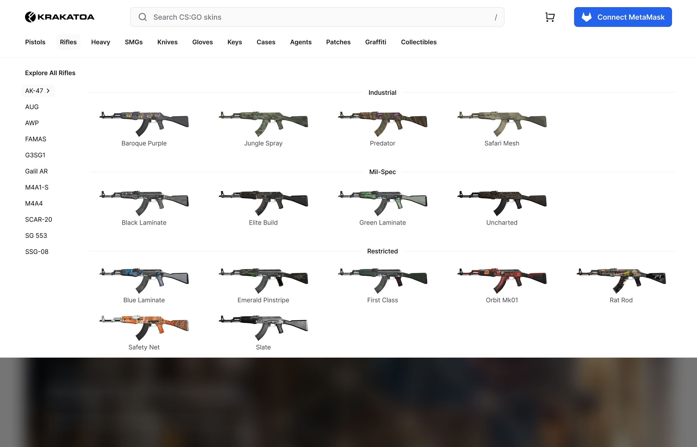
Hovering over the navigation reveals an Apple.com-inspired mega menu, putting the entire product taxonomy front-and-center in a way that's visually engaging, yet unobtrusive.
Faceted search to boot.
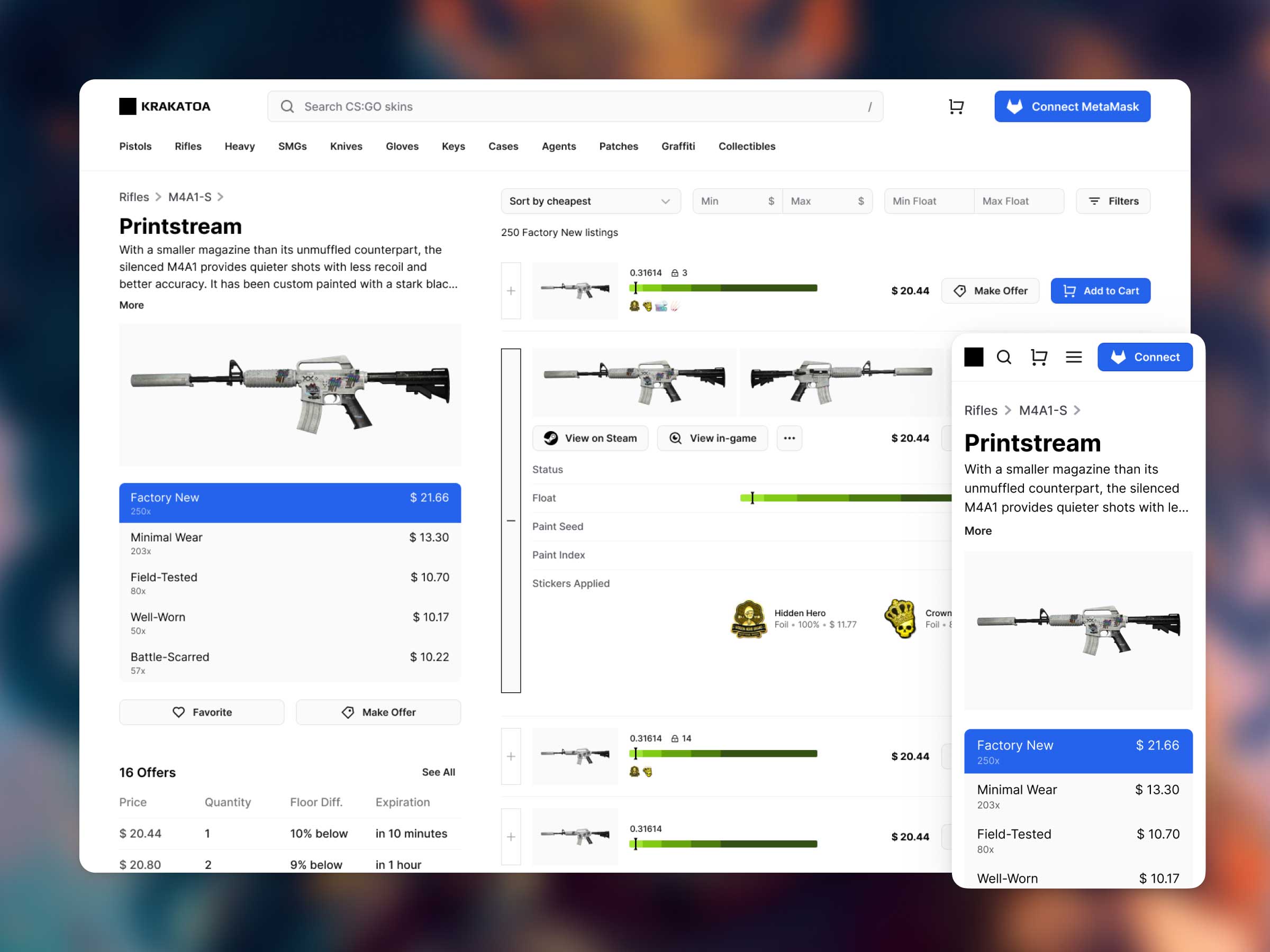
Each marketplace item has attributes like status, float value, paint seed, paint index and a list of stickers that are applied to it. Gamers can filter by these attributes to find their desired item quickly.
Unobtrusive yet immersive full-viewport gallery.
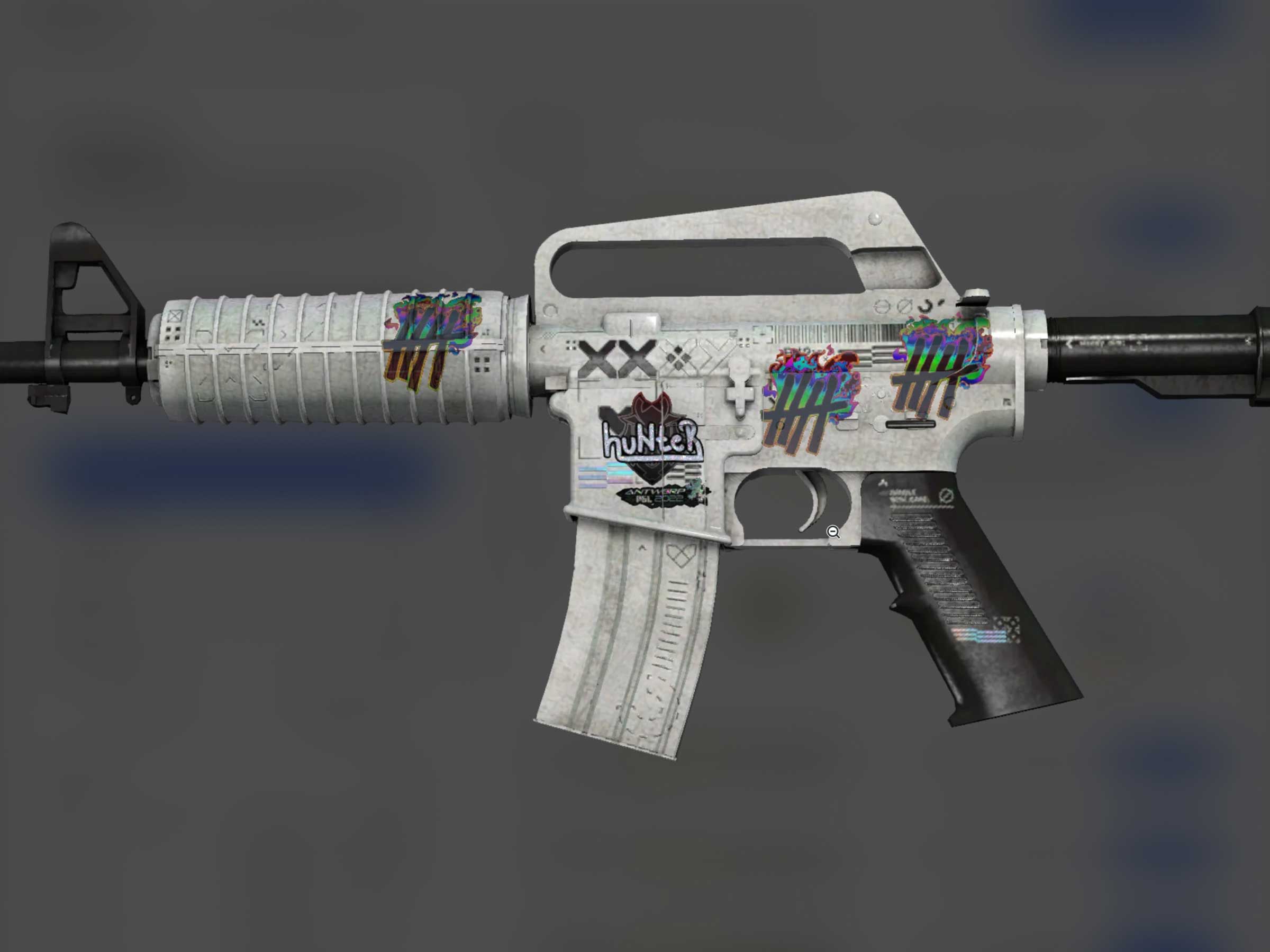
In one click, gamers get an immersive full-screen preview so they can see in detail the skin they're buying. Then it's simply one-click to continue where they left off.
Web 3 shopping cart.
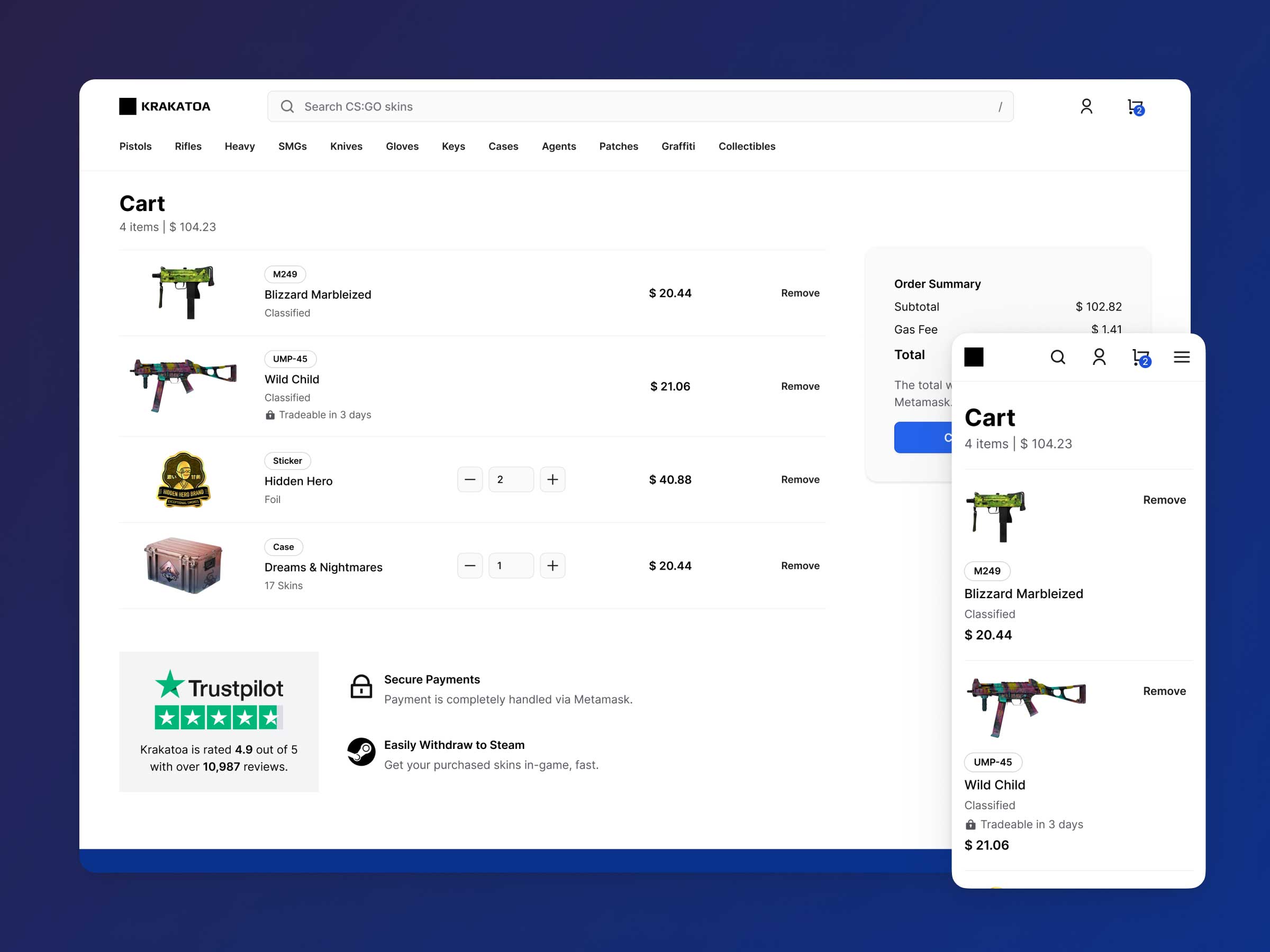
The web3 cart works similar to any eCommerce cart, but with added information breaking down the subtotal and gas fee. Like any good conversion-optimised eCommerce site, the Trustpilot social proof and accompanying points are deliberately placed there to "tip the user over the fence" when it comes to making the purchase. Metamask takes the flow from here to complete the purchase.
Powered by Frames X.
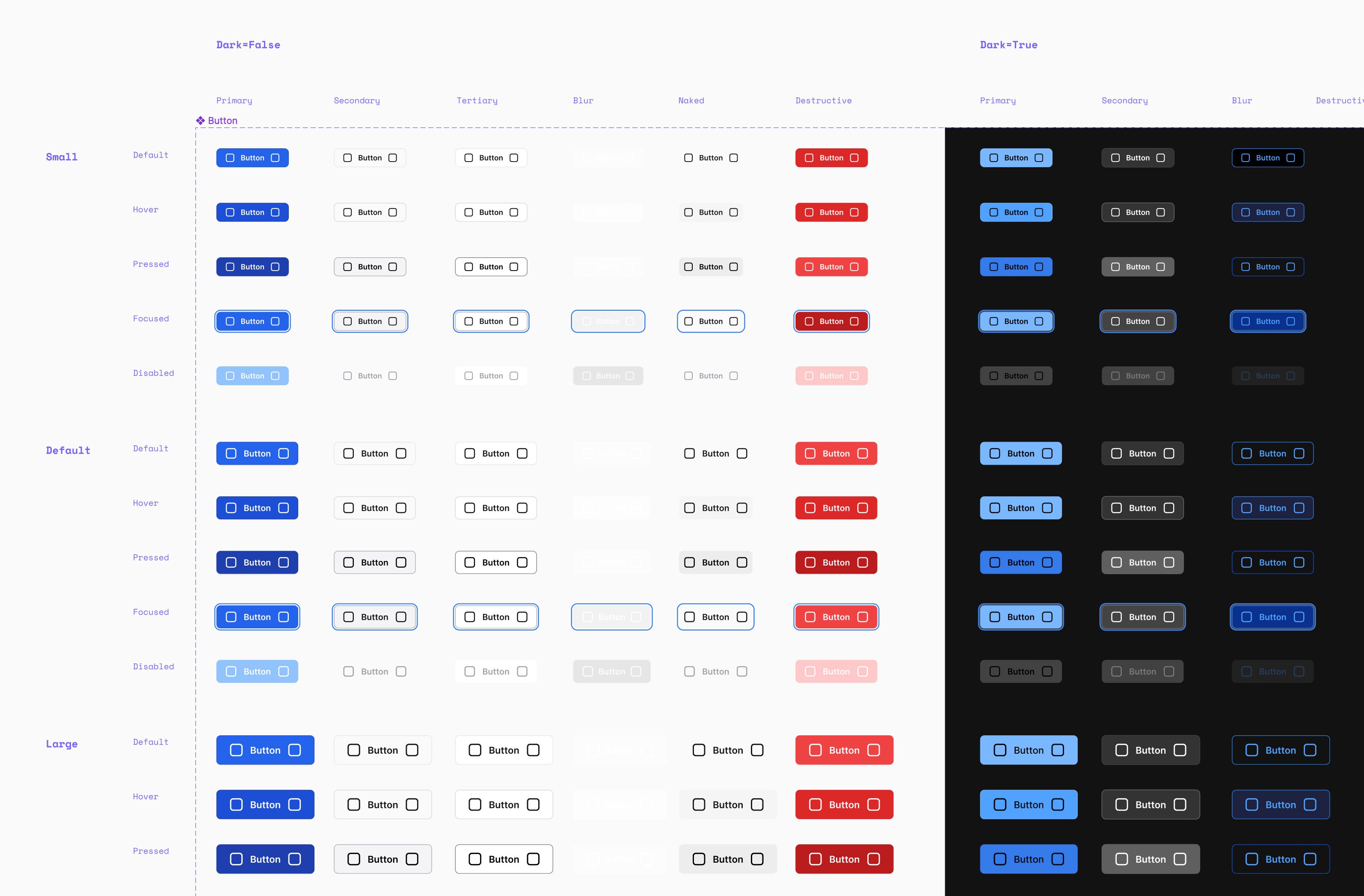
I picked Frames X as the UI Library of choice, and customised it to the typography and colours of the new Krakatoa brand. Customising a pre-made UI Library is the faster way to an MVP for startups, so that's usually my go-to strategy.
Metadata is no joke.
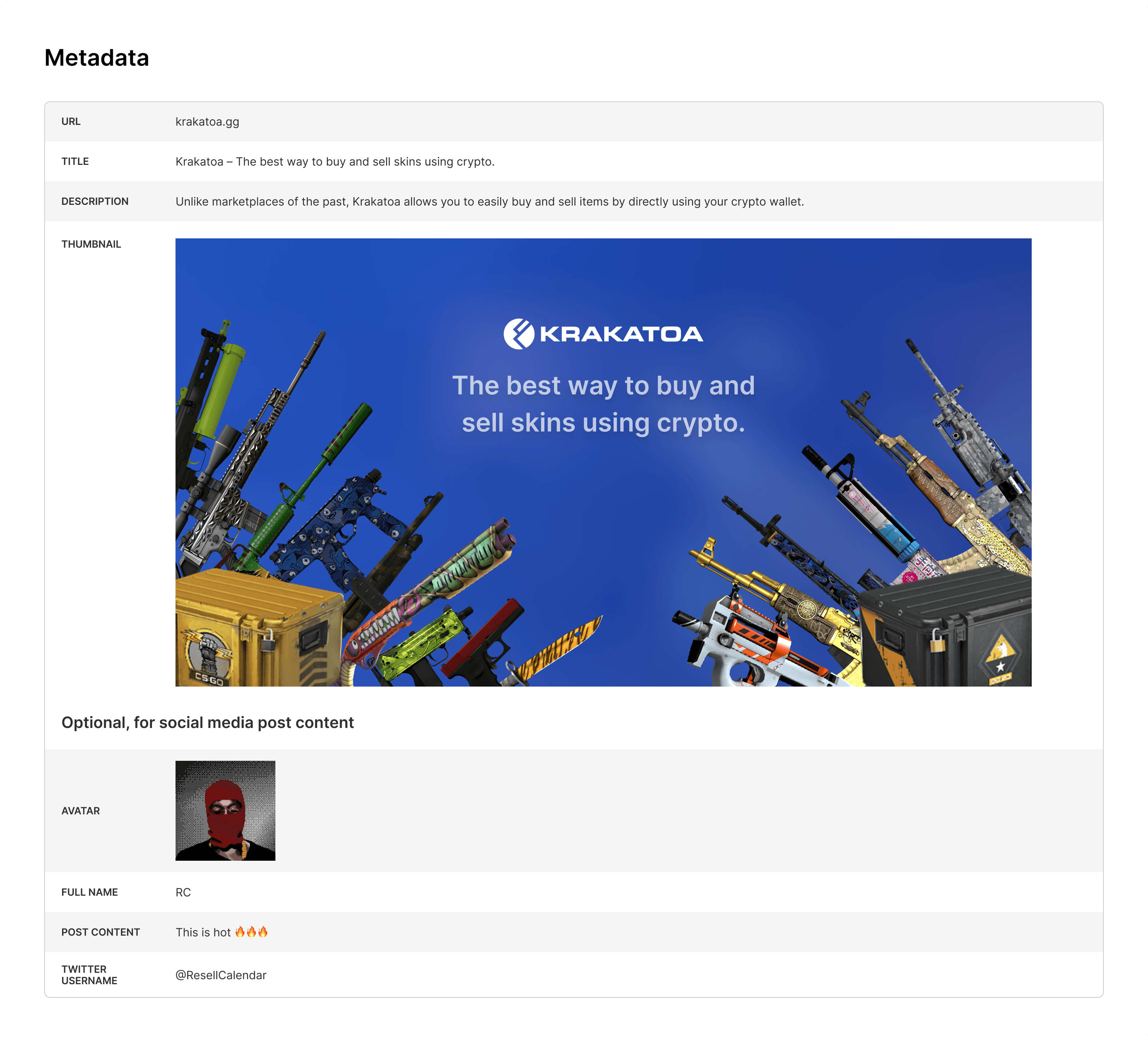
Optimised for social media sharing. Often, I see designers overlook this critical piece of the overall UX puzzle. In Krakatoa, I specified the metadata along with each page mockup.
Thoroughly documented.
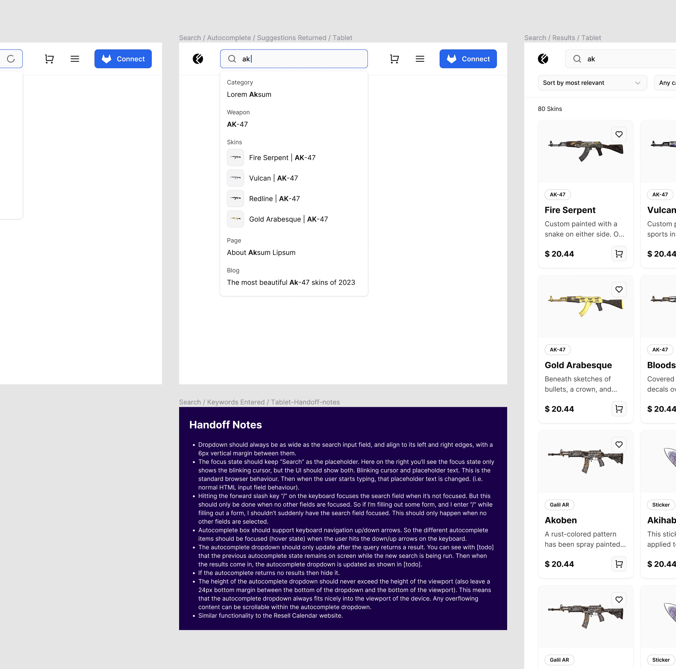
My Figma file is full of these handoff notes, laying out the minutia of the interaction details, and reducing back-and-forth between me and Sapient Pro, the development team who obsessed over the details of the UI design with me. This reduced time spent on quality analysis, where my mentee Edmir Fazlović, took the helm to see my mockups through to code, while I tackled mapping out the remaining UX flow.
Designed for 5 breakpoints.
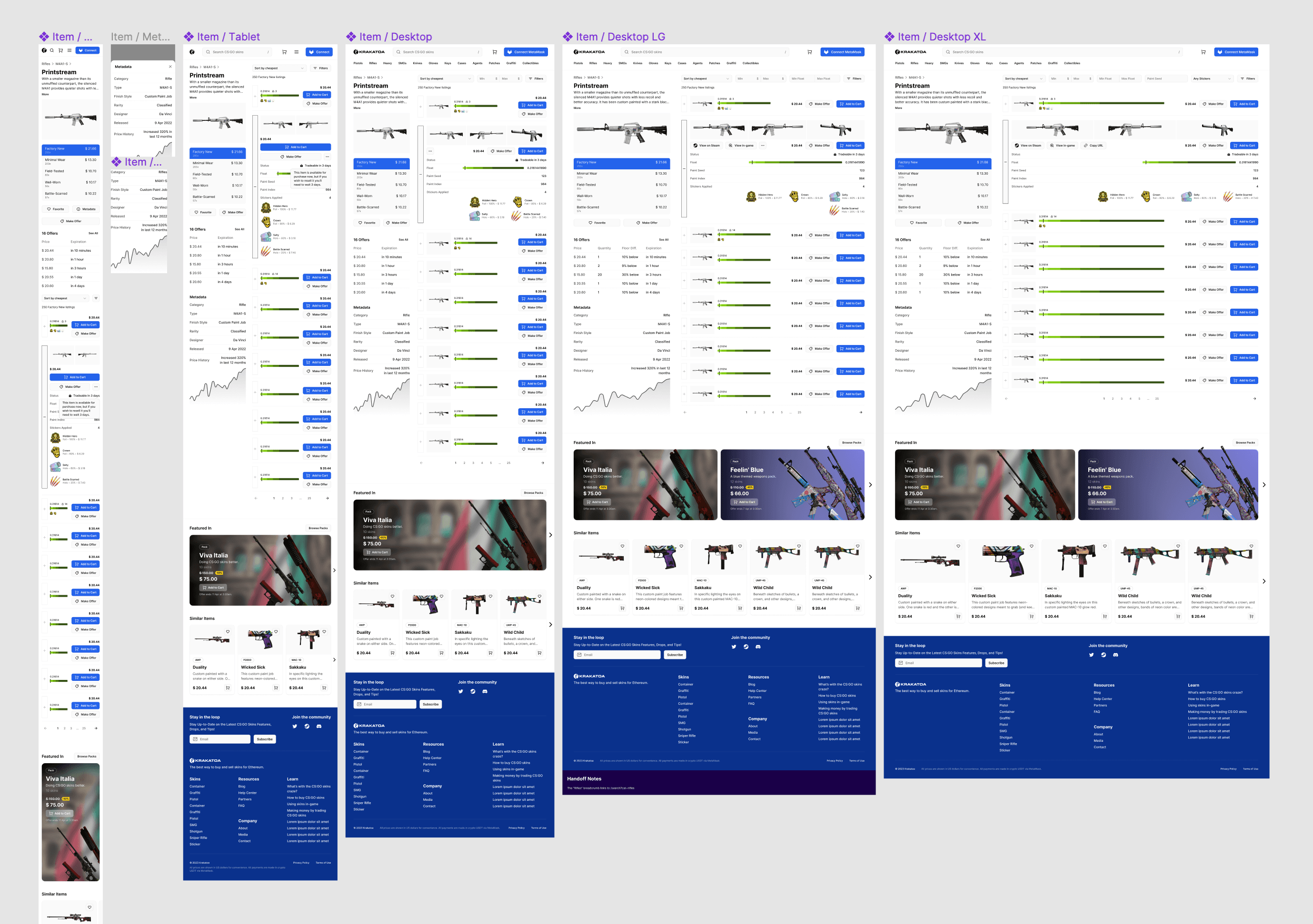
Everything from the smallest of 320px phones to the 1920px wide desktop monitors, leaving little-to-no guesswork for developers implementing the mockups.
The 404s and 503s.
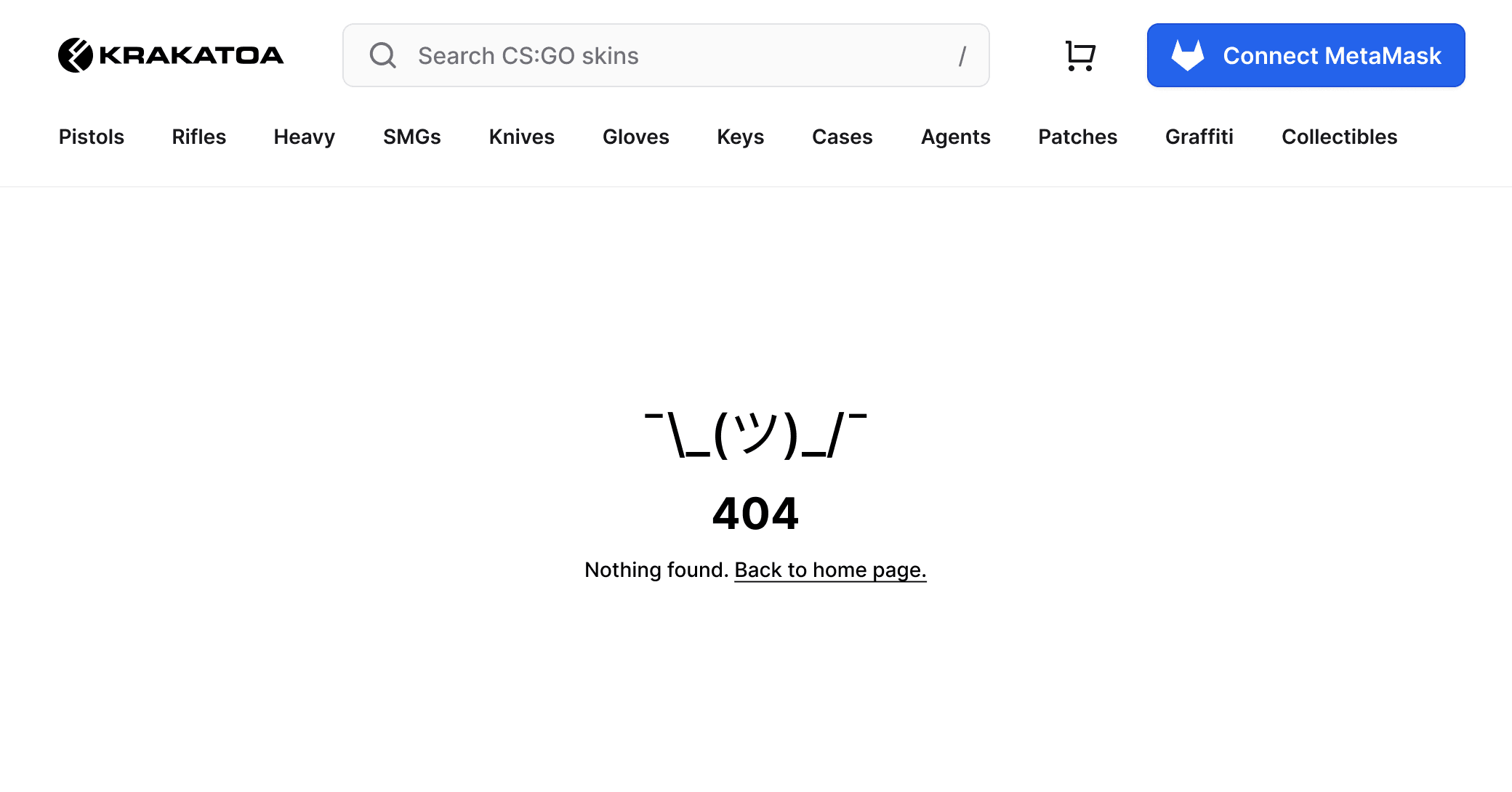
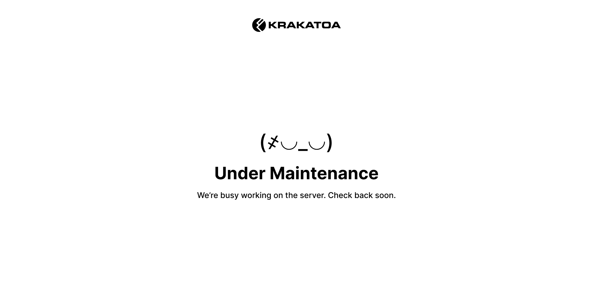
A touch of ASCII art gives personality to the nooks and crannies of the site, without wasting needless time and adding useless scope with overly elaborate error pages.
A dashboard for buyers and sellers.
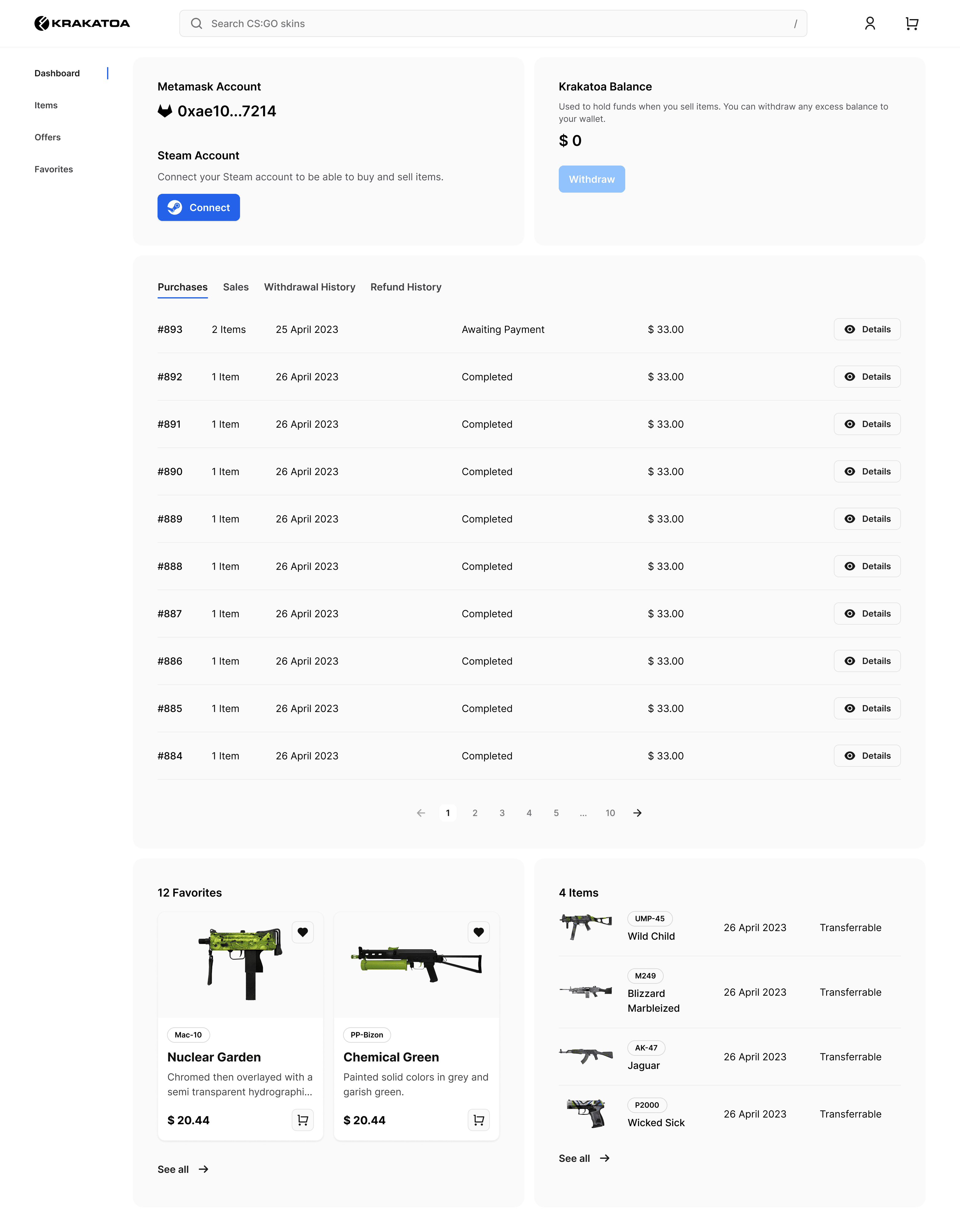
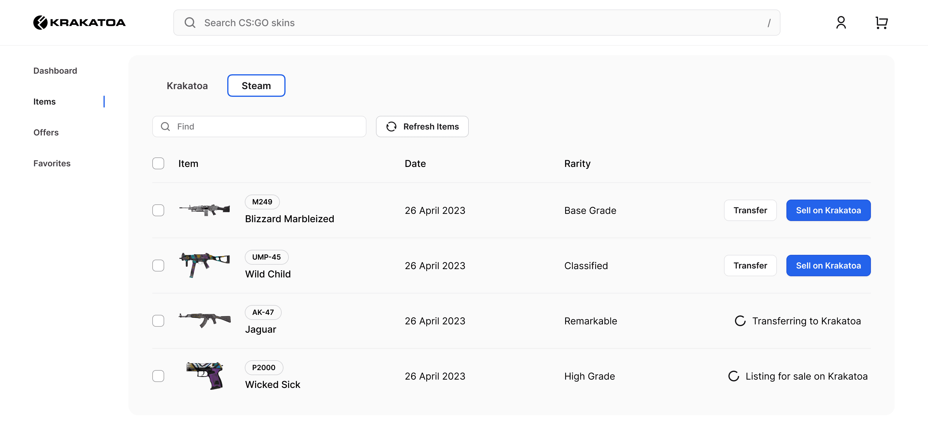
When gamers buy a skin, they need a way to transfer their Krakatoa purchase to Steam, and vice versa. Unlike a typical eCommerce site, Krakatoa also allows users to bid and make offers to each other, so the account dashboard takes care of all user-related matters.
AI art with Midjourney.
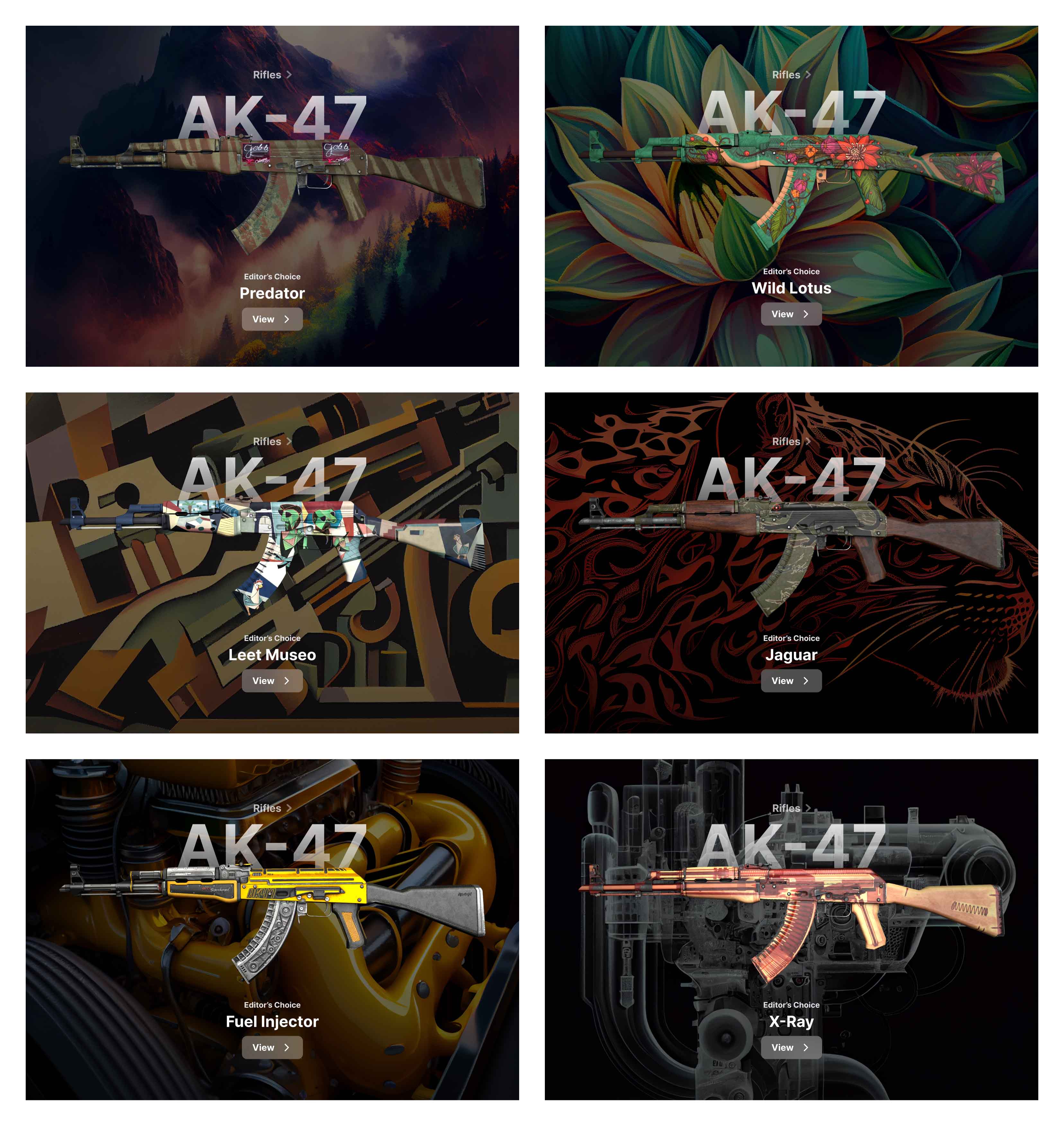
Using Midjourney, I created the background art matching each skin. For the first time I delivered a machine learning prompt as a UI design deliverable. Having only utilised AI art once for placeholder assets, it has instantly become an indispensable part of my toolset.
Explore all work
