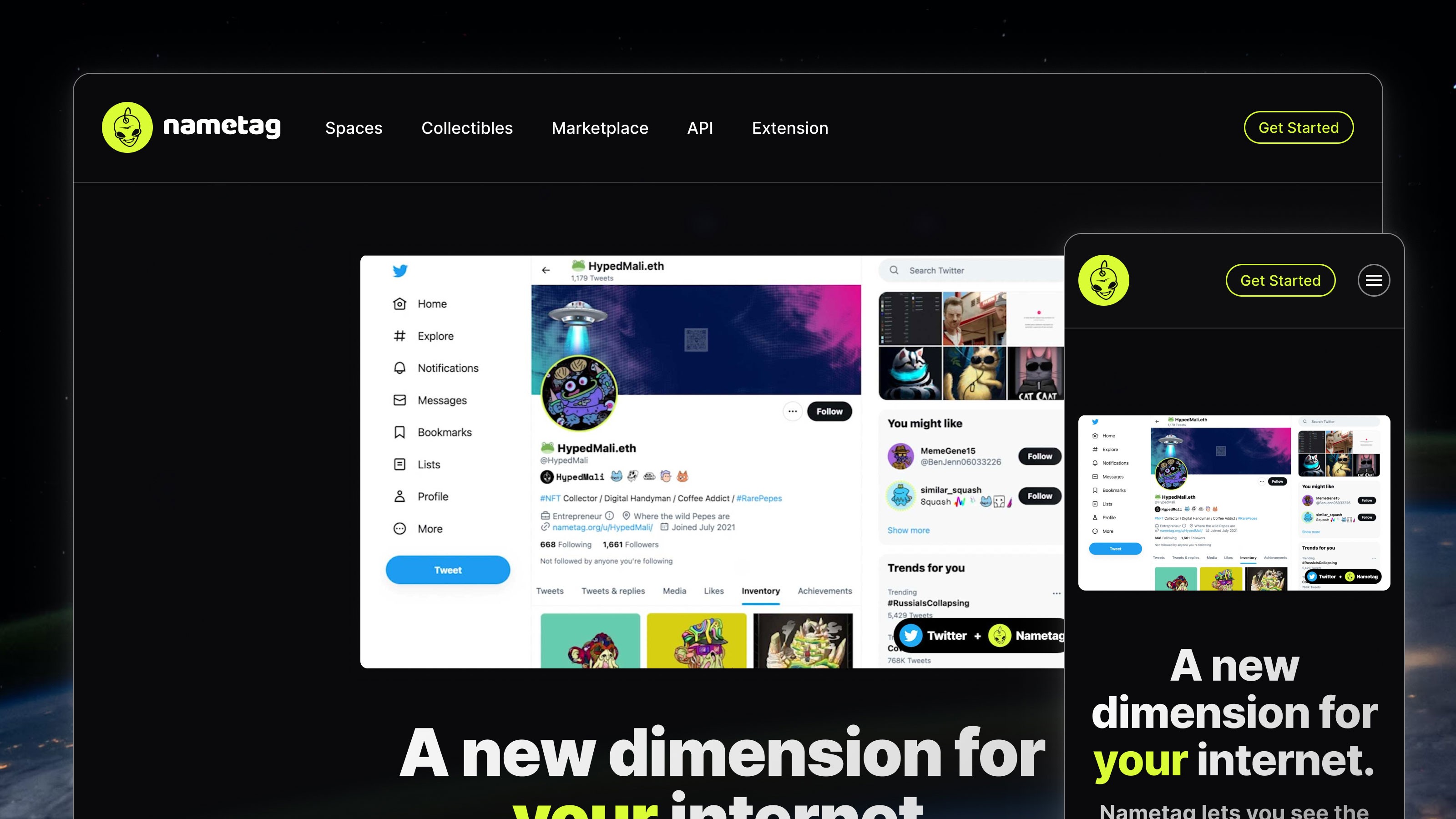
Nametag secured a $2M seed round as a result of this work. The product offers a "special lens" on Twitter and Discord profiles allowing users to exhibit their digital collections (including, but not limited to NFTs) on their social media accounts.
I helped take the product from an early alpha code prototype, through to design and to shipped product. The startup now has 60,000 users, and a stellar 5-star rating on the Chrome Web Store.
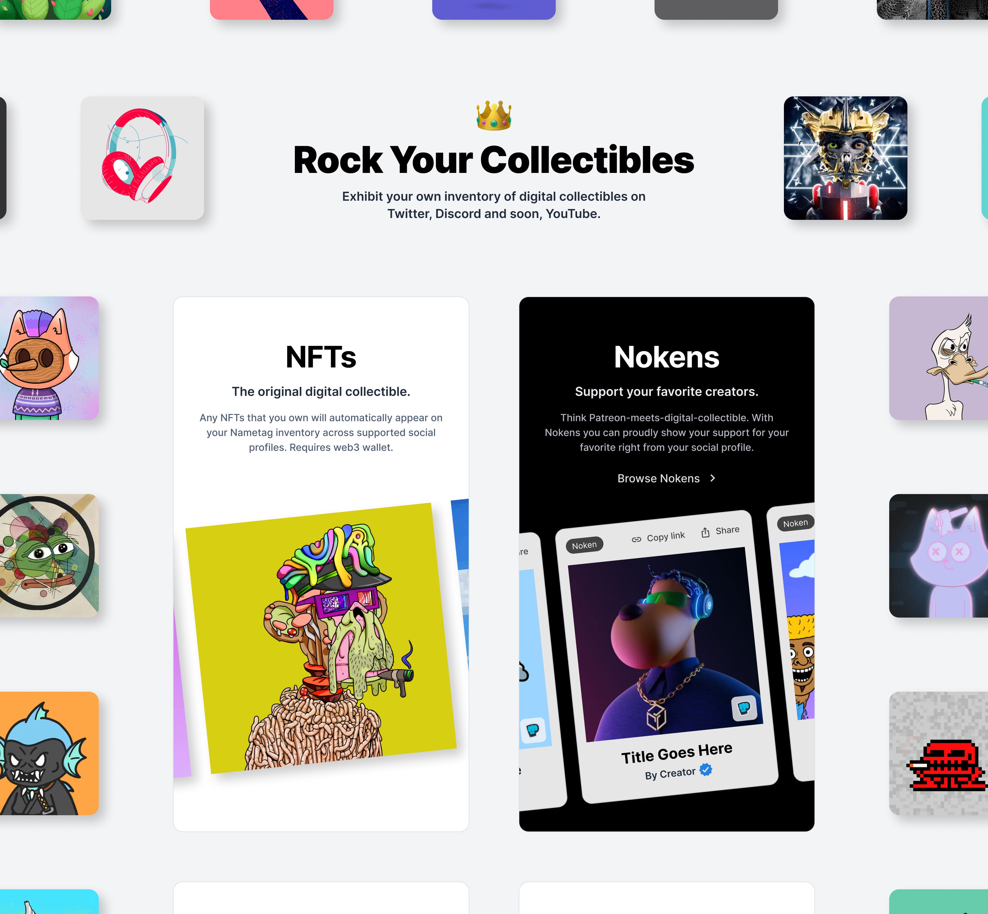
Nametag: Bringing collectibles back!
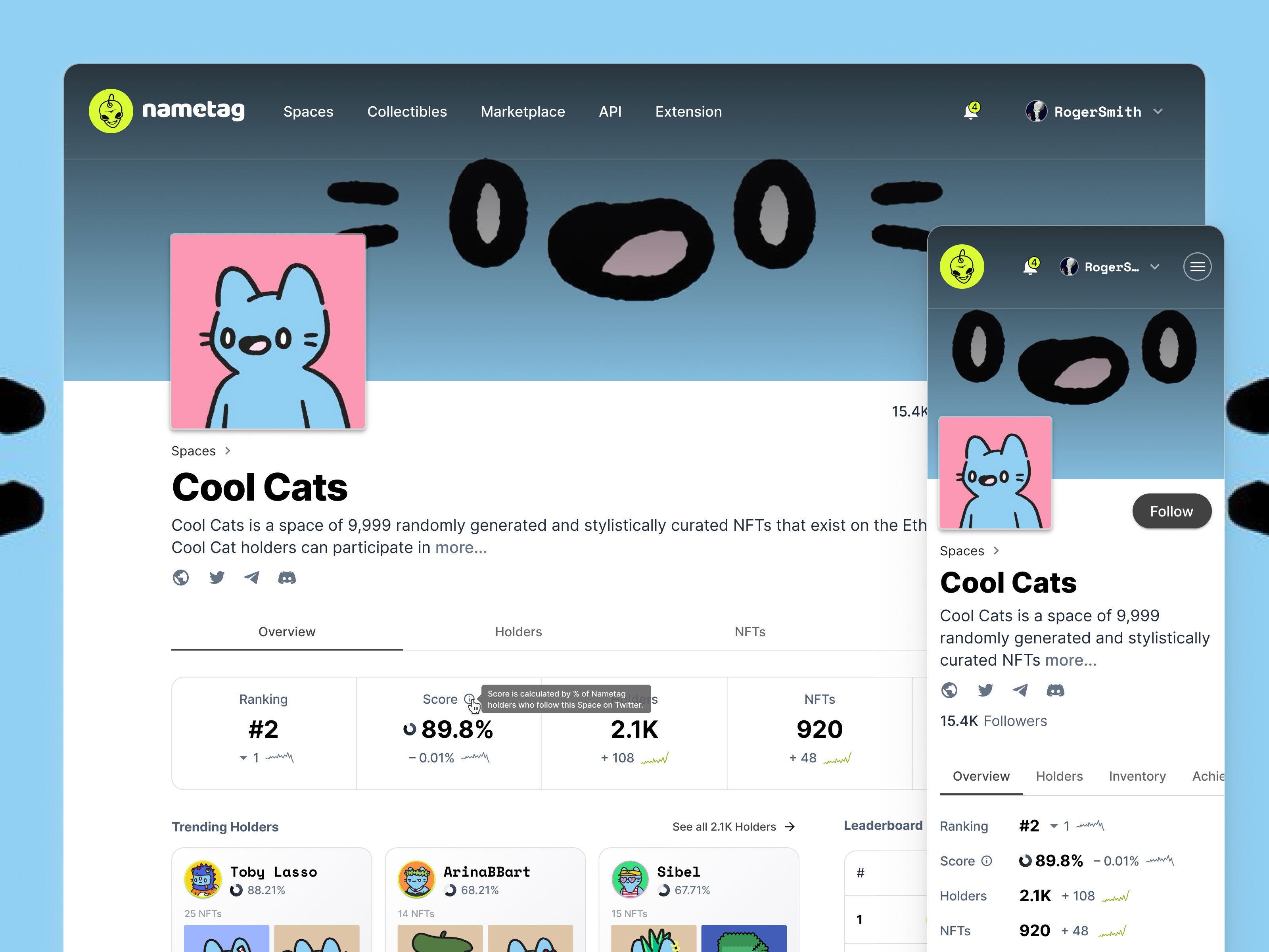
Space: A collection of digital collectibles centred around a theme or artist. In this case, Cool Cats. Browse all spaces on Nametag.org.
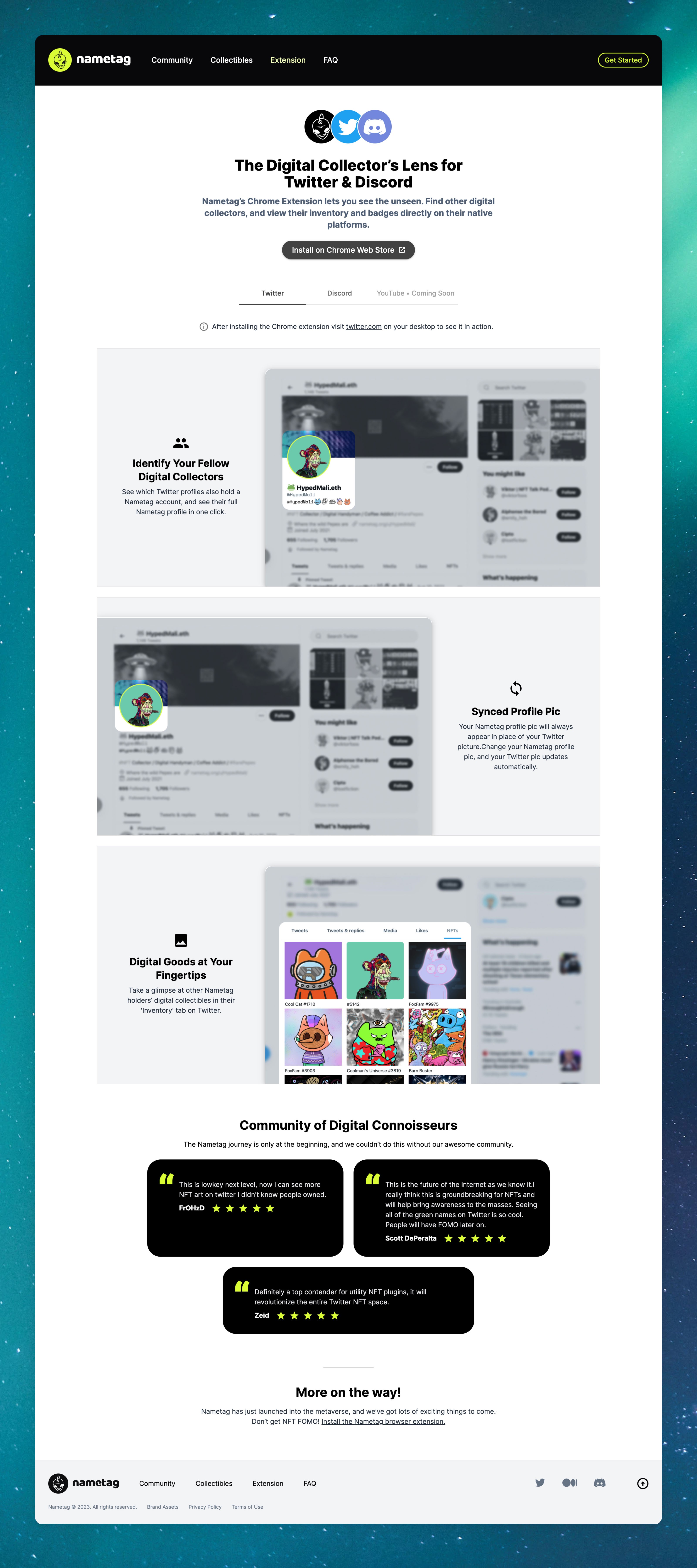
The Extension landing page. Users need to install this extension on Google Chrome in order to add a layer of web3 on top of web2 platforms like Twitter and Discord.
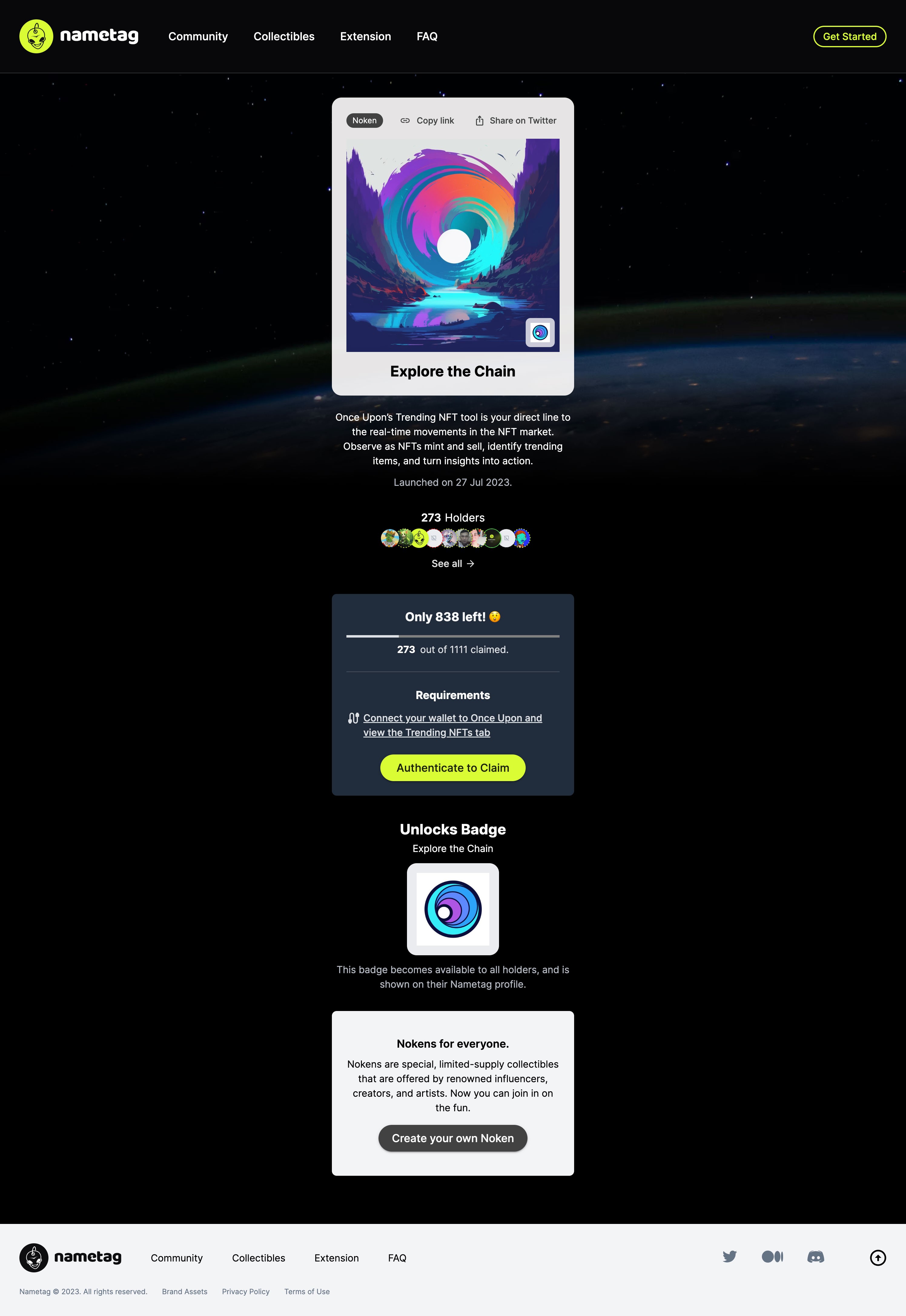
Noken drop. These are Nametag proprietary digital collectibles, and are announced in special collaboration with content creators. Browse Nokens on Nametag.org.
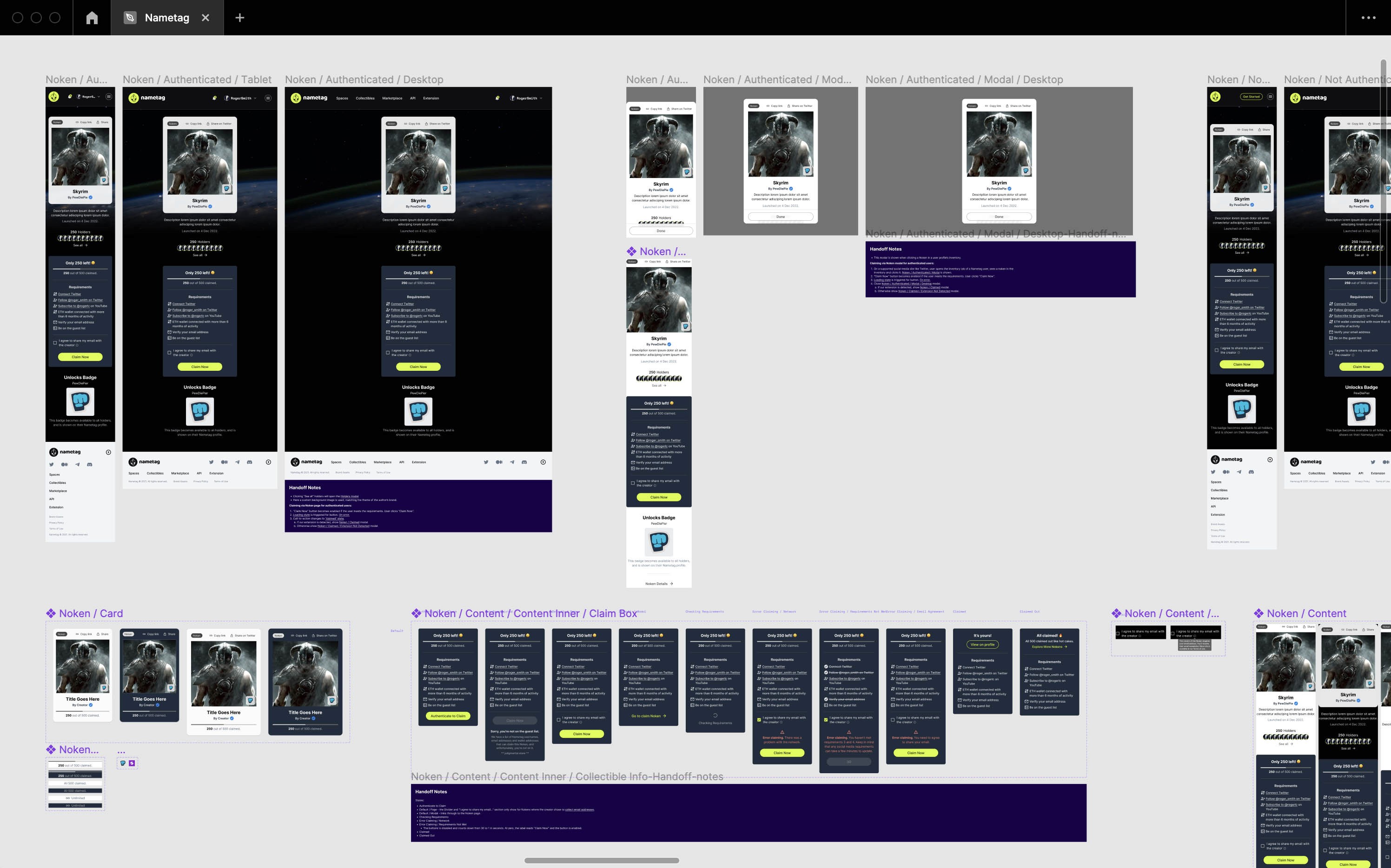
Behind the scenes. Looking at the Noken page mockups and components that I put together in Figma.
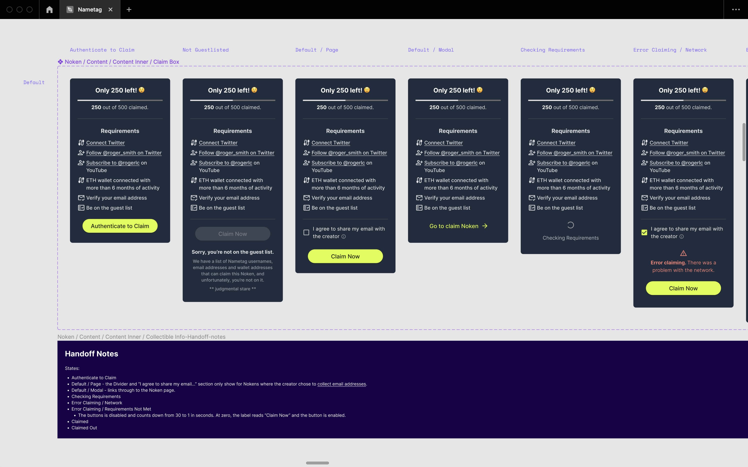
Deep dive on the Claim Box component. As you can see, this modest looking component has a wide number of states that need to be catered for, so I provide such mockups to developers so that we cover all the bases.
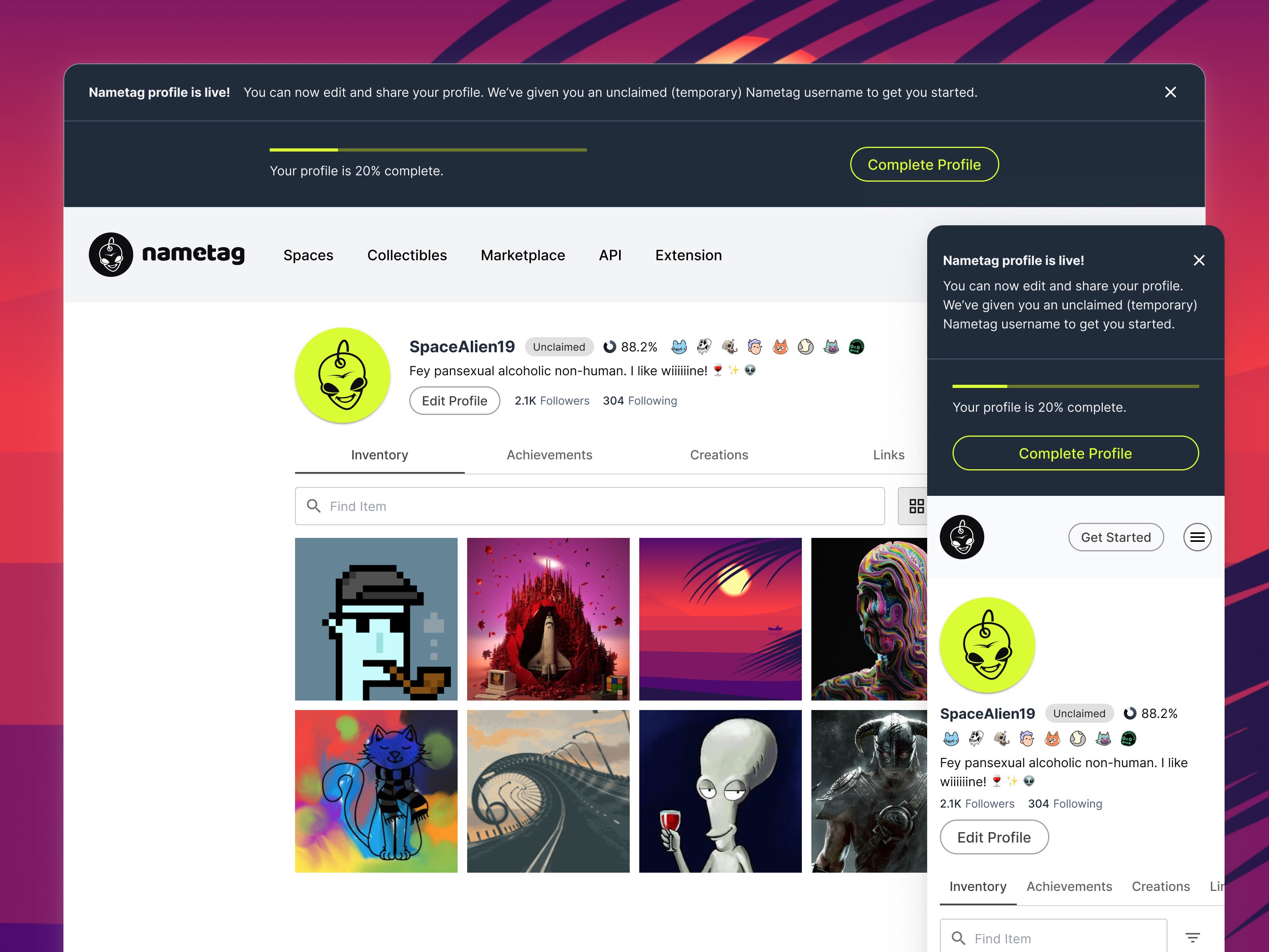
Profile page, as part of onboarding. We opted for a soft onboarding option, allowing users to start making use of Nametag before jumping through all the hoops of finalising their profile. But in order to make the most of Nametag, they're still encouraged to finalise via a set of post-onboarding profile completion steps.
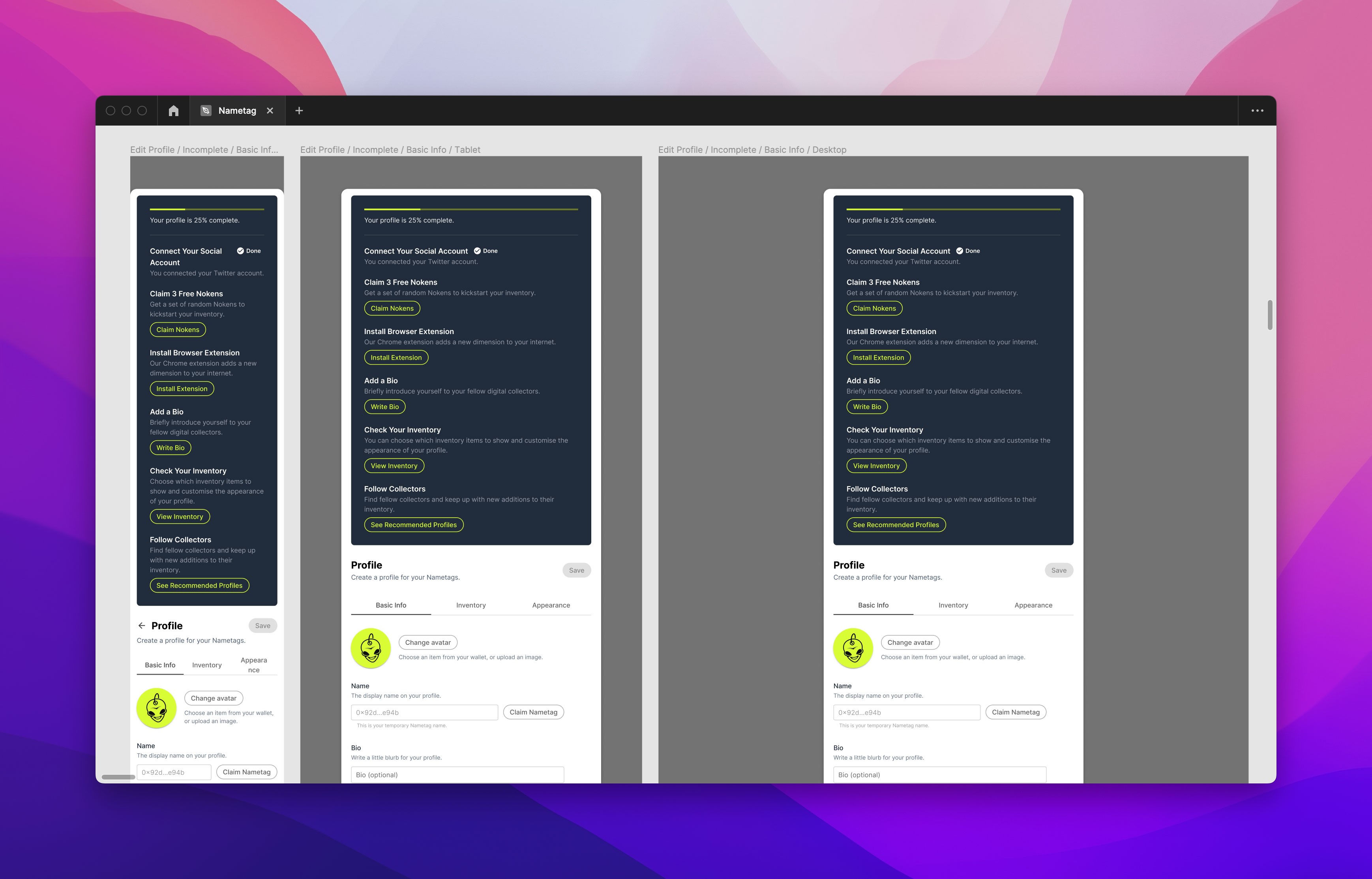
Figma design mockup for the profile completion modal.
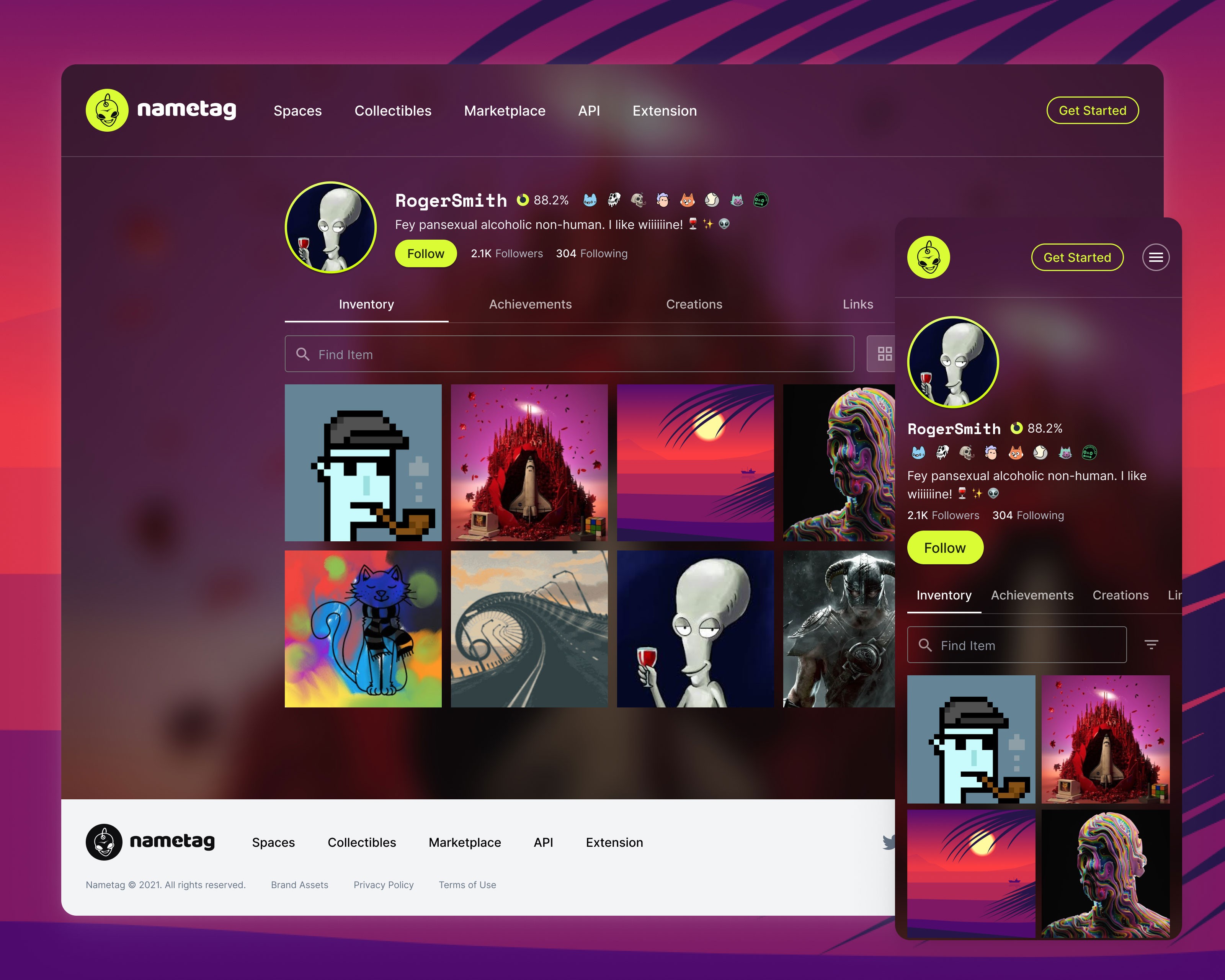
A completed profile. Browse profiles on Nametag.org.
Designing for web3 integration.
We deliberately chose to make signup as easy as possible, providing the most flexible signup options. Don't make it hard for prospect users to become regulars — that's the motto!
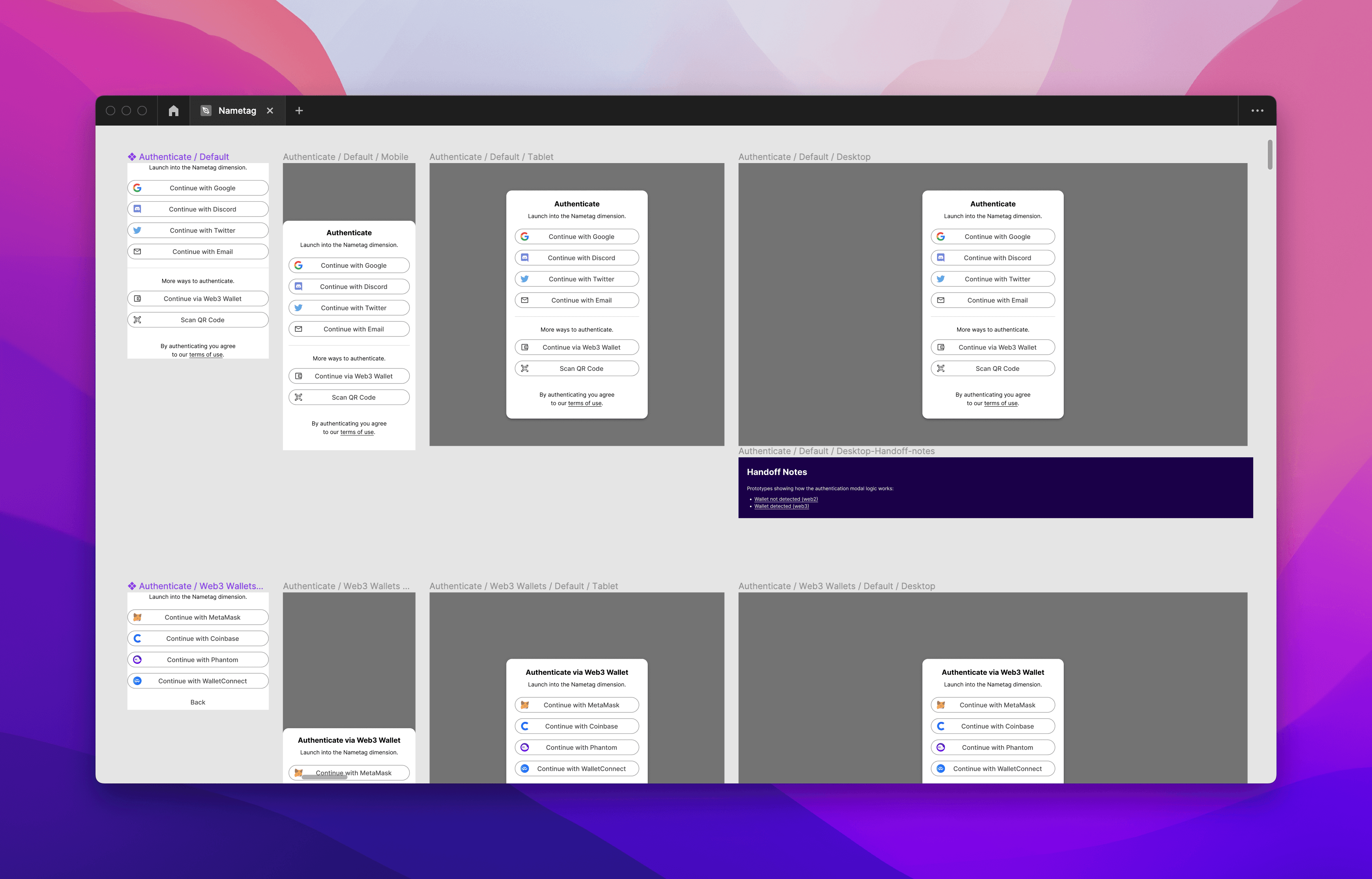
This meant designing a highly flexible onboarding system. One where we allow signup via social channels, email and via a web3 wallet like Metamask, and even via a QR code.
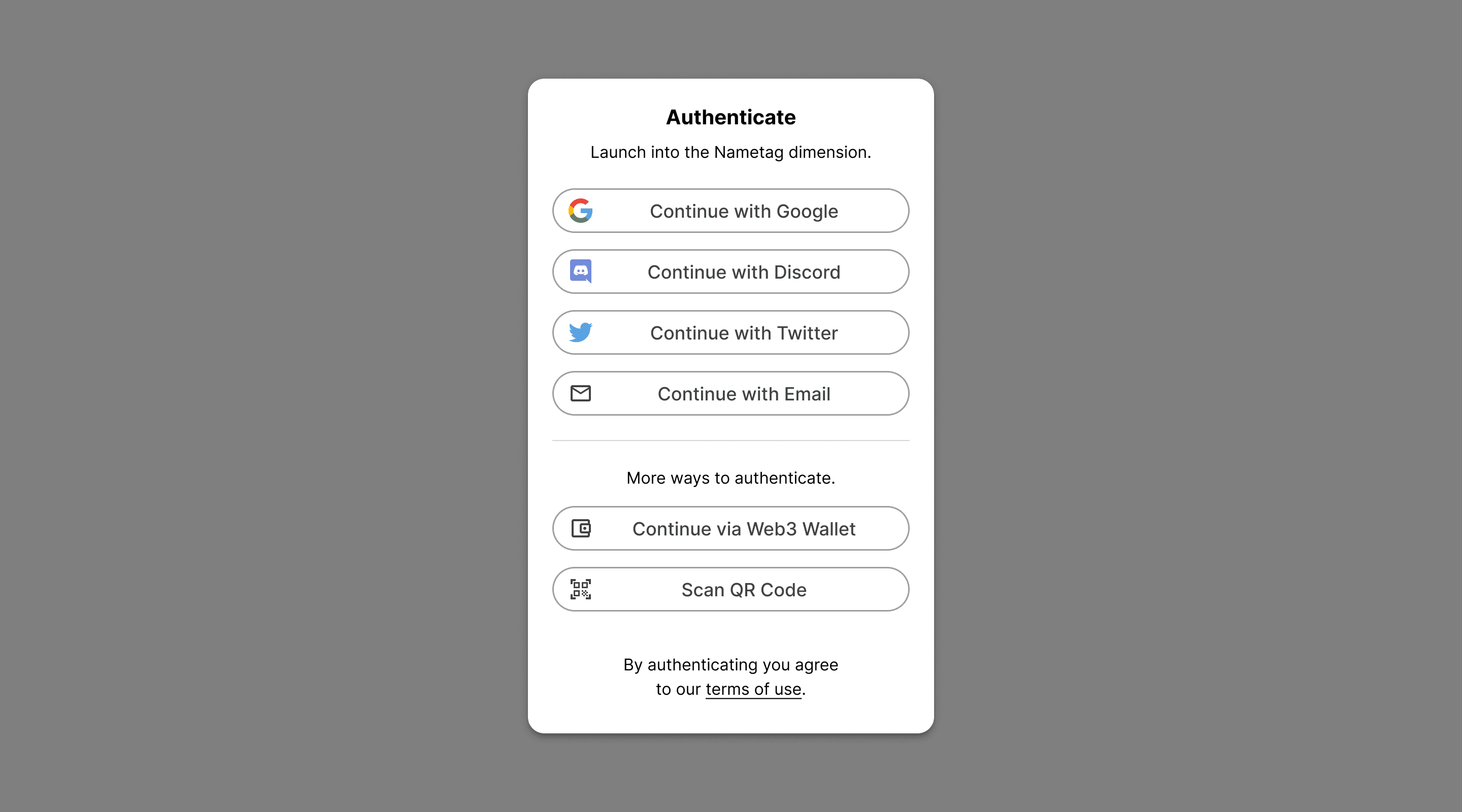
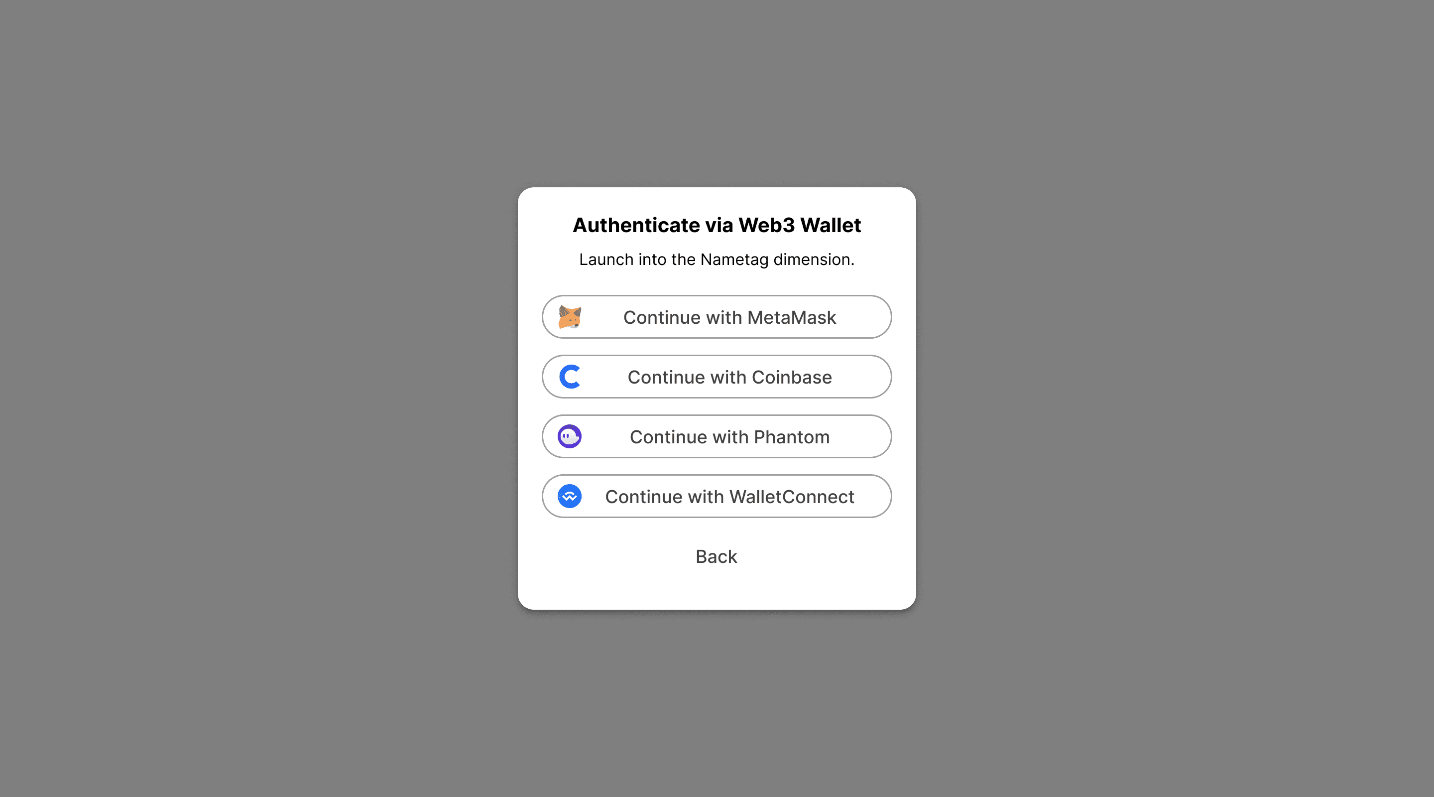
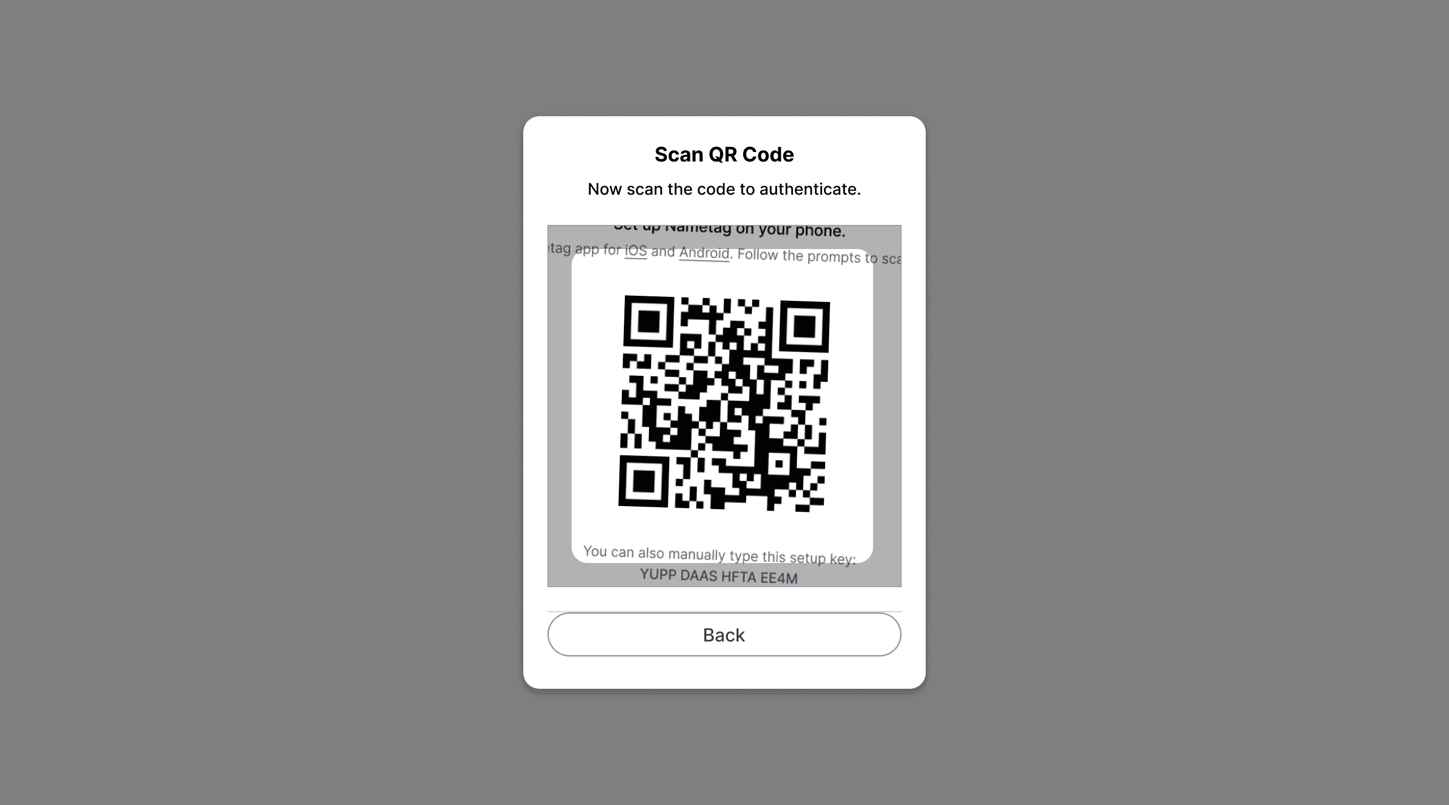
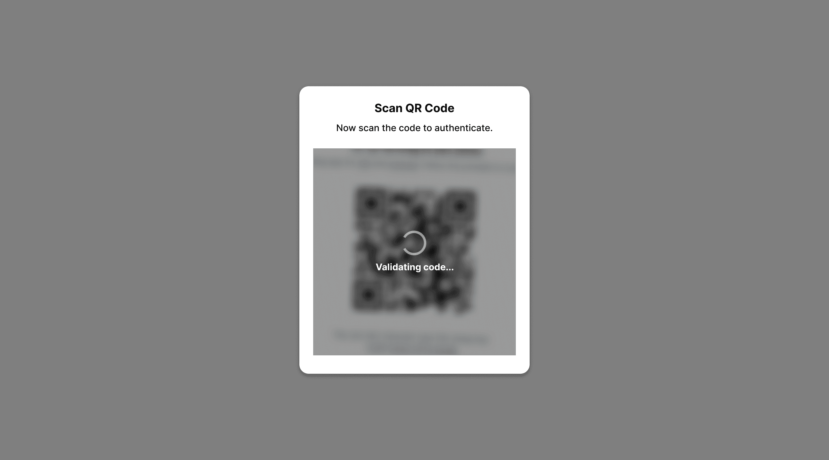
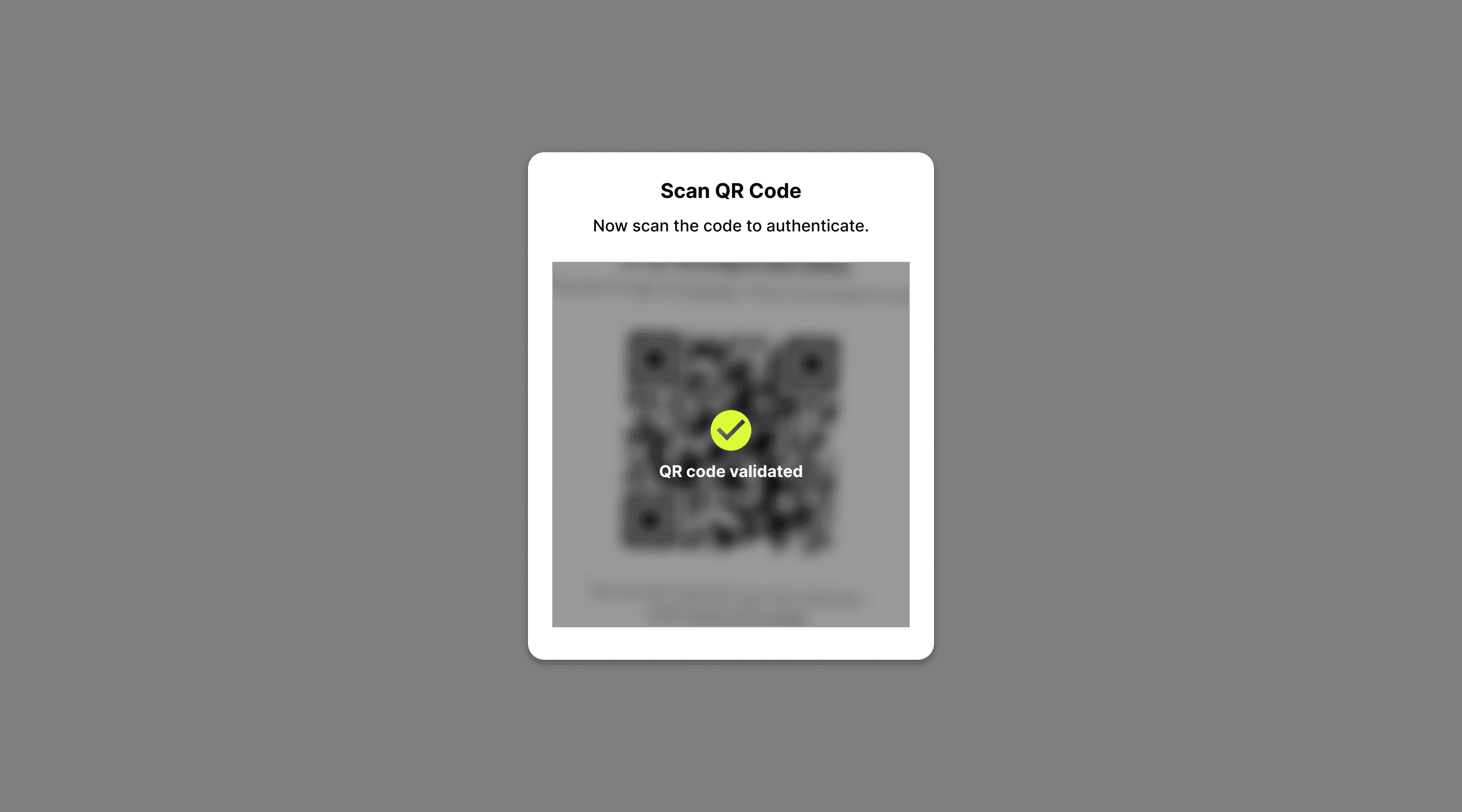
Instead of separating "sign up" from "log in", we just ask users to pick their desired method, and then if we recognise their account, we log them in. Otherwise, we follow with the signup onboarding process.
iOS & Android concepts
The team initially set out to create mobile native apps for Nametag, but eventually we pivoted to solely focus on the web experience.
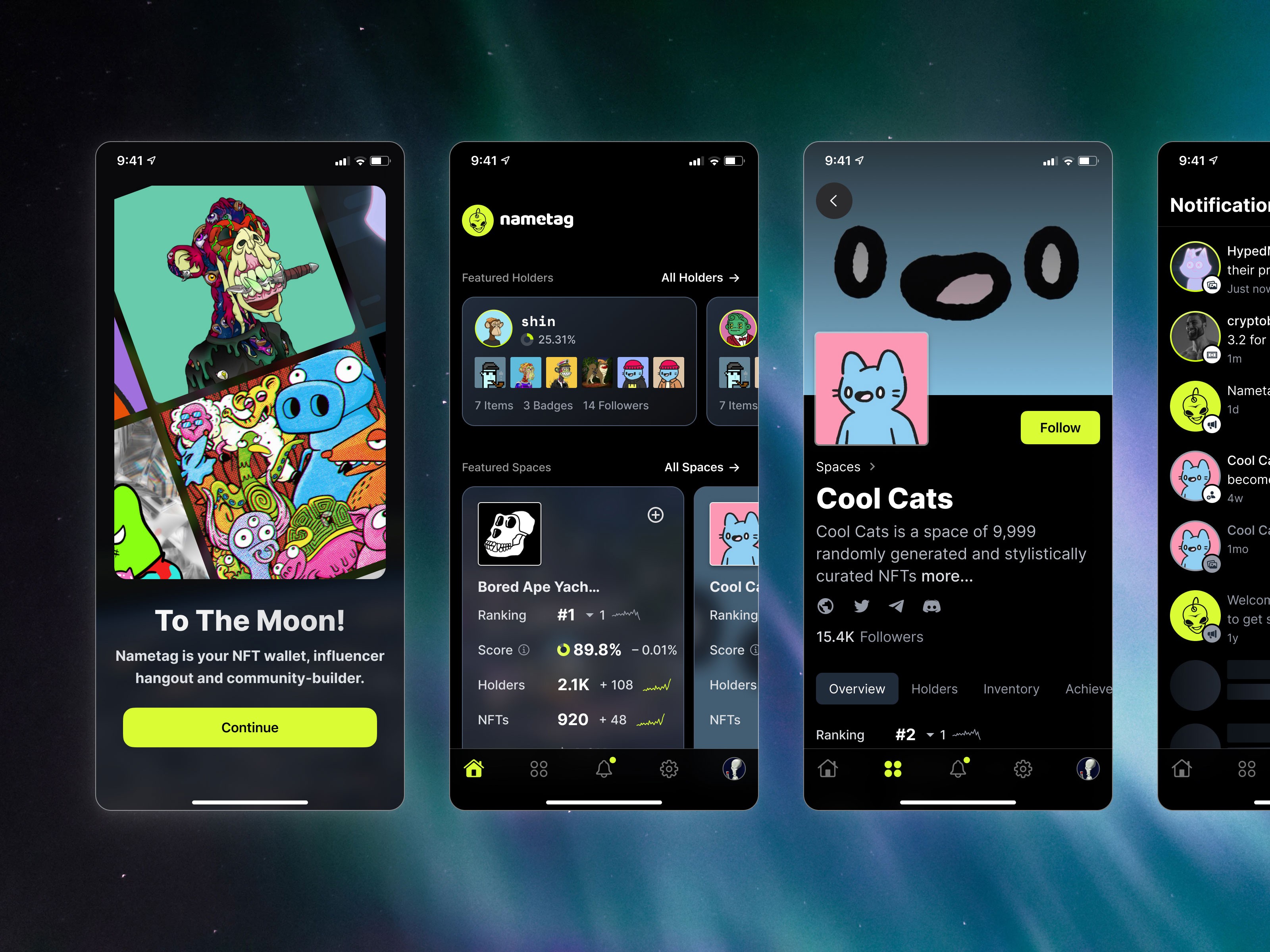
While working on the native mobile design, I incorporated both a iOS UI Kit and Material Design kit, and built a custom UI component library on top of it. The trick here is to make the apps feel intuitively iOS / Android, while at the same time feeling like a quintessentially Nametag-esque user experience.
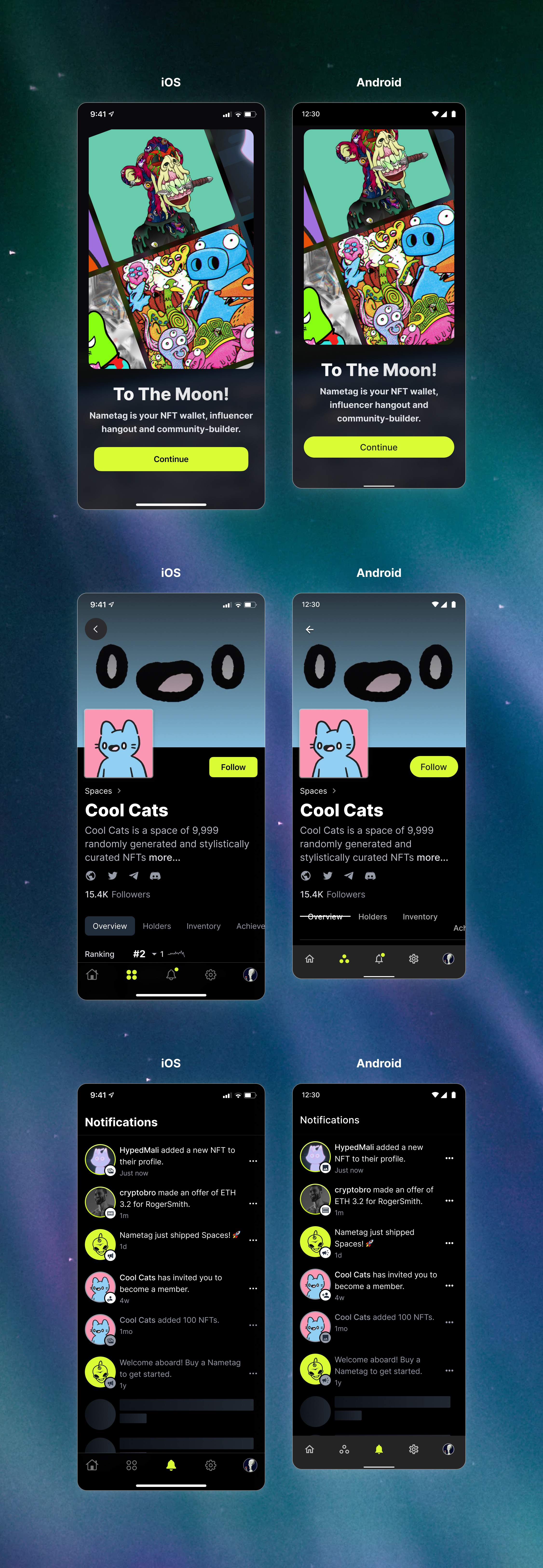
This is done by creating a good balance between use of native components and styles (for example, the bottom bar, icons, button radii) and then utilising custom typography, a universal component library and a consistent colour scheme for the consistency of Nametag experience across platforms.
Design System
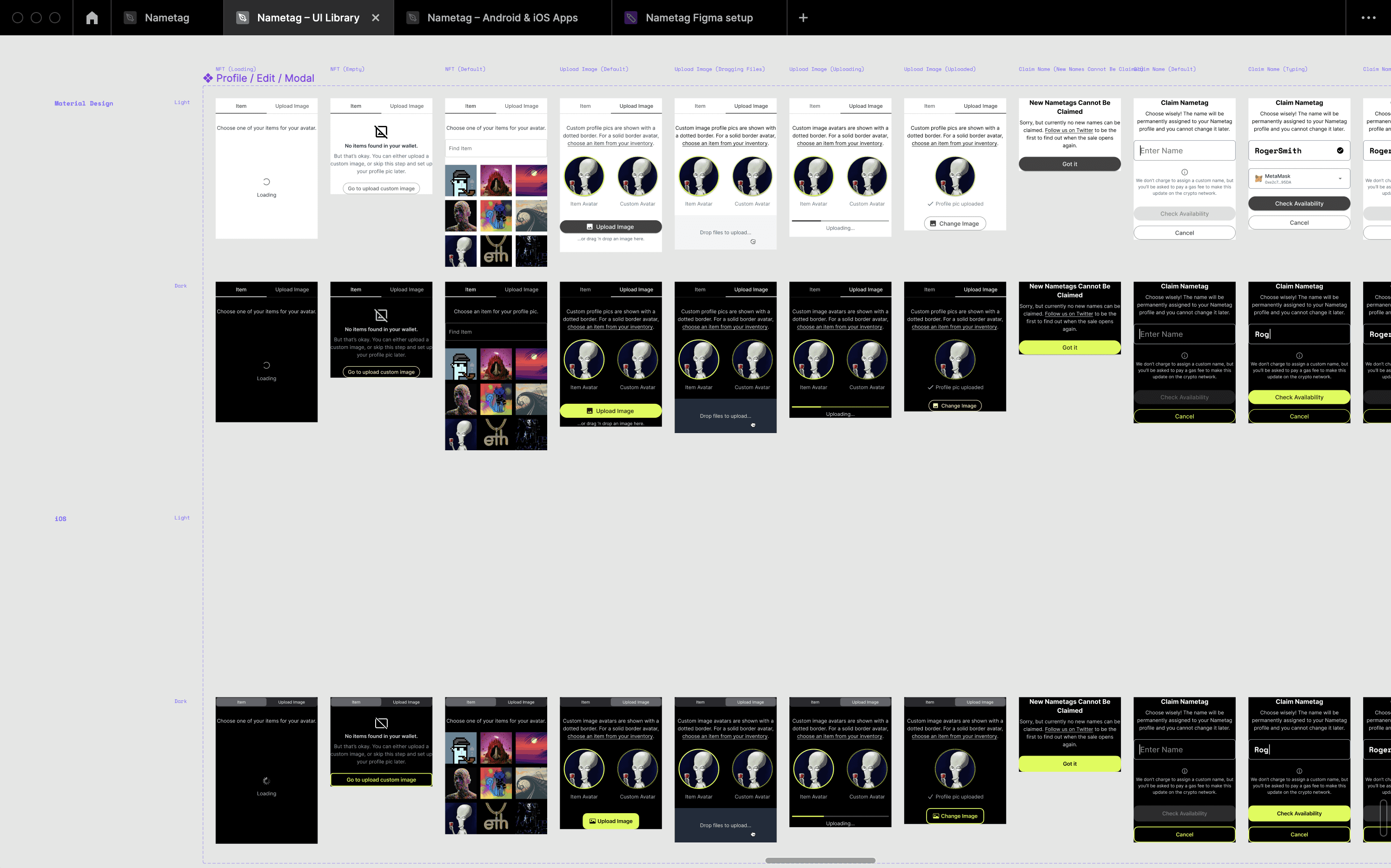
Getting fancy. The Figma setup for the Nametag project.
I created this setup in order to achieve the most bang-for-buck for my client. Keep in mind that I'm a solo designer, doing the work of entire teams of designers at some companies, so I need to work smart.
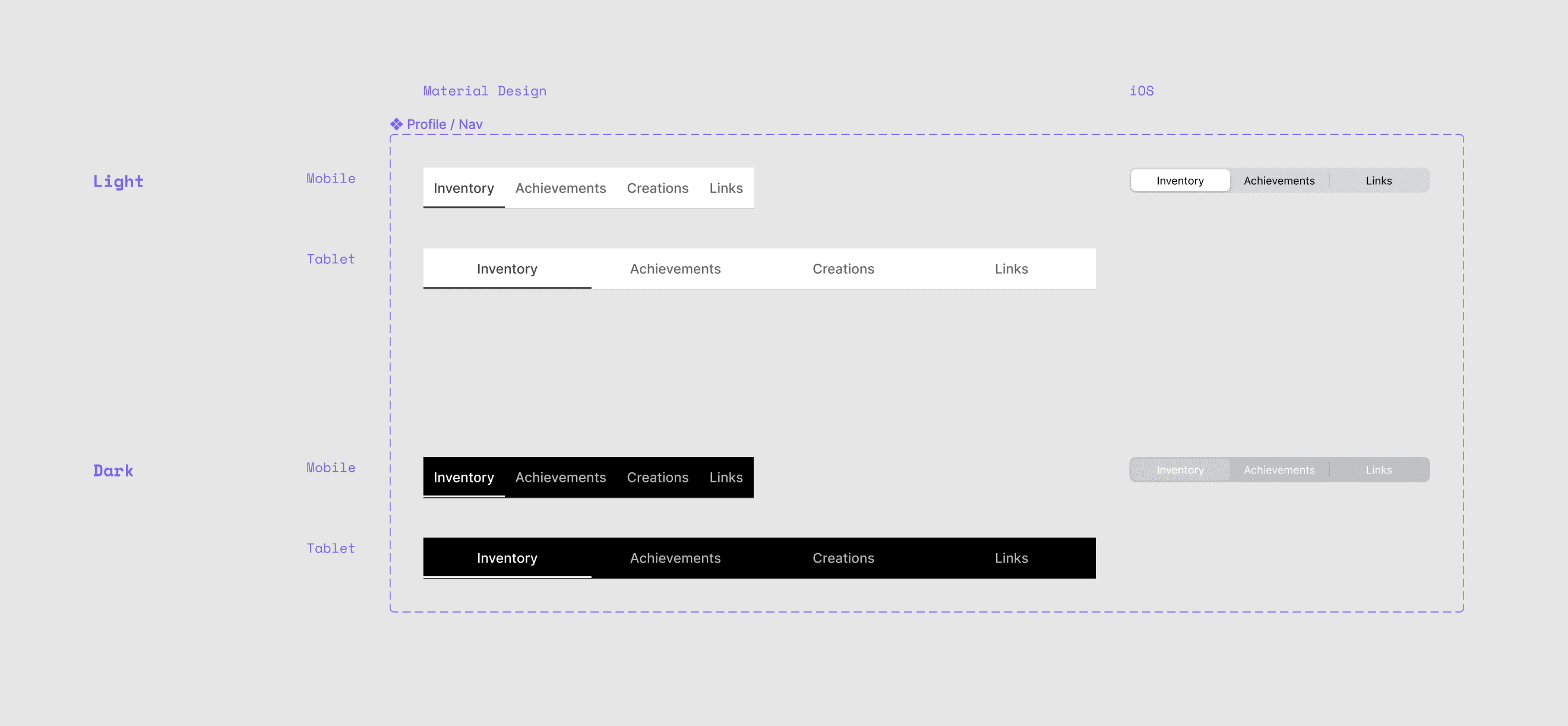
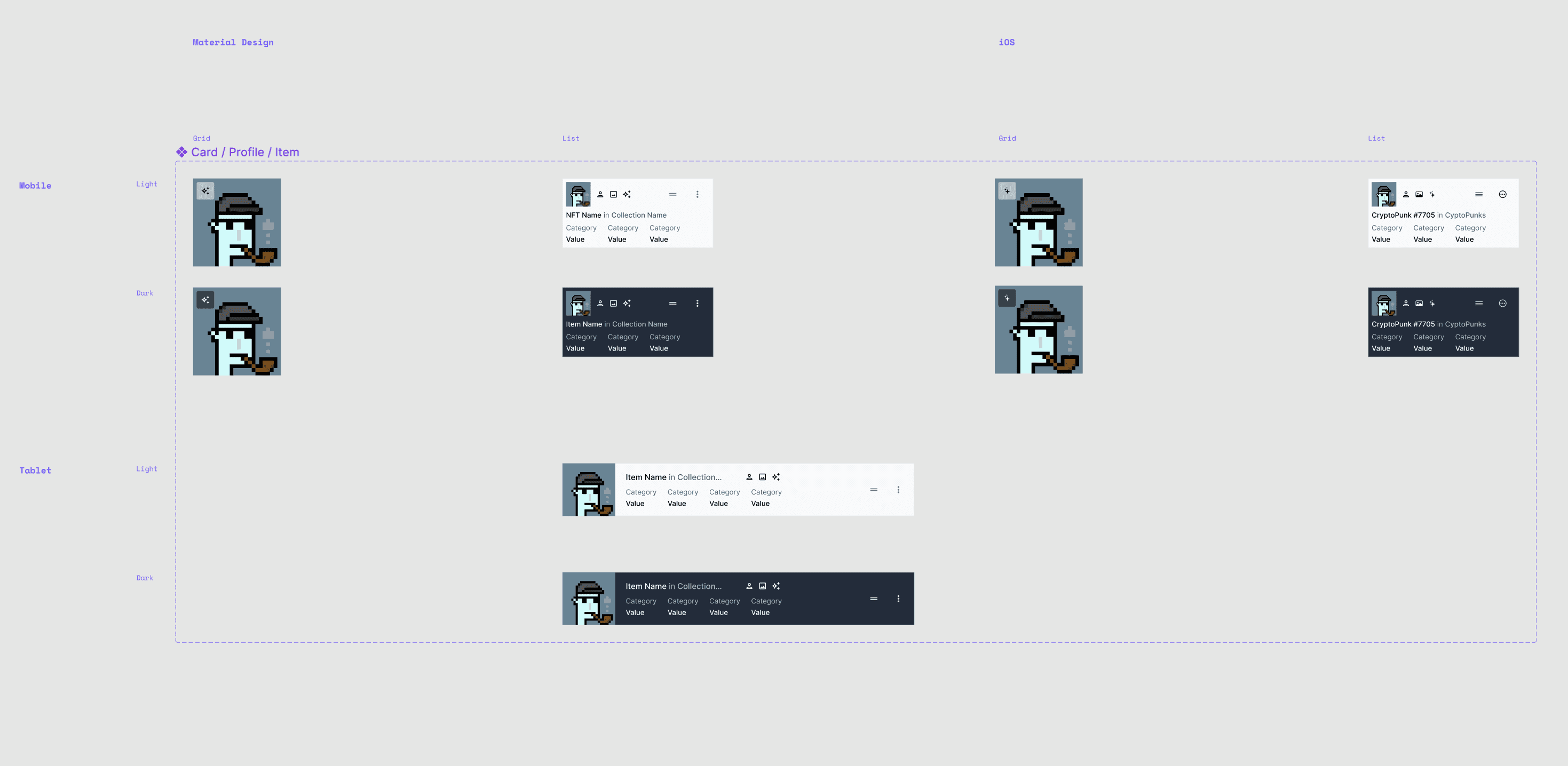
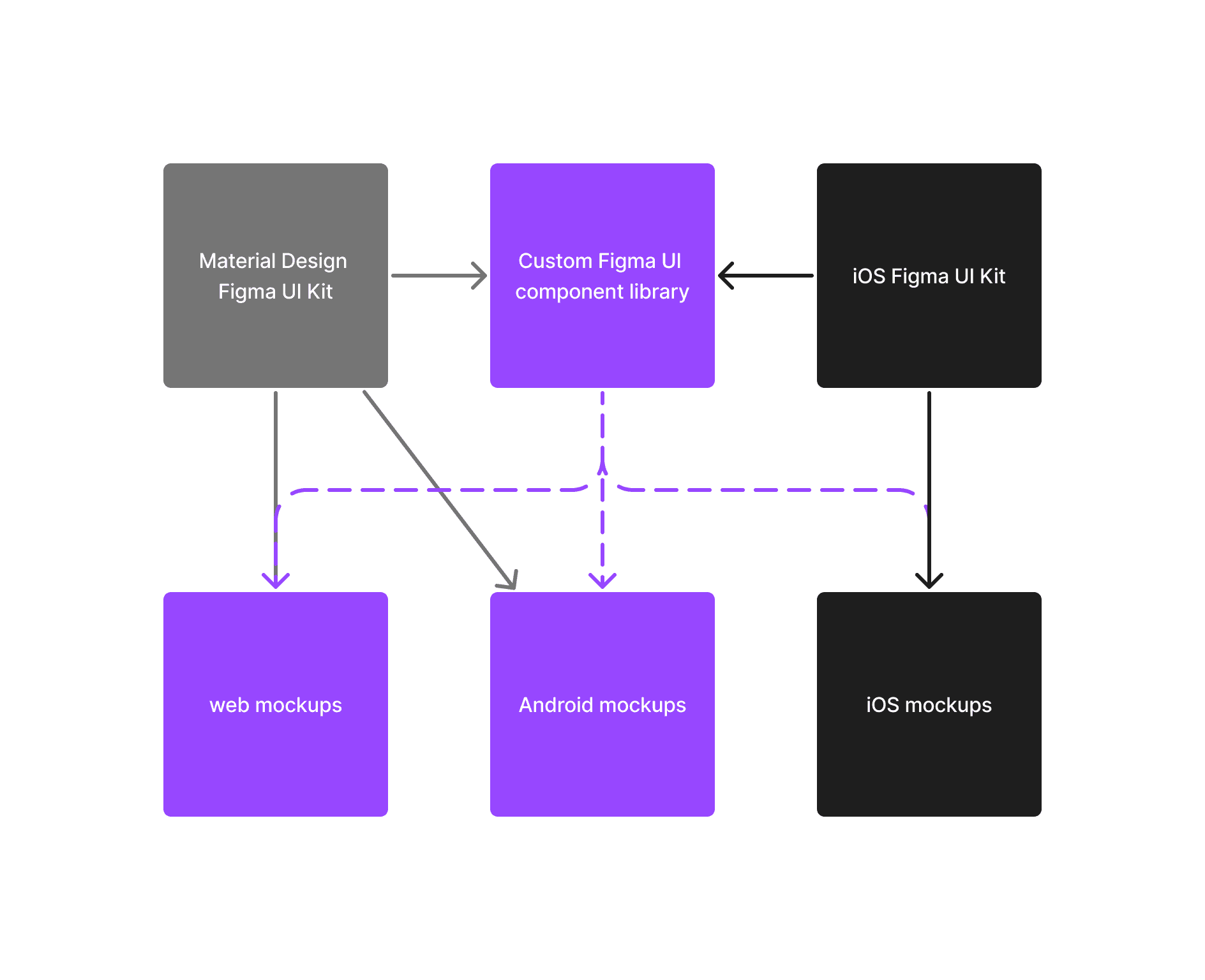
I utilised Figma community UI kits for the Material Design and iOS starter kits. Then, I used Material Design for both web, and Android. It's an elaborate setup, but this meant that I'd only need to create two variations for each custom component.
One for Material Design, covering web and Android.
One for iOS.
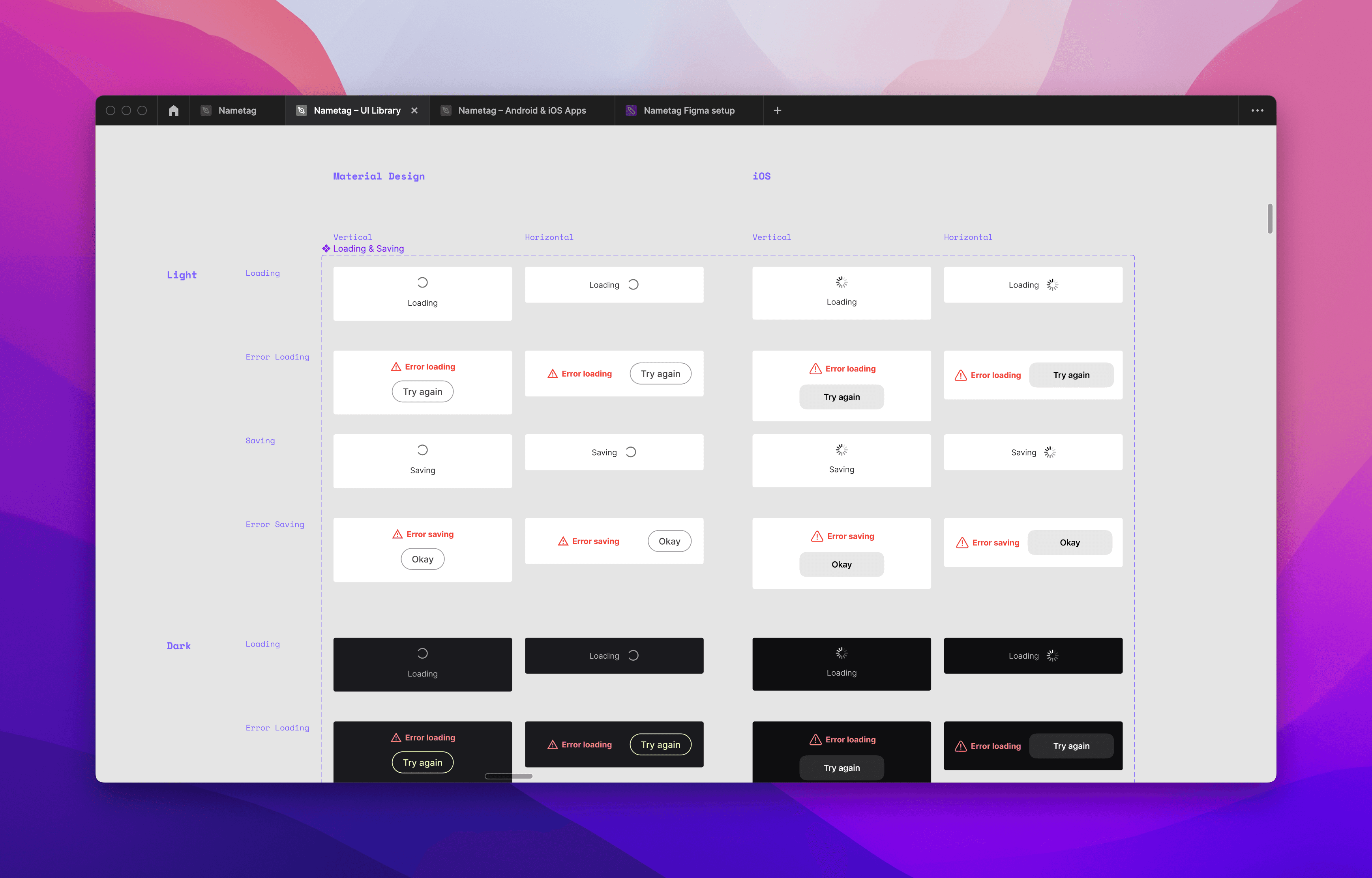
That's a reduction in design cost by roughly 33% since one Material Design component could then be used on both web and Android, with only occasional, and minimal, platform-specific tweaks needed.
Explore all work
