Resell Calendar is an information hub and community for resellers — people buying items with the hope of selling high due to price trends, pricing errors, and any other insider information that the site makes available to the public.

The online reselling craze is going viral, and Resell Calendar is an early mover aiming to become the central hub and community for resellers. I worked with founder Robert C. and the excellent dev team at SapientPro to take this project from idea to shipped product.
Within a year of launch, the site generated over 14,000 email newsletter signups.
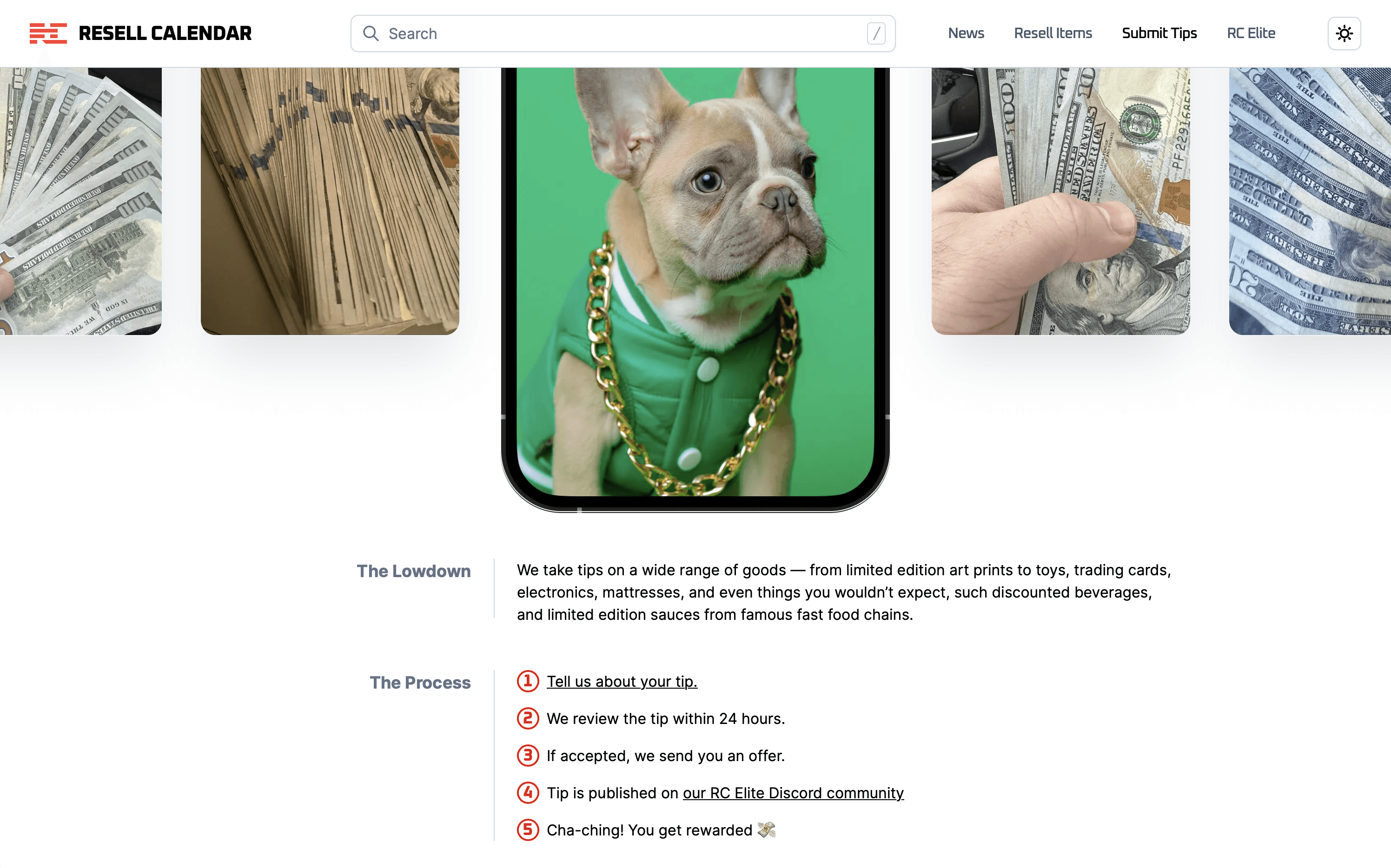
Raffle: Designing landing pages for time-limited offers.
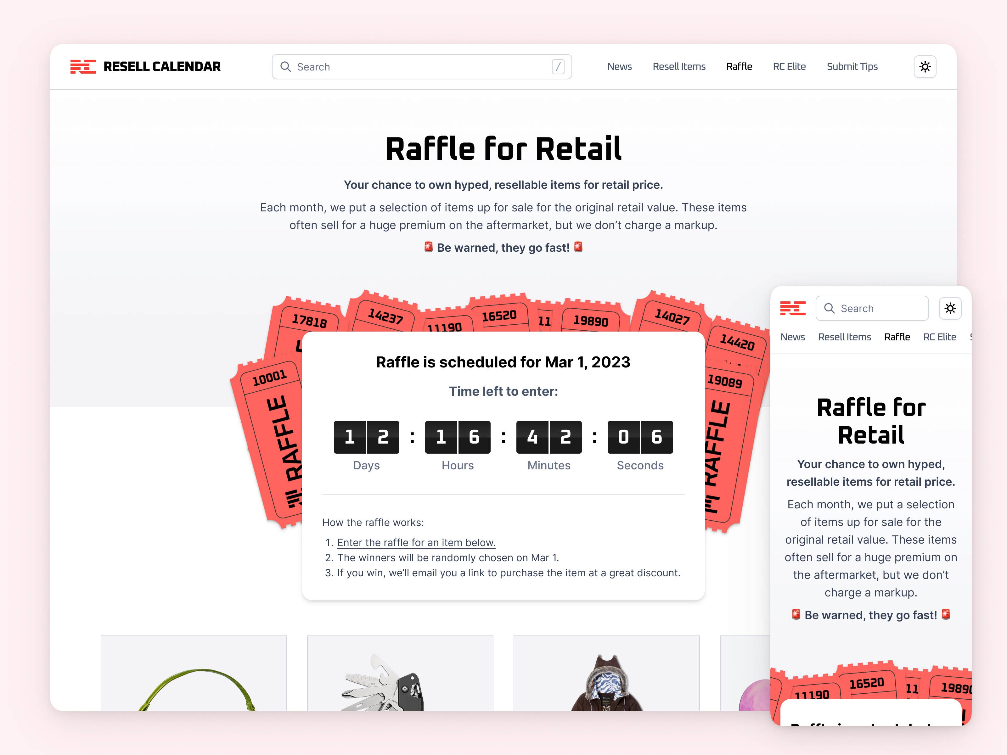
Raffles are limited time opportunities for resellers to be able to win a high-value item at ridiculously low prices. My work here included designing all the possible states for this page.
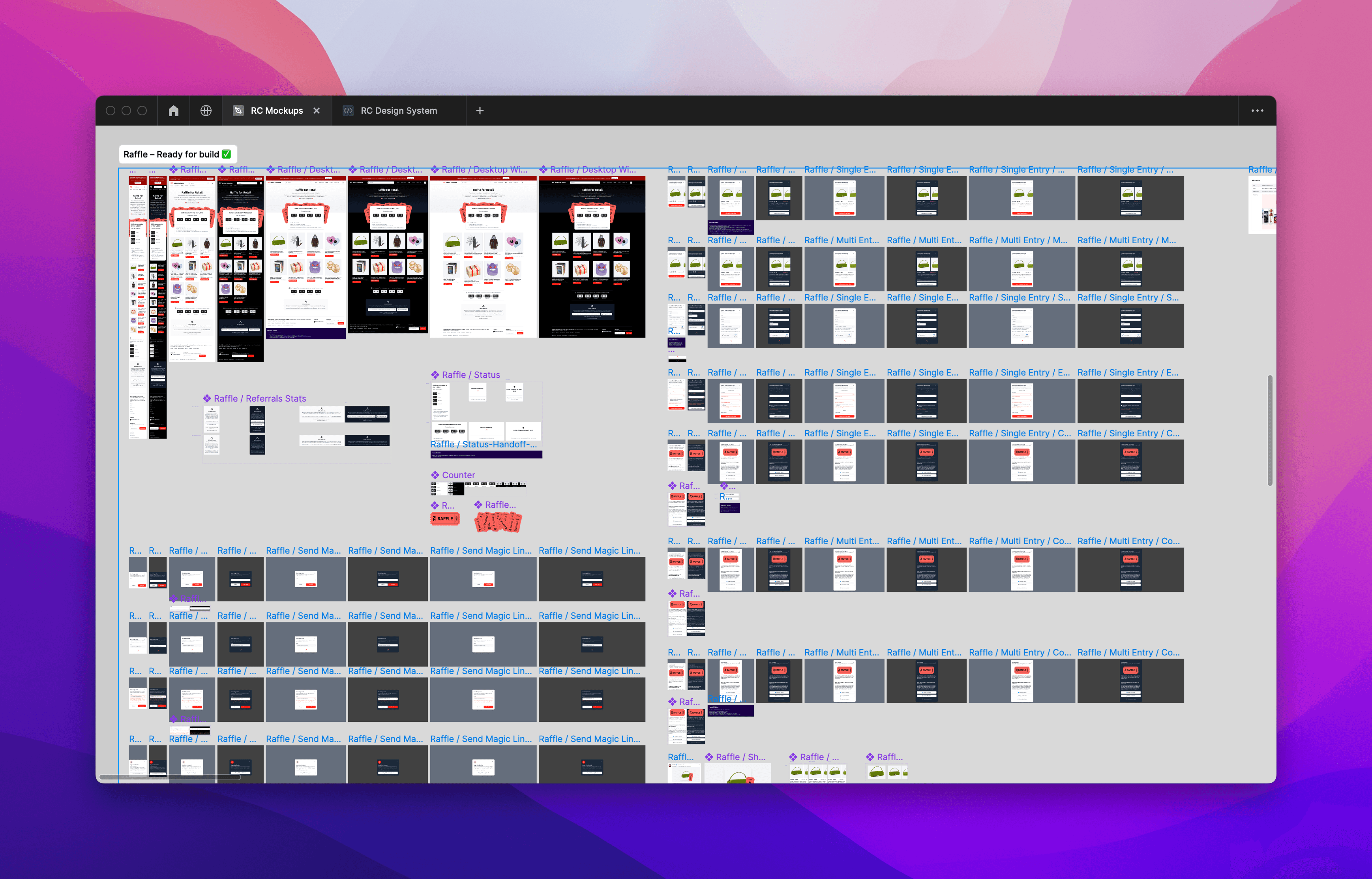
An overview of all modals and states that I designed for this page.
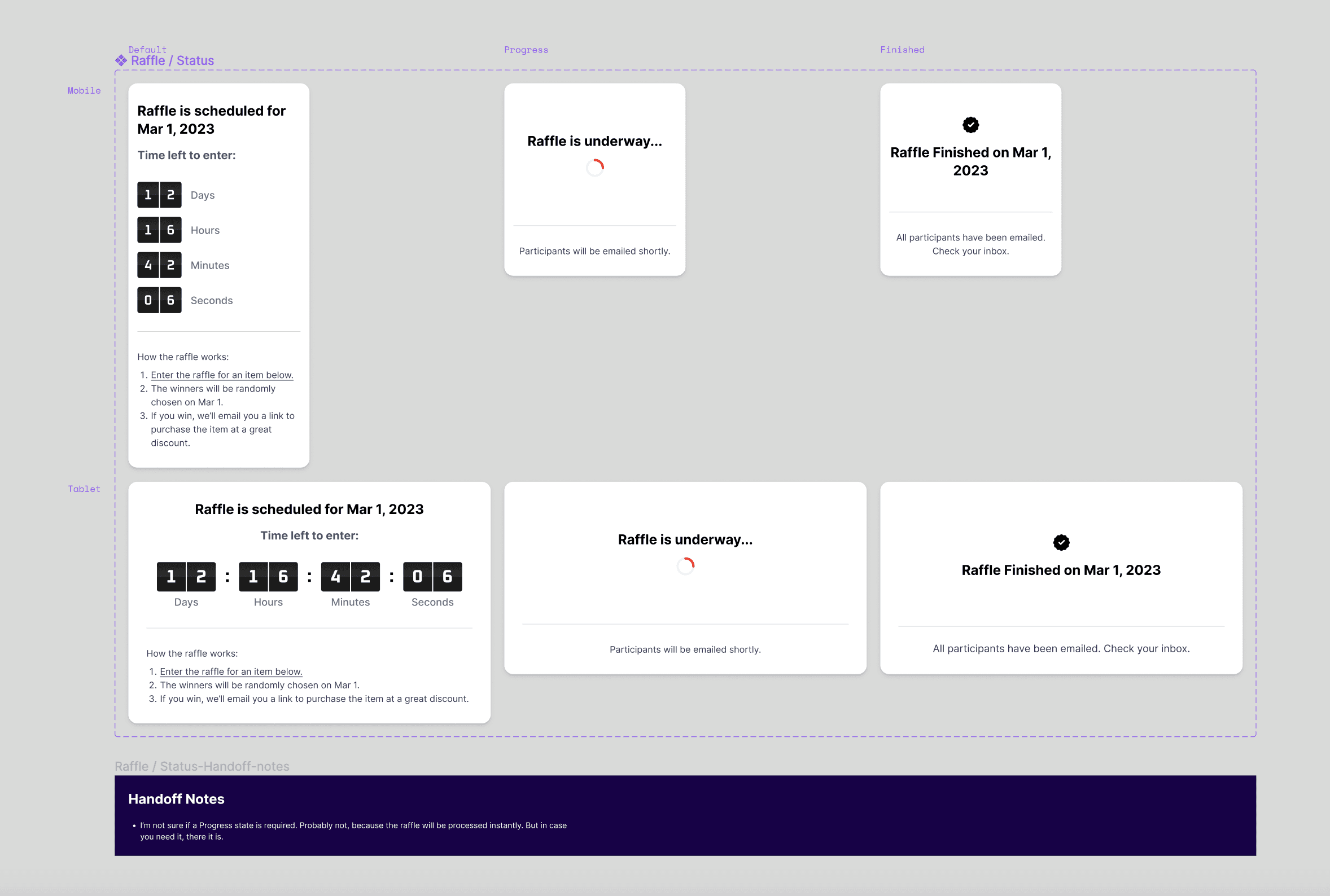
Deep dive look at the Counter component.
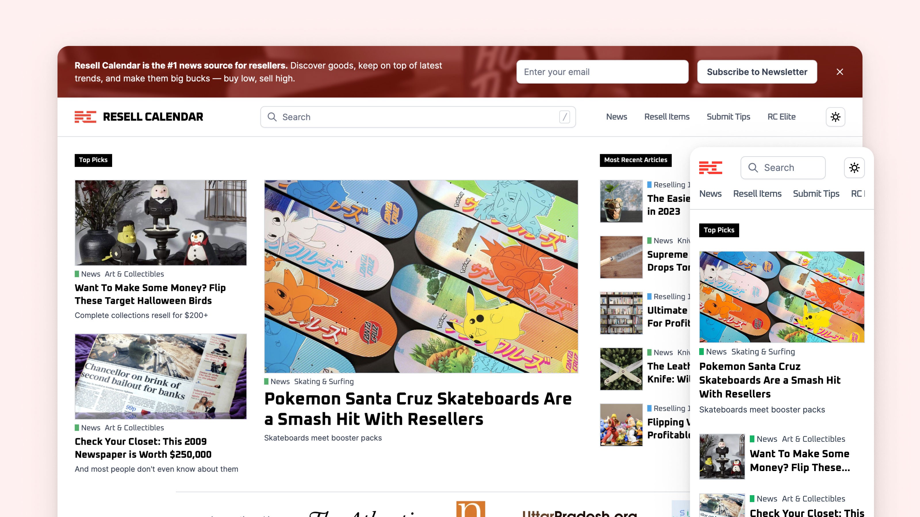
News: Designing a blog.
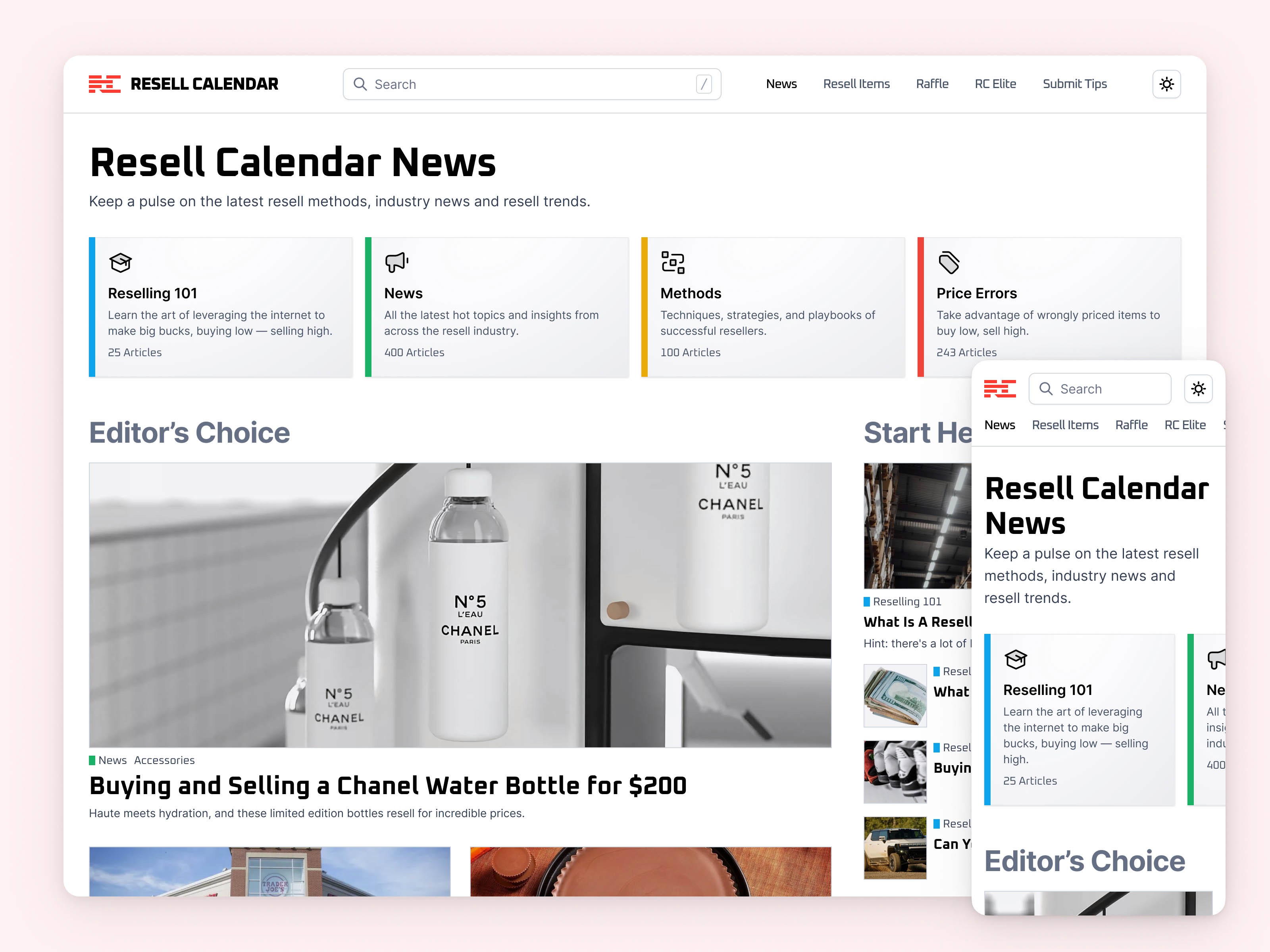
News top-level overview page.
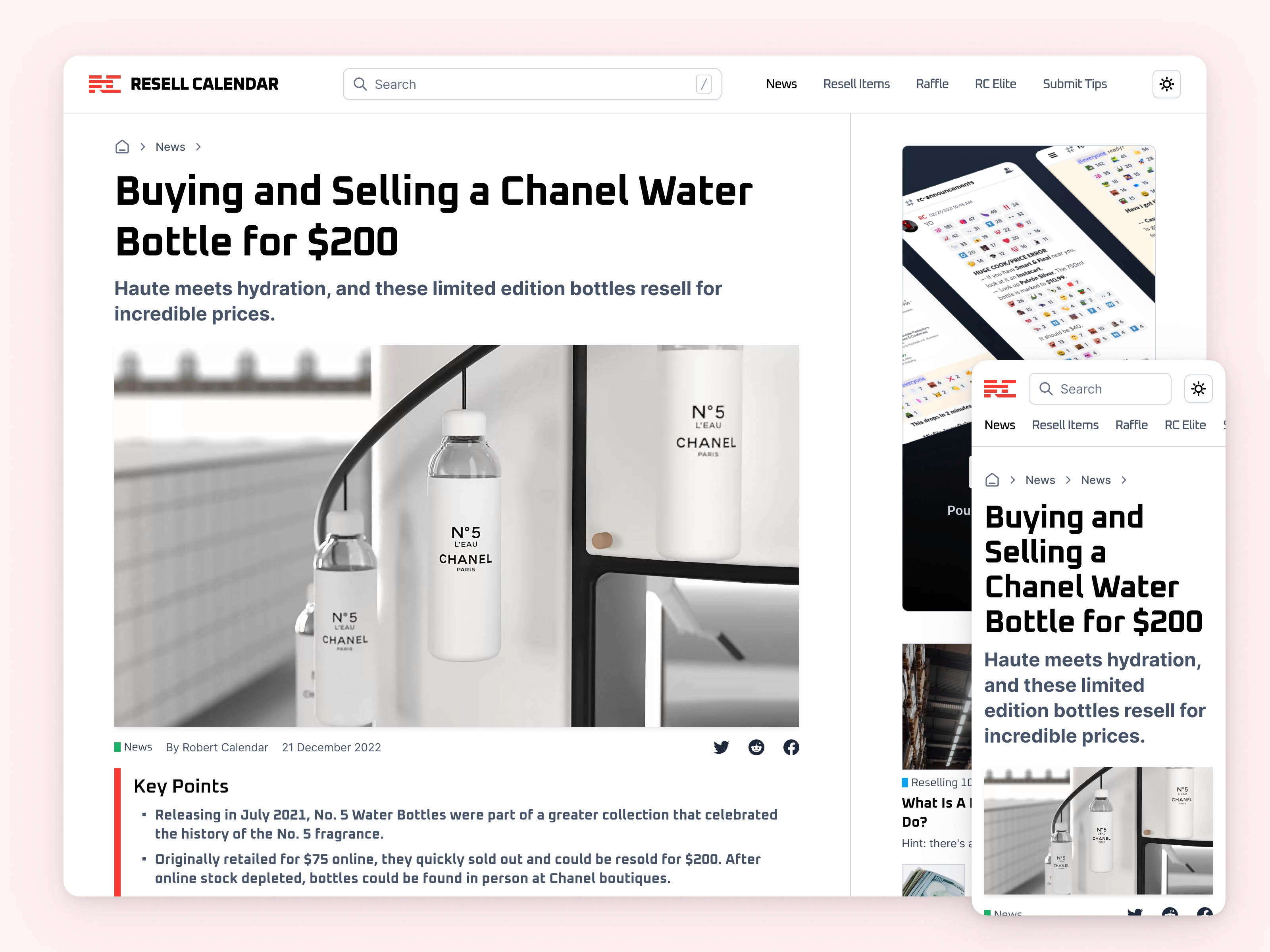
News article page.
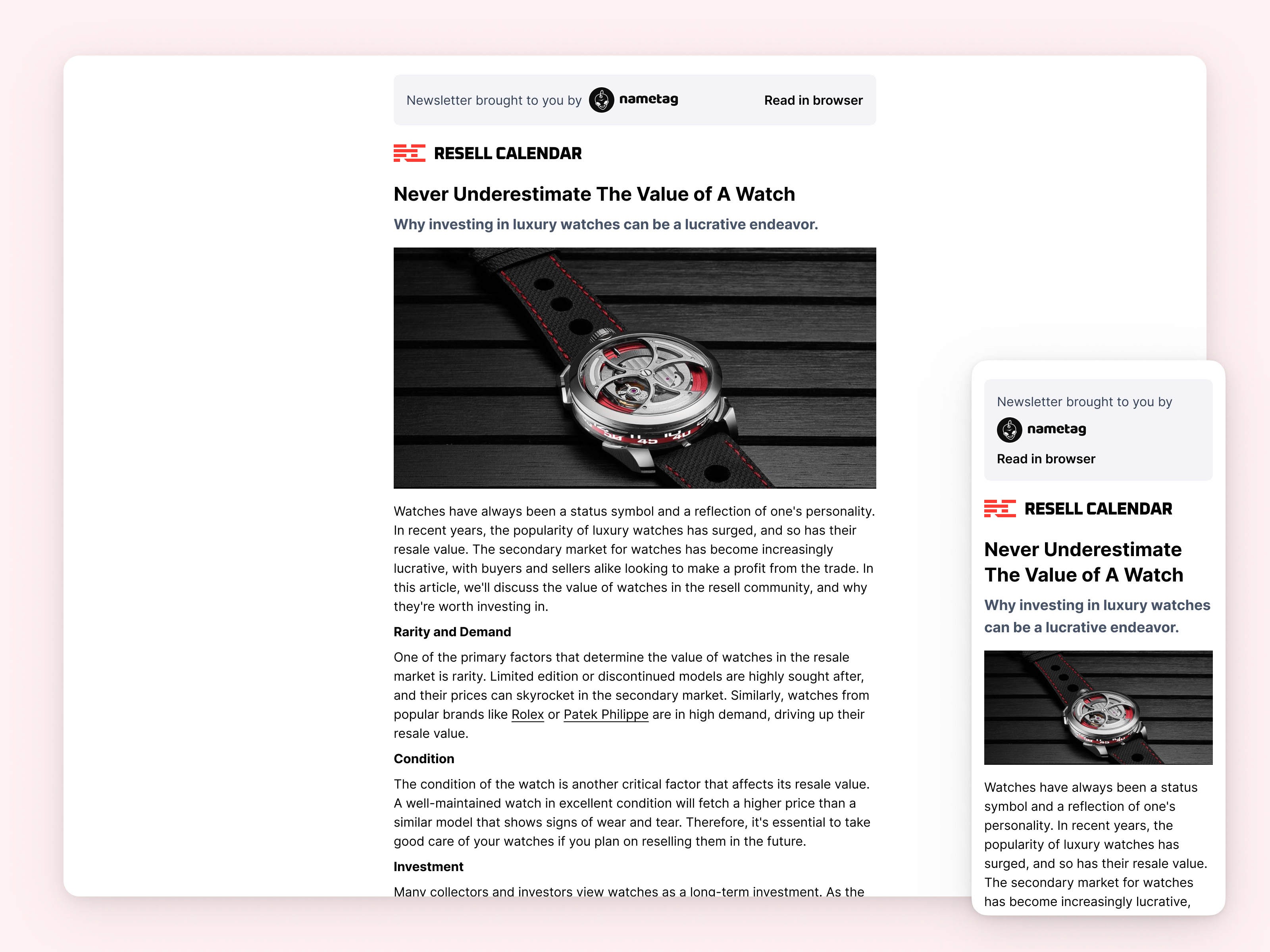
The email newsletter design.
Search
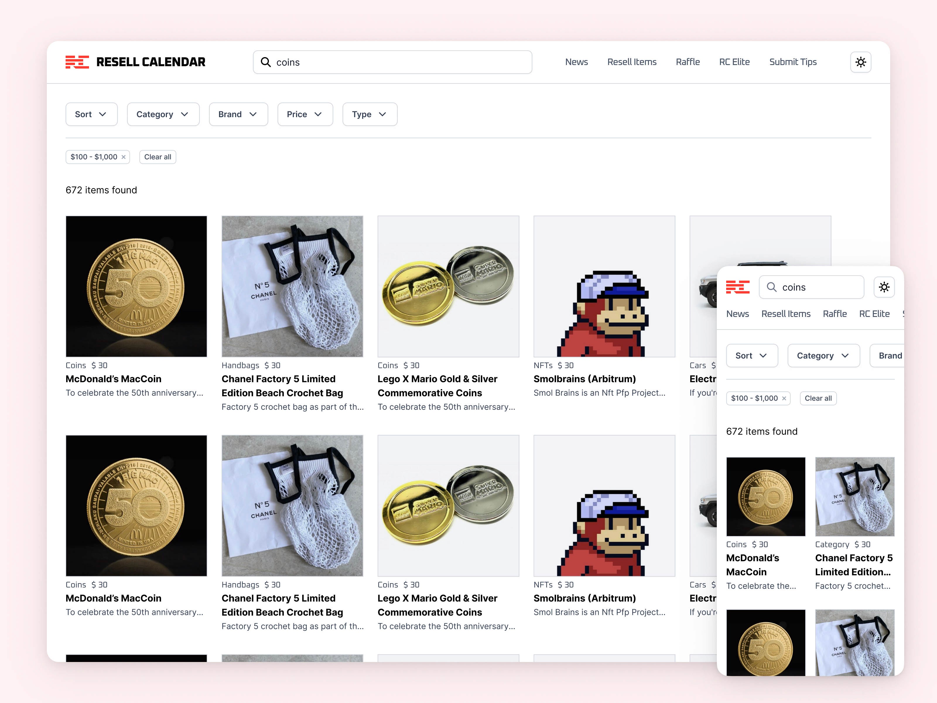
Search results overview.
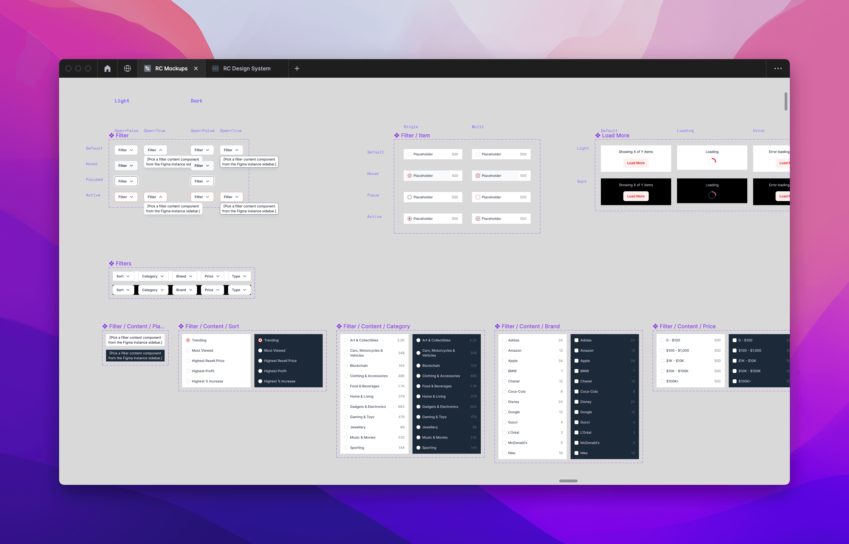
The custom components powering faceted search.
Branding
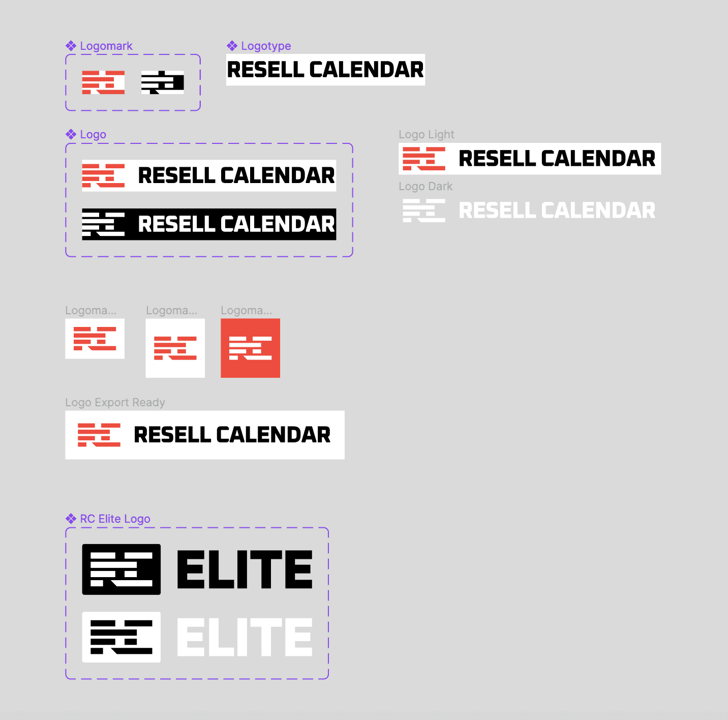
Simple does it. A typographic logomark, subtly hinting at the idea of a calendar or store shelves, and simple enough to be legible when displayed on the small 16x16 favicon size in a web browser tab. A red with sufficient contrast, so it can be used as the interactive colour, and the Oxanium logo typeface to complement the logomark.
Information Architecture, Content Strategy & UX Copywriting
I wrote much of the UI copy myself. The blog was left to a CMS specialist. Everything else was worded by yours truly.
Notion document laying out the information architecture implementation details.
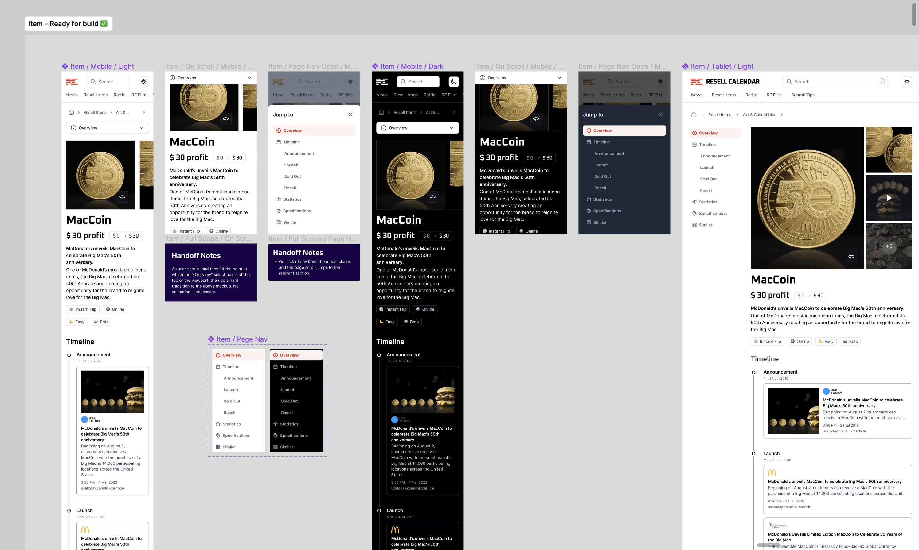
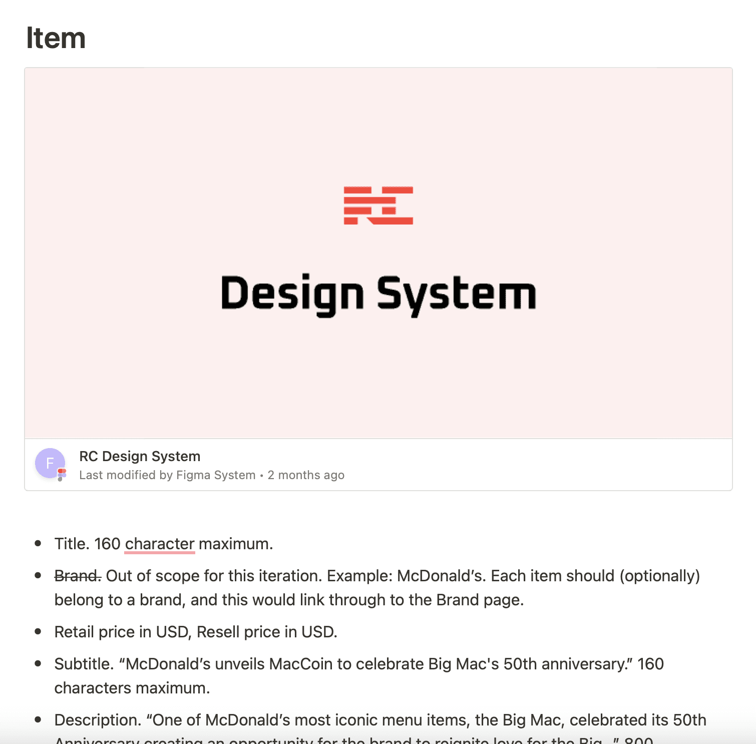
A look at the Item page design mockups in Figma.
Each page mockup was accompanied by a detailed description in an Information Architecture Notion doc that I prepared. Both mockups and the Notion doc were then handed off to developers as deliverables.
Bling, bling!
Not just the copy, but the images chosen complement the hustle culture style of the resell industry. I aimed for a balance between a kind of millennial hustler vernacular and that of a professional SAAS service. Not too boring, not too unprofessional.
Design System
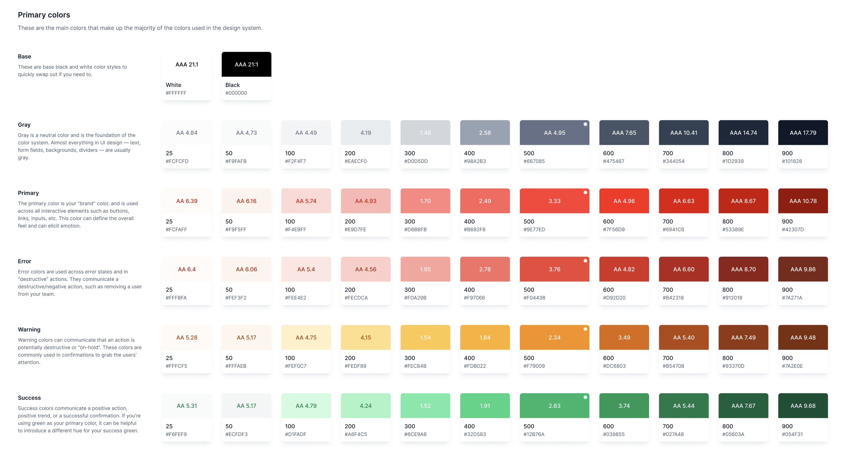
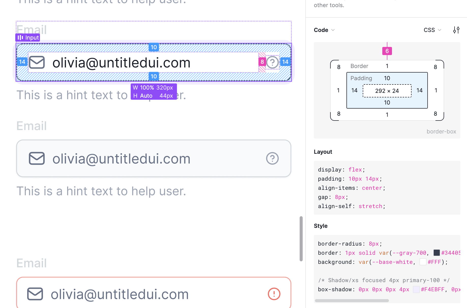
I chose UntitledUI as the UI Kit of choice for this one, and customised it to the client's brand, thereby saving us dozens of hours had I needed to create an entire library of components manually.
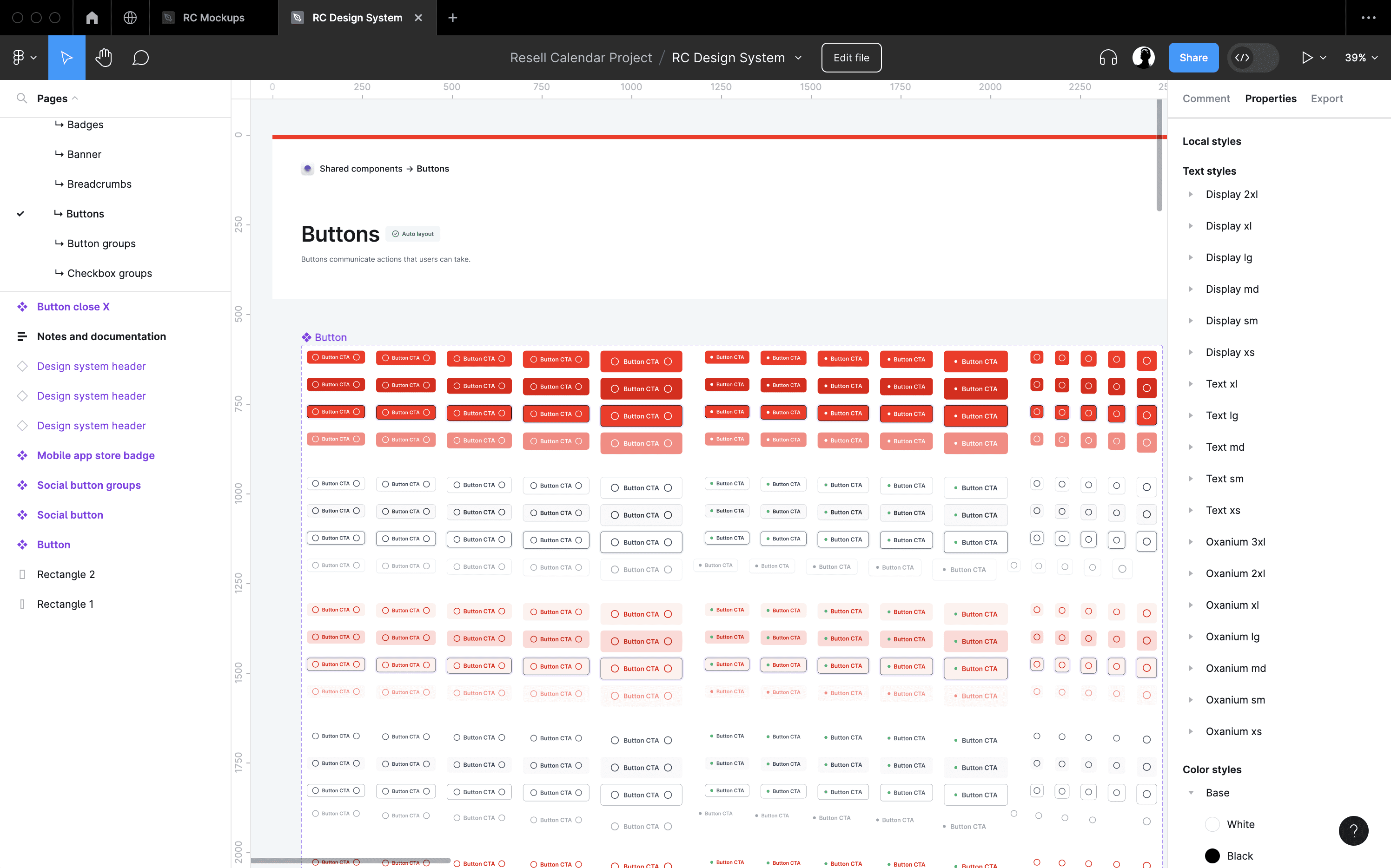
I customised, tweaked and built upon the component library as needed. I only found out later that the UntitledUI Kit had poorly implemented consistency of sizing, which I only caught once I started pairing components to create mockups. This drives home the need for a battle-hardened UI Kit.
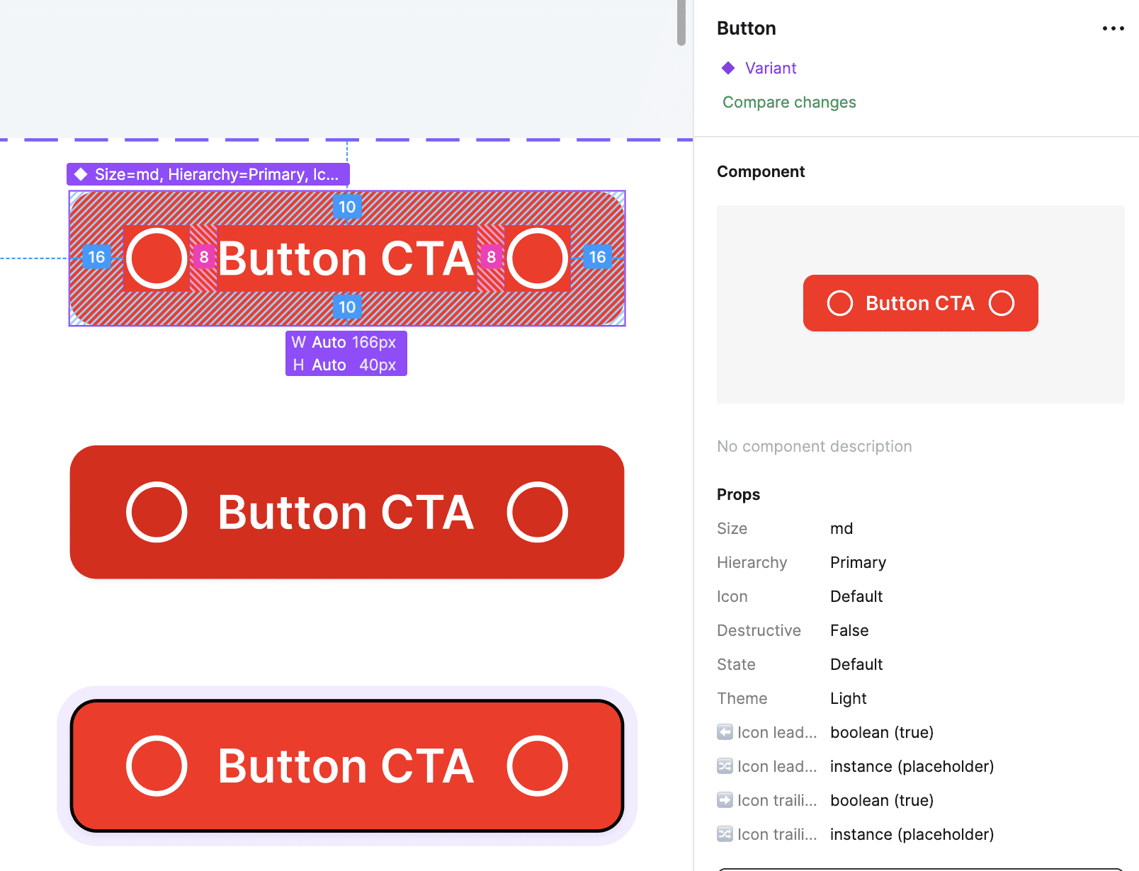
A medium (md) sized button, above, is 40px in height.
A medium (md) sized button, below, is 44px in height.
I was facepalmed hard when I realised this flaw. One would hope to be able to pair all medium sized components side-by-side in a horizontal stack, and have them elegantly take up the same height. Not so with UntitledUI.
I immediately promised myself never to use UntitledUI again, even though the UI Kit had some really nicely implemented details in it.
Ultimately, these sorts of niggles didn't hold us back from shipping a high quality product. It's the kind of "scar tissue" one develops from trial and error, and now I've developed a sharper eye for sniffing out quality UI kits before selecting one for a client project.
Light & Dark Mode
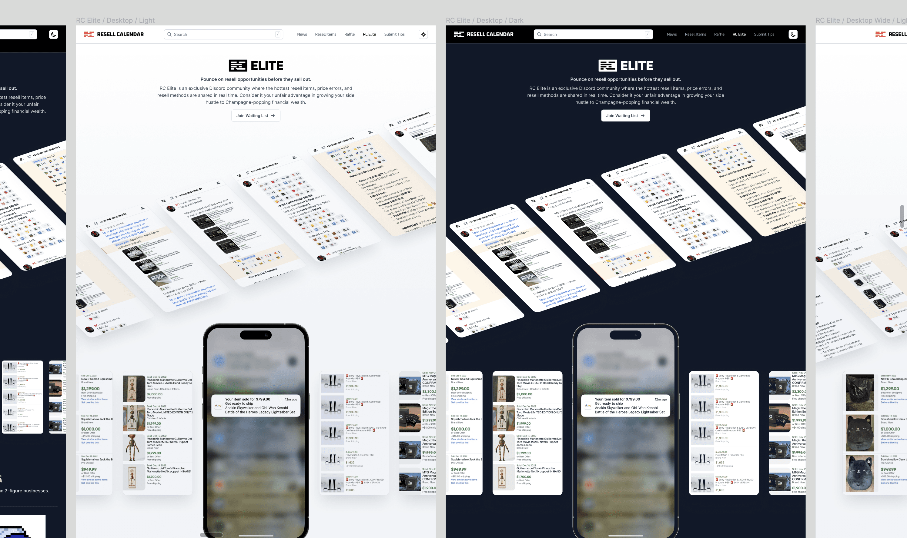
On the topic of scar tissue, dark mode was another problems we bumped into.
Unfortunately, UntitledUI didn't provide dark mode variants out of the box. Nowadays, with the launch of Figma variables, all decent UI Kits come with dark mode enabled components out of the box. At the time, in order to cut scope this meant having to make the compromise to only tweak the custom components to support dark mode, and leaving the UntitledUI components as is. A less than perfect dark mode implementation, but a workable one for the MVP release.
In hindsight, we could've ditched dark mode support entirely at the time. Nowadays, when choosing the right design system, it can be included in a MVP without adding much scope. Even so, I'd err on the side of excluding it unless there's a good reason to make this in scope. Especially when browser tools like Dark Reader do a good enough job for people who prefer dark mode experiences.
I guess hindsight is 20/20, in both light and dark mode.
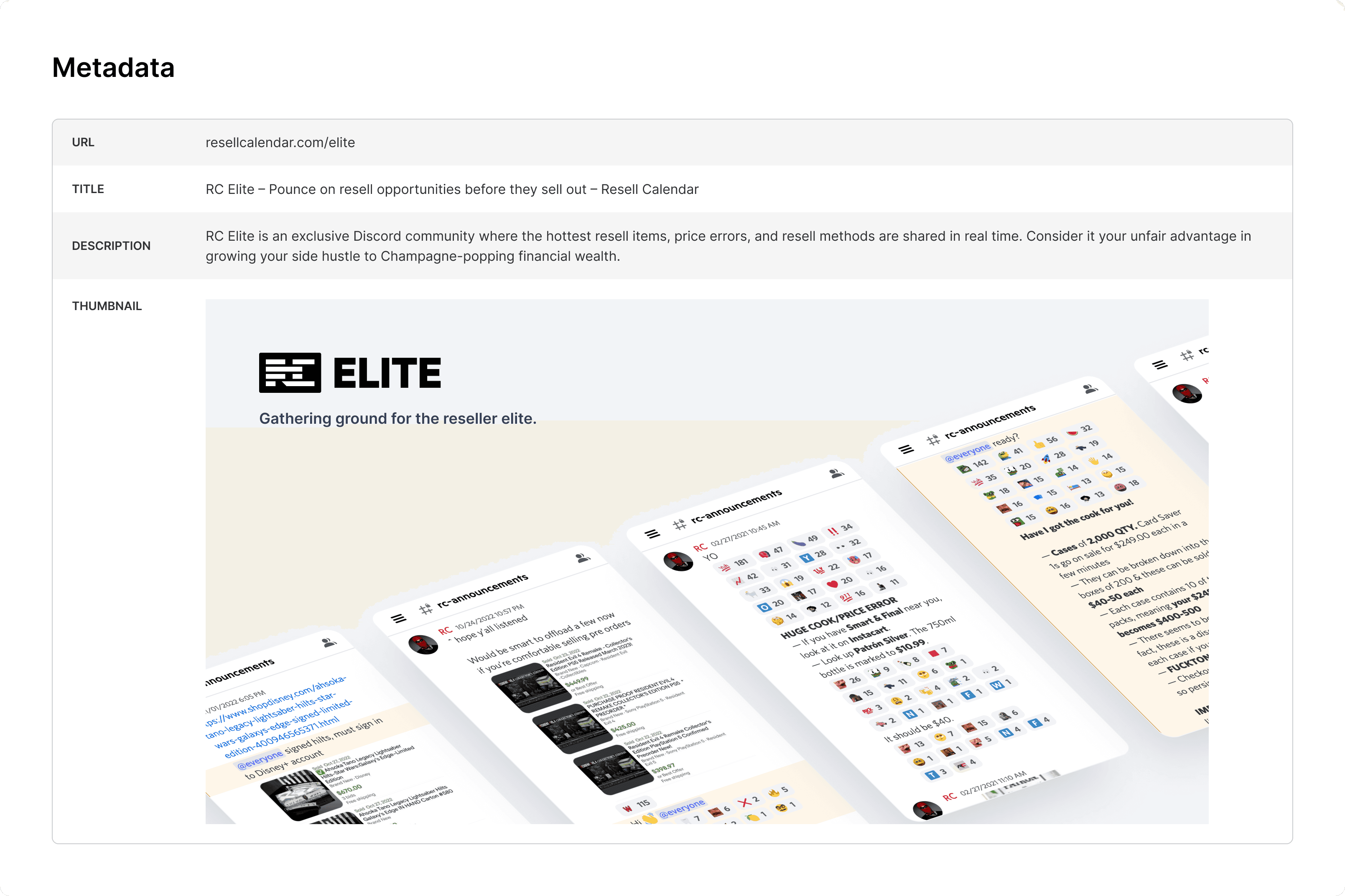
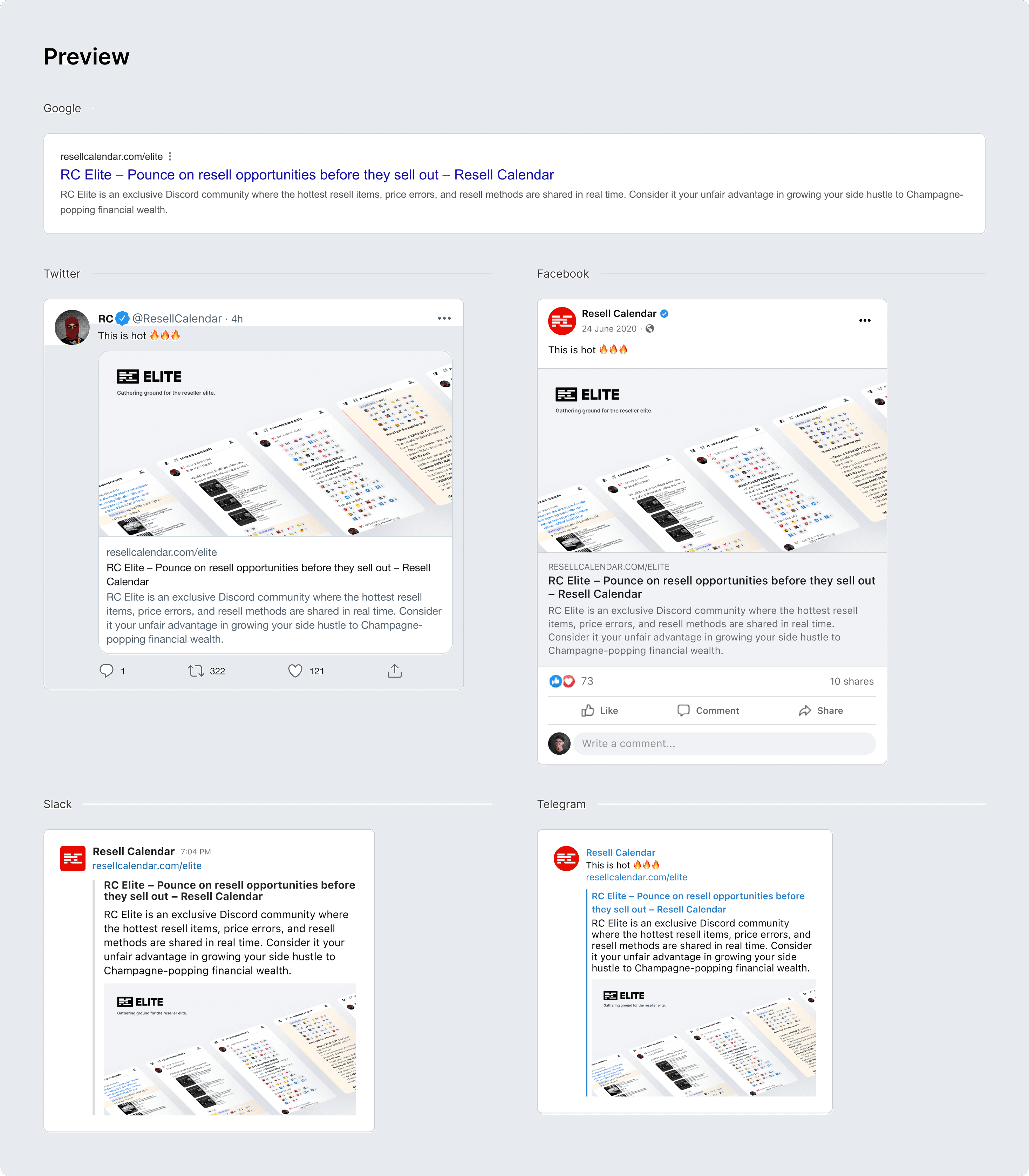
Meta Tags
Newsflash for anyone new to design: UX is more than just UI. And a clear example of this is the importance of designing for meta tags.
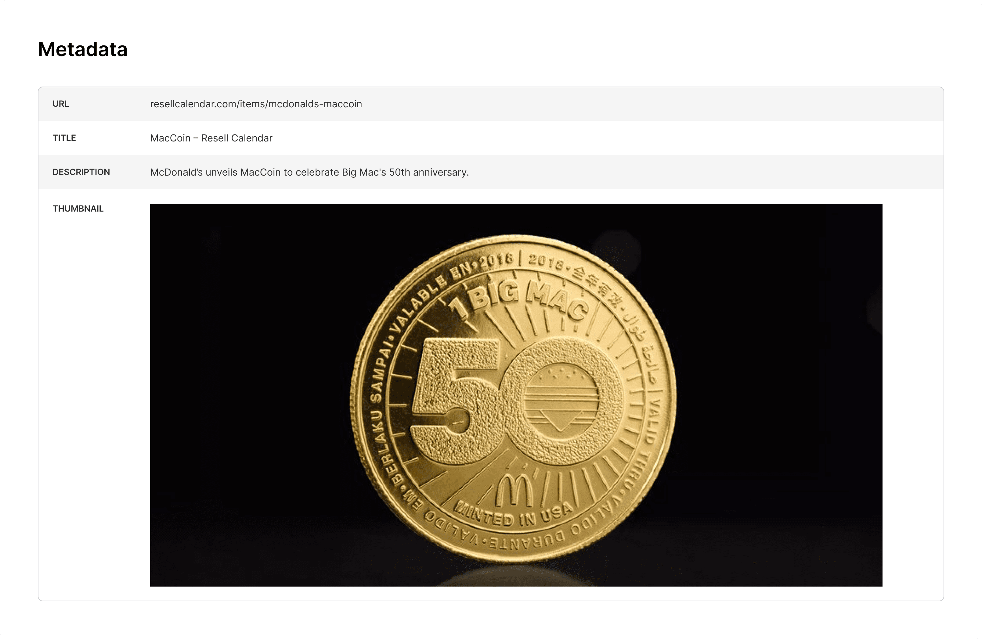
On this project I designed the exact meta tags — URL, Title, Description, Thumbnail for each page. This means that attention to detail of the design extends beyond just the Resell Calendar website, but onto any social platforms where the site's links are shared.
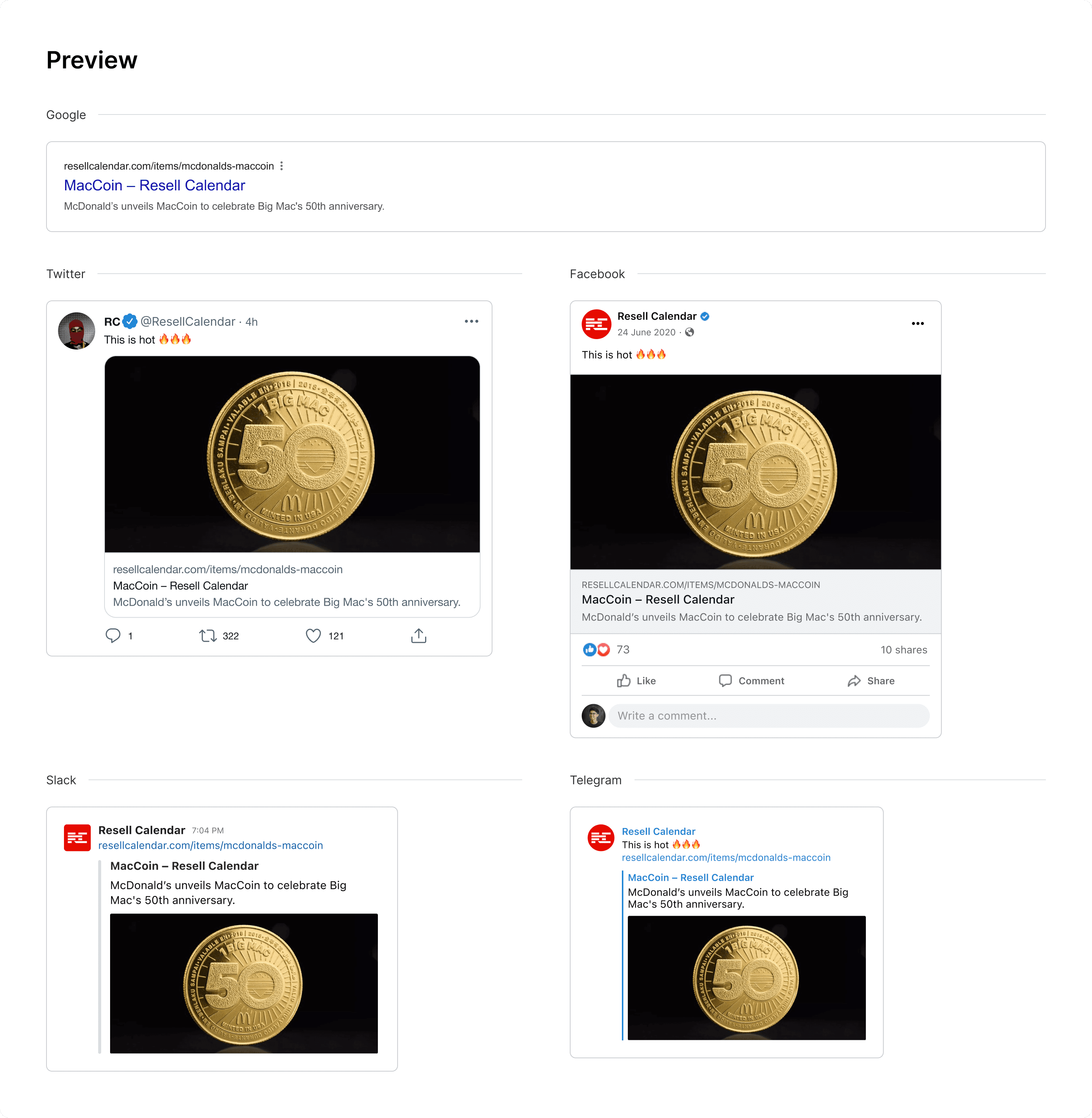
Designing for meta tags is a prerequisite for any decent UX work, so I'm not gonna tap myself on the back too hard, but it's worth pointing out because Resell Calendar is the first project where I started including such deliverables in my work. Now I can't imagine delivering a website design without them. They're invaluable for both SEO and attracting clicks to the website.
Explore all work